


Confex North
Confex North was launched as a re-brand of Confex Future Focus in 2019. The rebrand was so the event would not just be technology focused and more open to exhibitors of all types like its parent brand International Confex. I was approached by the event director to create a logo more similar to the parent brands logo mark.
Using ITC Lubalin as the logo type paired with the Confex signature icon ‘O’, we created the new logo.

Branding
After the logo mark creation, myself and marketing began connecting ideas for how the brand should look. We took a web first approach first. Meaning I was designing headers and web UI mockups to get a feel for how the brand should look.
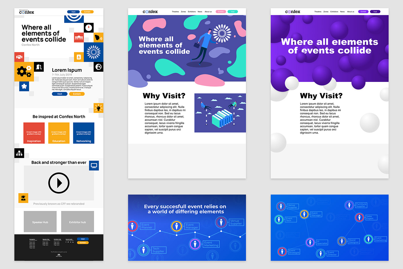
We wanted to create a separate brand look and feel to the parent brand but still keep the same values. Confex North is simply a Conference/ Exhibition for the events industry based in Manchester. Our aim was to create branding that showed of all of the aspects and people within the industry coming together, almost the colliding of separate worlds.
Establishing
Working with the head of marketing we decided the idea above of showing the different jobs within the events world would suit our needs for the event. Pairing this with the logo icon mark to create a visual. We then paired these icons with lines to stimulate the idea of building a network - one of the many reasons to attend the show.
Moving forward we began prototyping two page UI/UX mockups to get a feel how the brand would look digitally.
Development
After the initial website mockup we then moved onto designing how our print advert could look to get more of a full picture of the brands aesthetic. Using the early header concept we carried on the idea of people connecting at Confex North.
At Mash Media we have several publications about the events industry in which we use to advertise our events within also. Using the website we put together an advert but decided we may not want to use a blue as this is a colour that is already used in the shows parent brand. Below is the process of adverts and where we eventually ended up with final look for the branding of the event.


Website UI
After determining the branding on the print advert we moved back to the websites user interface to develop how our online presence would look. After being given a site map created by the marketing team I began using there copy to create the below.
The pages consisted of:
Home - A brief introduction to the show and also navigation around the website
Why exhibit - Includes stats and a place to download the sales brochure for potential exhibitors
When & Where? - Event information to help visitors
About us - Used to explain the organiser company and also a contact page
Footer - The footer of this page also includes sliding logos that show of the show sponsors and partners.

Sales Brochure
We then moved onto creating a document to help the sales team properly communicate the show. This document contained various stats and information to help potential exhibitors decide what stand or sponsorship would best be suited for their needs. I originally designed this to be a printable document but it was later decided that we would just use this digitally as it is the best and easiest way to connect with users.
After designing this for print it became the Confex North style for type and layout. Making it easily transferable to other documents.


Digital Advertising
At Mash Media we also use a digital advertising to advertise our events. Mailing we use web banners on our own publication websites as visitors of these websites are the target audience. For this campaign we also used Linkedin advertising and Instagram posts. We also sent banners and social media posts to people speaking at the event so they could promote their sessions

E-Mailer
I also created a E-Mailer template for convex north. Using Adobe XD to create assets to size and then Mailchimp to create the template and send to the mailer team within Mash. I also created varying headers for the E-Mailer so we could create a different look for visitor promotion, exhibitor promotion & our news channel

Show Guide
To help show visitors we also needed to create a guide. The guide helps with way finding, timings of sessions and also is a great sponsorship point for potential advertisers and exhibitors. These where printed and handed out at the show for all visitors.

VIP Invitation
Prior to the event we also sent out A6 invitations to selected event professionals to attend the show as VIPs. These where mailed out personally by the event director.

Event Signage
Running up to the event I was given a signage schedule from the operations team within the company. This includes the specs and materials of every piece of artwork that needs to be created. The signage varies from way finding to promoting event sponsors. When creating signage I always try to ensure designs are kept simple and the purpose of the artwork is clear.


At the Event
Sadly there was not much imagery taken off my work of the event but please see below a few images of how the signage ended up looking


THANK YOU!
Thank you for viewing this project. Feel free to take a glance at the rest of my work and of course likes and follows are appreciated.
Want to see what else I’m up to?
Instagram: instagram.com/ogs_design/
Dribbble: dribbble.com/OscarSpinks
Instagram: instagram.com/ogs_design/
Dribbble: dribbble.com/OscarSpinks


