

AMORZOTE RE DESIGN
New Wafer and Concepts
AMORZOTE was a Nestle's chocolate covered wafer with a great market share, but, in the last months the competition were affecting the sales of this product because of the prize. So, the Client's idea was to make the bar more affordable and nicer with a new form of the bar and obviously a re designed packaging.

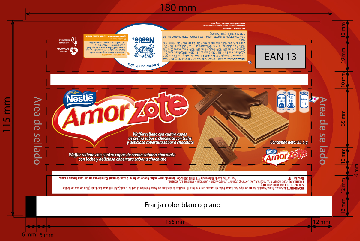
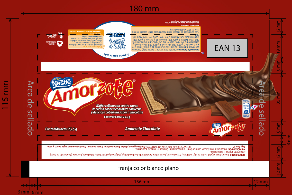
Current AMORZOTE packaging design.
It had 5 wafers with 4 layers of cream in between, covered with chocolate.
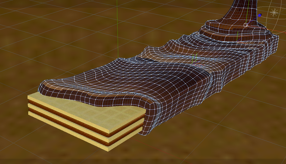
New Wafer
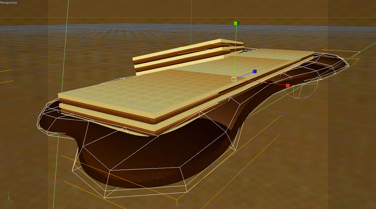
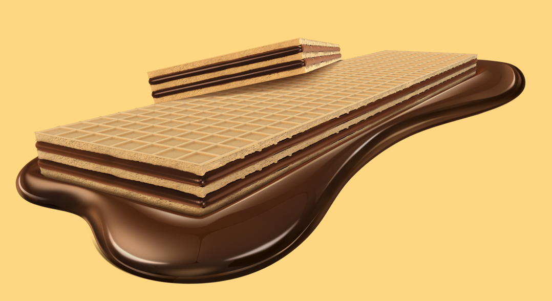
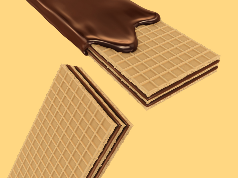
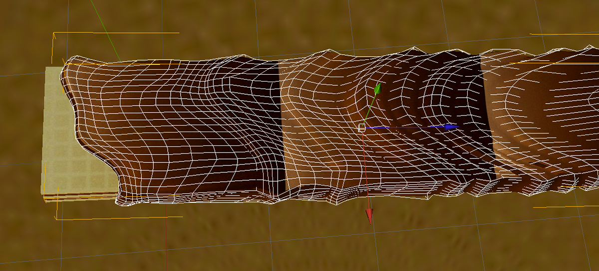
So, The new form of the wafer would be wider. 3 layers of wafer and 2 layers of cream, covered by chocolate, in order to reduce the product's prize.
I began making a 3D model of the new wafer so I could change the perspective every time I needed.

My first 3 concepts for showing the wafer covered by the chocolate in the packaging.
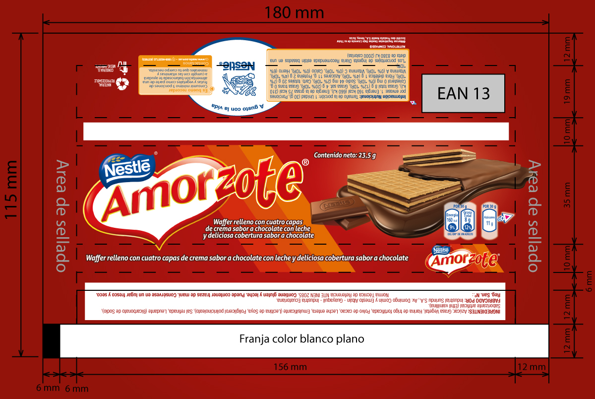
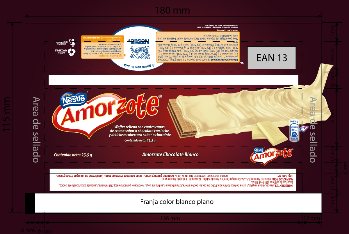
In the Layout Stage of the Packaging, the idea was to make them easy to recognize by the customers in the stores with their already known form and colors. Not changing too much of them. Just to make them a little bit simpler and tasty.
I made some concepts for the Logo too, but in the begging were rejected, because of the awareness of the original brand.
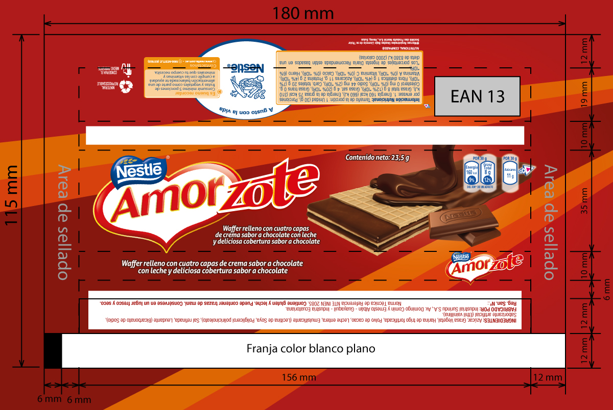

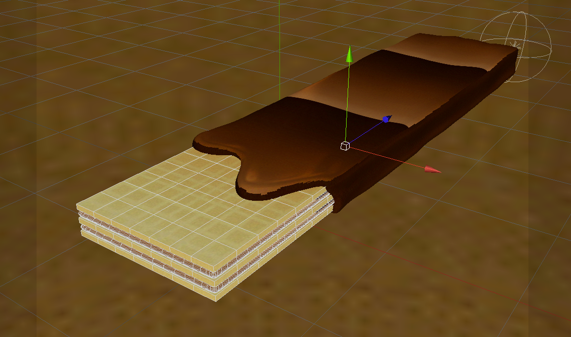
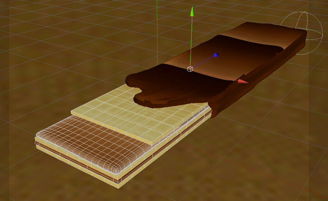
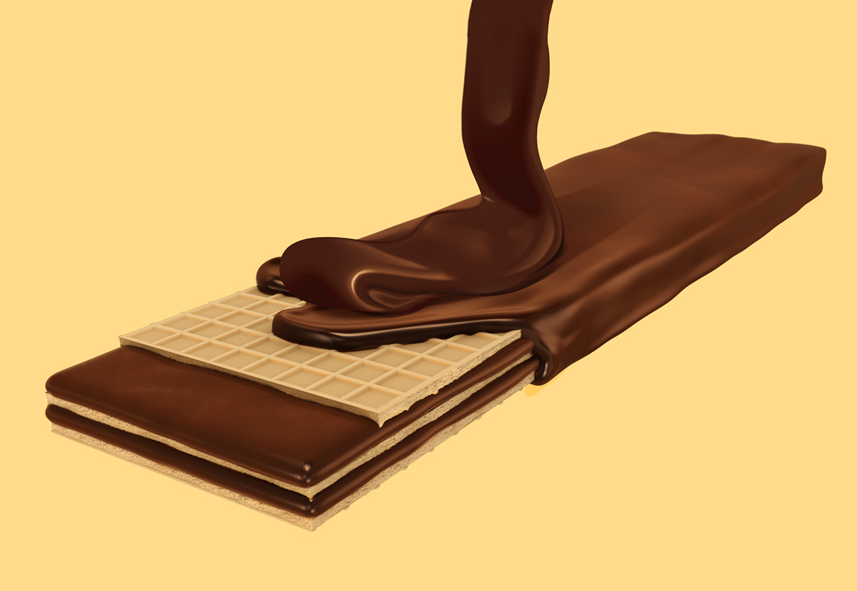
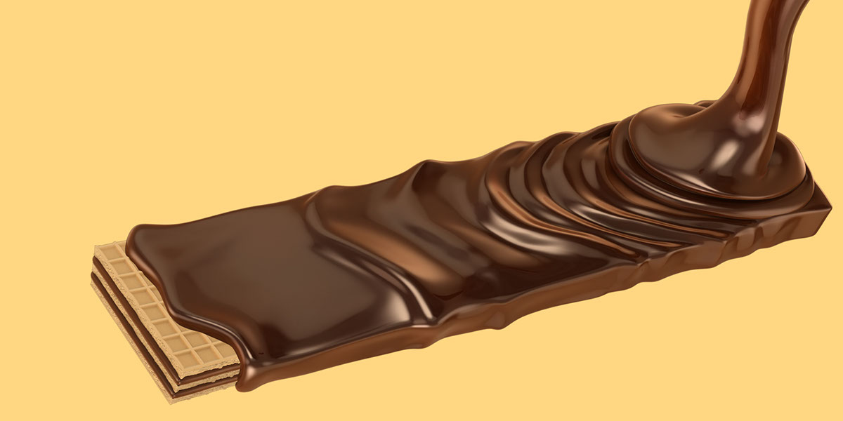
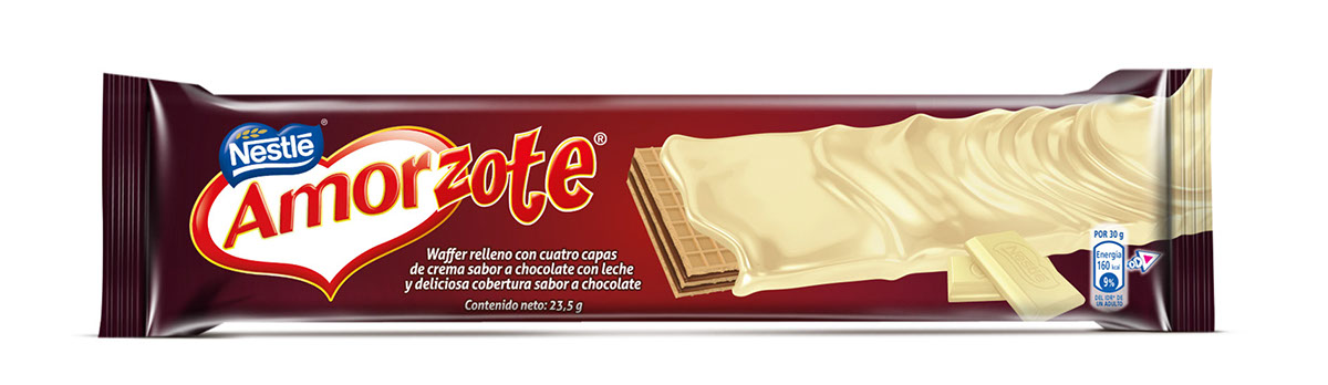
The client ask us to make the product look more tasty and add more indulgence to the chocolate. So, I make a melted layer of chocolate covering the wafers and to put them in a closer shot in the package.
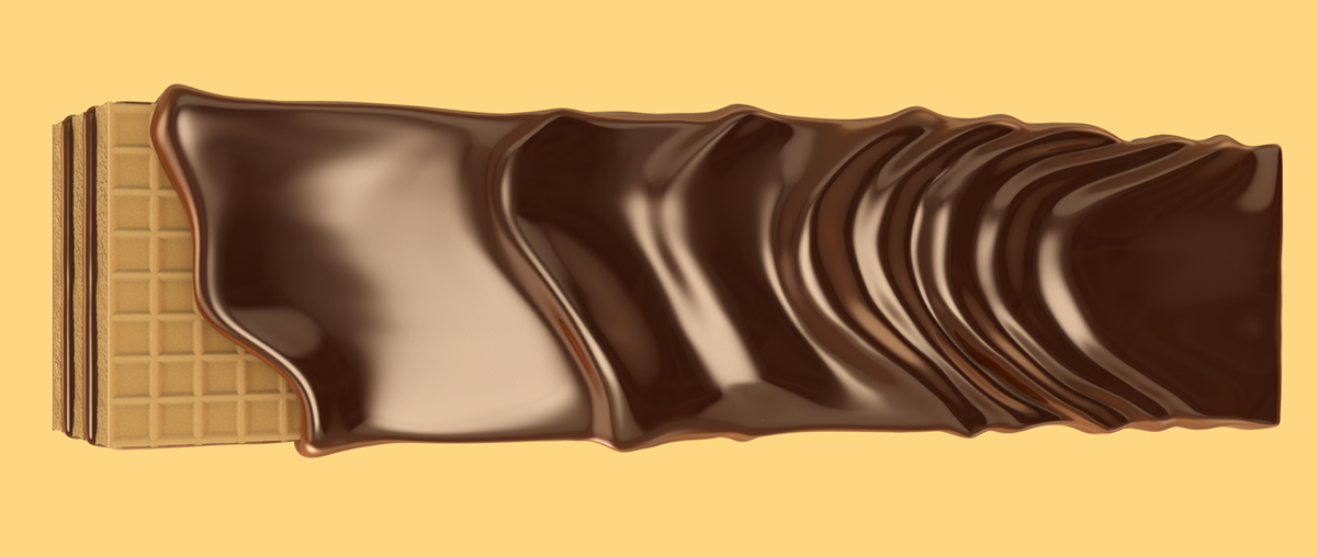

The The client decided it was too much. So, I make a new perspective of the melted layer of chocolate streaming by the side. It worked a lot better.

In the final Layout I finally remove every element in the background just to enhance the product.
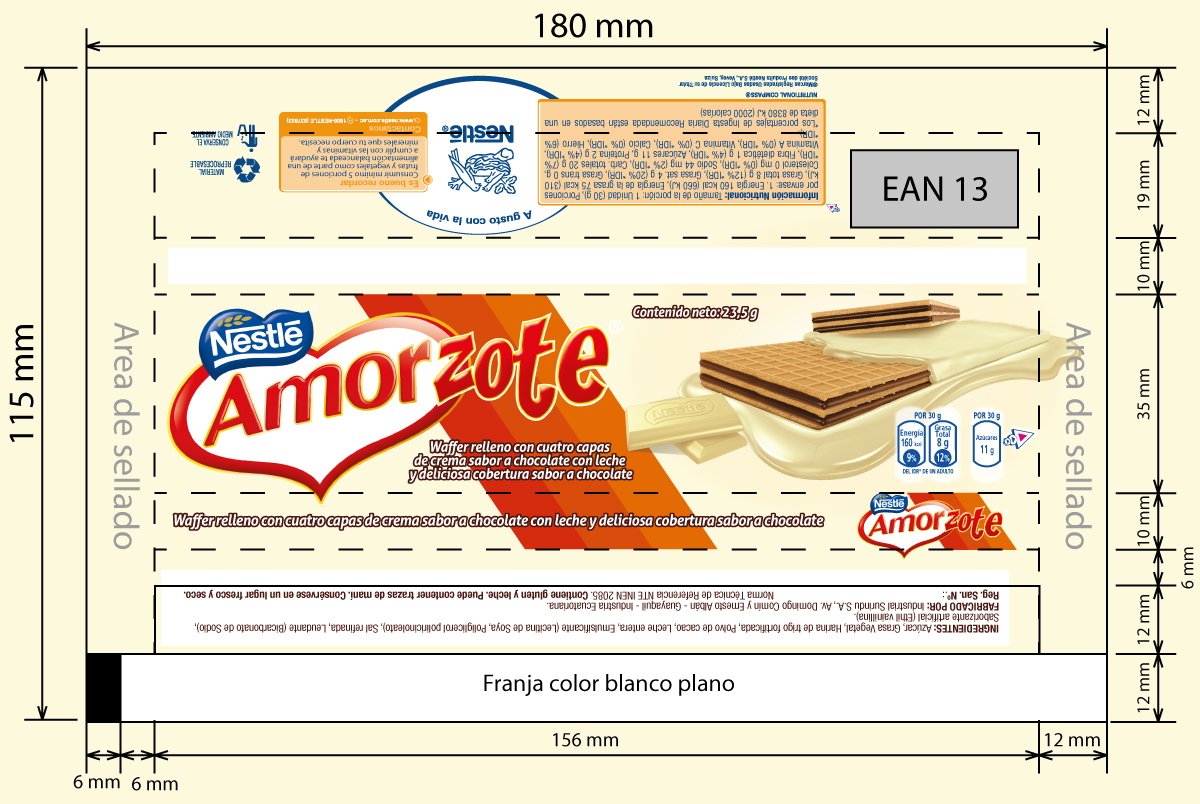
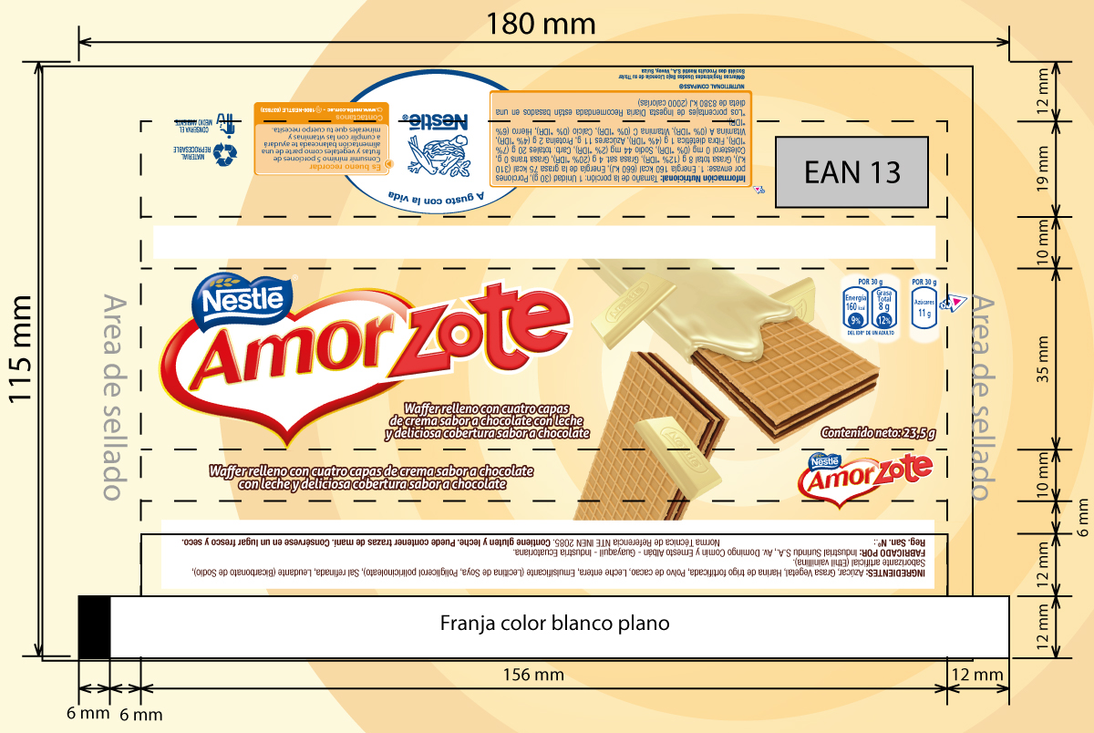
To make the variation in white chocolate it only will turn into a darker color, making them easy to distinguish

At the end I couldn't see the final stage of this concepts, but, I enjoyed to make my part in this project.


