Here's a collection of logotypes and wordmarks that i've done for clients.

logo design for Duckling, an internet design company.
[details about the process of creating this work are documented in the Duckling folder elsewhere on this site.]
[details about the process of creating this work are documented in the Duckling folder elsewhere on this site.]

Wordmark for Leigh Morse Fine Arts, a New York 20th Century through Contemporary gallery.
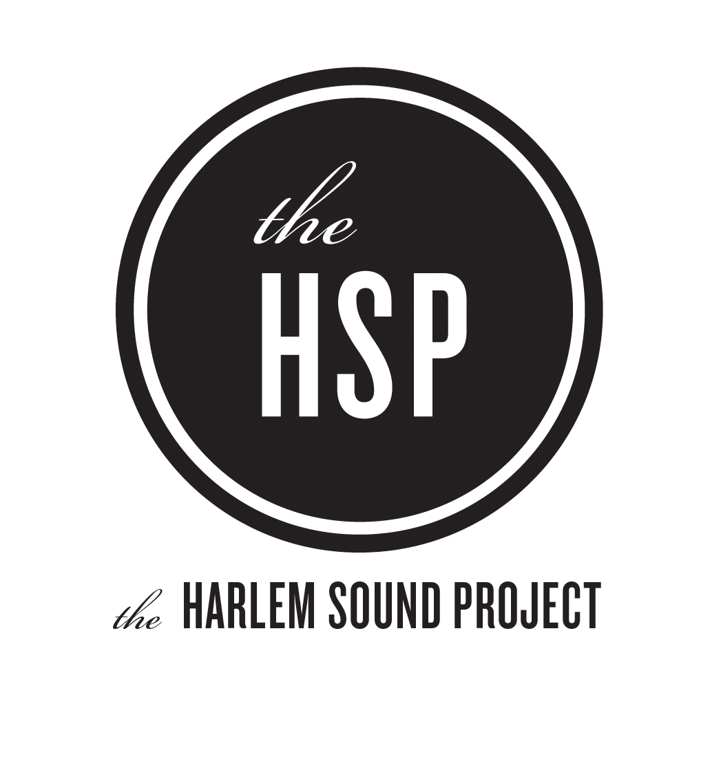
Logo rondelle and wordmark for The Harlem Sound Project. HSP is a rotating orchestra of jazz musicians performing benefit concerts of standards in and around the Harlem community.

Logo for a social giving platform. The two opposed arrowheads are set on end to suggest trees; and the letter form they jointly form suggests a "G"; and the negative space within the square it forms suggests a fruit with leaf. All of things important to the client, GivingTree.

logo for a specialty tack room and stable design and construction firm, Sixteen Three
[details about the process of creating this work are documented in the Sixteen Three folder elsewhere on this site.]

Logo design for internet, podcast and youtube channel gaming and gamer culture company with strong ties to WoW and Minecraft.
wordmark for a cosmetics boutique

Logo and type treatment for startup social media marketing company. Full logo development case study also posted here on Behance.
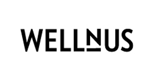
Wordmark for a Manhattan based concierge storage service. emphasis on well'n'us verbal cue from the client; and visual cue with a shelf under the "n" that divides and combines the word.
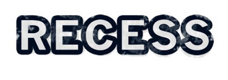
Recess is a quarterly day-long event run by the social gaming network NerdNYC.
logo for an online gaming service, Play Now
Logo for gaming company Down Across.

logo for outdoor tile and ceramics company, Jack's Patio
wordmark for a Portland based rock band
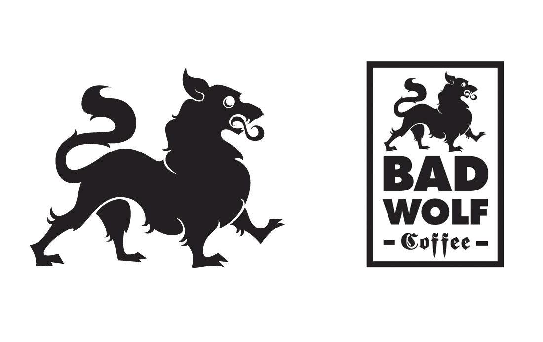
Logo for a new boutique coffee and pastry shop in the Chicago area. Answering a client brief that asked for metal... no, more metal! I provided them with a wolf logo that has some classical heraldry. The eye has a small crescent moon in it as a nod to additional badassery. The principle type was as heavy as can be with a slightly modified version of Fraktur to punctuate coffee. The daggers in the fs were elongated to further imply "fangs".

All logotype works begins with a standard practice of producing at least 50 individual variations on a mark with dozens of versions of those. The lead designs are then transfered into digital versions and further revised before the rough drafts are complete and presentation is made to client.

