Fore more sports branding, visit www.lagrecasportsidentity.com!
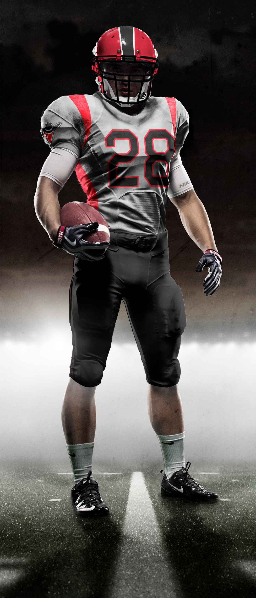
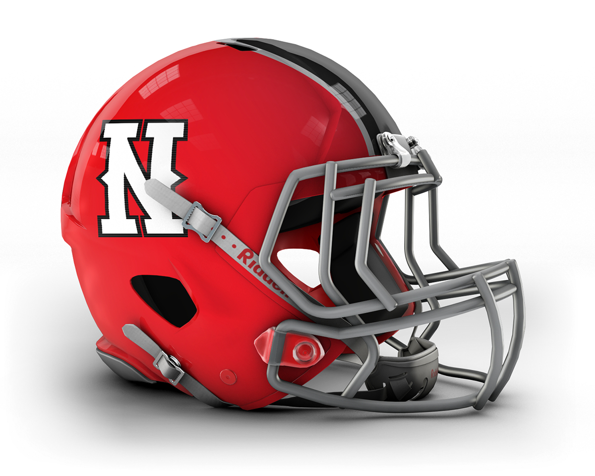
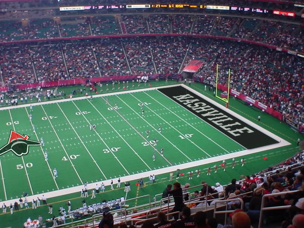
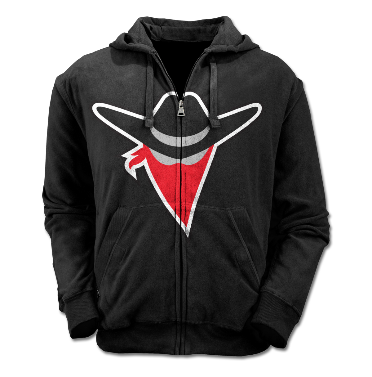
Fictional rebrand of the Tennessee Titans. This was an extensive project over the course of three months that involved creating the name, tagline, logo, colors, and everything else involved with the brand. The unique part about this project was complying with not only my professor's rules, but the NFL's as well to make as accurate of a brand as possible.
The research started with competitor audits, competitor audits, and moodboarding. All of the ideas and everything in the final solution can be directly attributed to understanding the market for my brand. There is absolutely something to be said about understanding your market, and that thing is that it's everything. A rebrand is pointless without extensive and thorough research.
The goal was to create many touchpoints to make the brand feel as real as possible. I'm pleased with how my brand really worked across all of the touchpoints.
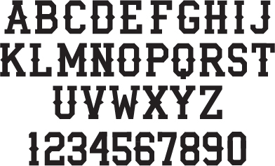
The most extensive (and sometimes painstaking) part of the process was the end result, the brand standars manual. It dictates everything about the brand, such as clearspace, lockup, color builds, and more. View the document below to see the amount of time and effort was put into the manual as well, thus making it a touchpoint in its own way.
The end result is a cohesive brand that I feel really strongly about and am proud to show off.
All edited photos are credited at the end of the brand standards manual. Thanks to the NFL and Nike for making my brand feel as real as possible.