Abstraction, a tight-knit game-development and adaptation studio that you might know from games like Angry Birds, ARK, Broforce and The King of Fighters. But what do you do when your organisation is expanding, but your brand does not longer represent who you are, what you do and how you make a difference?
Abstraction is best known for accurately and faithfully adapting videogame-titles across multiple platforms. But along the way, they learned that this has become part of a much wider variety of areas that they’re in. Unfortunately, the brand itself didn’t grow accordingly and that's we call a ‘huge red flag’. Stuurmen was challenged to build a ‘killer’ brand in close harmony with Abstraction. A brand that has both substance and surface. Together with Abstraction we exposed their DNA to their core and built up the future from there.


Outcome
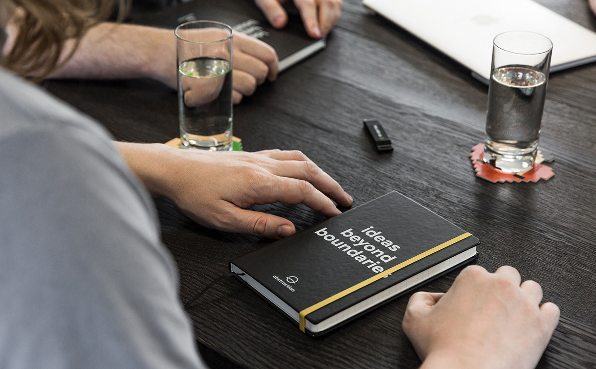
Combining conceptual thinking with sharp aesthetics, led us to the creation of a meaningful brand that has both surface and substance. ‘Beyond Boundaries’ is the pay-off that they’re embracing from now on. This is what typifies them. They do not shy away from a challenge. Make it hard for them, and if possible, even harder. We also created a comprehensive Brand Guide System, which addresses the identity’s usability and perception, all while representing the core values and beliefs.
The most visual change is in the name. They have lost their tail: it’s no longer Abstraction Games, just Abstraction. And there’s a clear reason for that. Game-development is and always will be their core, but now there’s more. An ‘identification name’ like Abstraction Games, is simply in the way of that.


One coherent whole, one point of contact.
Whether it is copywriting, photography, animation or even interior design. Within a project like this we gladly take the role of the ‘Stuurman’. We know what we’re good at and that’s Branding & Digital. That’s why we often act als ‘brand guards’ when there is an expertise needed that is outside of our services scope. Stuurmen wel always be the point of contact unless you like to see it differently. At the end of the day, a coherent brand is what we’re going for.


