Simple - The Bilingual Font
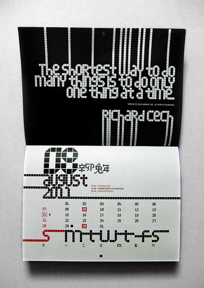
The Simple Calendar 2011
The Simple Calendar 2011
The vague motivation about simple is that it would be somewhat pixel-based. The idea was conceived in the beginning of 2010. The drawings came in around april during my convalesce. Richard Dawkins's Selfish Gene played a big role in moulding my thoughts of the typeface as a game of successful replicators that propagate itself into various forms of surviving vehicles.
The process of simple began with the usual alphabets followed by a series of icons and soon it was an avalanche of chinese characters. The pool of proposed chinese characters were loosely determined by the needs of a lunar calendar.
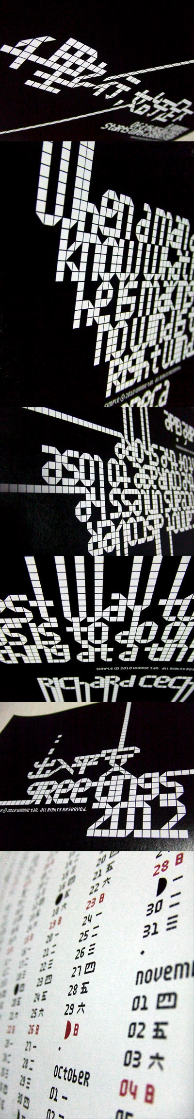
In a nutshell, simple is a single-weight, minimal, grid-based san-serif display. Prudent with details and sturdy in form, the geometrically-driven structure marks the foundation of a cross-cultural assortment of latin alphabets, chinese characters and thematic icons. After months of extensive typesetting, simple is also realized to be well-catered for use in graphical information design in games and tournaments, logotypes, advertisements and headlines.
The Simple Font is available to buy at MyFonts.com
The process of simple began with the usual alphabets followed by a series of icons and soon it was an avalanche of chinese characters. The pool of proposed chinese characters were loosely determined by the needs of a lunar calendar.
In a nutshell, simple is a single-weight, minimal, grid-based san-serif display. Prudent with details and sturdy in form, the geometrically-driven structure marks the foundation of a cross-cultural assortment of latin alphabets, chinese characters and thematic icons. After months of extensive typesetting, simple is also realized to be well-catered for use in graphical information design in games and tournaments, logotypes, advertisements and headlines.
The Simple Font is available to buy at MyFonts.com