

Io (ee-yoh) is a unique case. They began as Isis International in 1973, an organization supporting feminist movements globally through information communication. They needed to leave the name with its harrowing associations behind and launch a new identity for empowering activism in the digital age. Io now focuses on leadership training for the next generation of feminist activists, as well as providing safe spaces, figuratively and logistically, for activists and advocacy workers.
Logo Design
October 2018
Io came to me with a logo study from another artist. I overhauled the design so that it had a sturdier visual structure, but also introduced a brighter, more diverse palette. I then used good old Avenir for the tagline because a geometric sans felt consistent with the logo’s component shapes.
While the project scope didn’t include a branding guide, I went ahead and made a lite version just for the swatches. It was good practice and listing color values was weirdly satisfying.


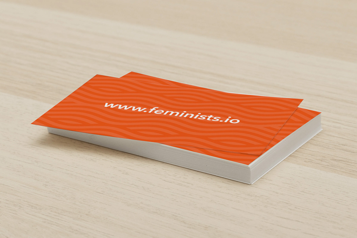
Business Cards
May 2019
Designing the rest of the stationery was pretty straightforward, given that we already had a great logo to work with. I used a wave pattern and a strip of brand colors as recurring elements. The same color strip appears on the footer of Io’s new website (which I also worked on as part of a team, but that’s a writeup for another day).


Letterhead Template
May 2019
The letterhead template had a Google Doc version with its own set of custom paragraph styles. There was no Avenir in the font options, but I knew from my team having built the website prior that Nunito Sans was an excellent substitute. Google Fonts, y’all.


