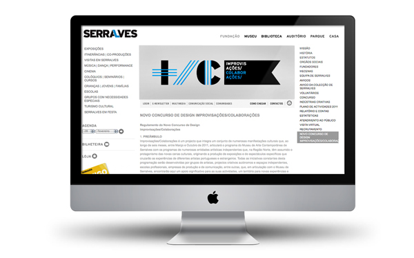
Fundação de Serralves is one of Portugal's leading cultural institutions. Besides the celebrated museum, their headquarters in Porto boasts a huge garden where they organize several festivals concerning performance arts, from music shows to theatrical presentations and sculpture gardens and installation. By the middle of 2011, they opened up a design competition to develop the graphic identity of an entire year of specific programming under the theme "Improvisations/Collaborations".
Here are some slides of my presentation.

Dealing with such a long name, the first thought was to devise a kind of mathematical formula that could provide logical simplification of the name, and come up with an acronym that would constitute the visual identity of the festival.

Around 2008, Fundação de Serralves had suffered a complete rebrand by McCann Erickson based specifically in two solutions: the contraction of the words Fundação de Serralves into the more succint Serralves, and maintaining the use of Interstate as a primary corporate typeface.
The previous logo:

The new logo:
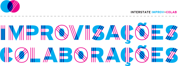
This operation inspired me to use a similar strategy to brand the festival. Other than starting from scratch, i would use the primary corporate typeface, Interstate, in a customized way. I took the festival's theme "Improvisations/Collaborations" and sketched two types of customization, Interstate Improv and Interstate Colab that would collaborate to form the letters of the festival's logo.
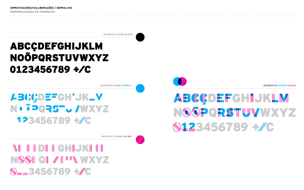

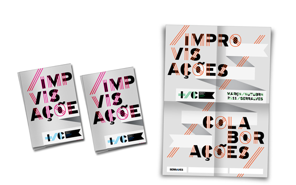
In order to emphasize the collaborative theme, the wordmark would only be legible by superimposing the two fragmented typefaces. In other words, they would only communicate when collaborating.
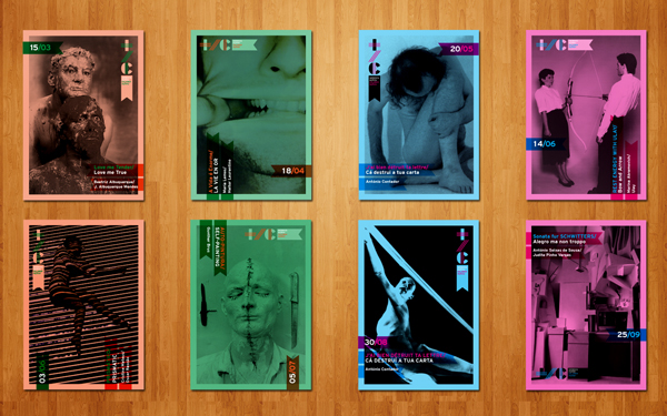
Given that one of the particularities of the festival was it's outdoors nature, i added a ribbon shape —thoroughly used in outdoor popular events as decoration— to the simplified version of the logo. This shape would then be used to frame the primary information about the shows (date, artist and location) on all subsequent materials.


Event information and artist's biographies were printed in colored paper, according to the color coding of event type (theater, music, installation, happening, etc.).
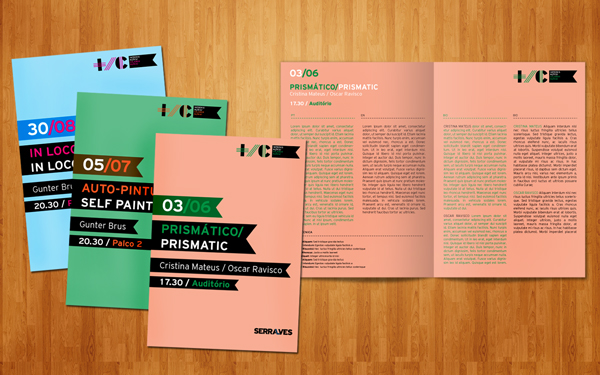
The same color coding was used for the postcards that advertised the events.