Blister packs, and other prescription drug packaging, can be difficult to open, read, and understand. Over 30 percent of those 65 and older take 10 medications per day, while the average for all post 50s is four daily pills. Unfortunately, this age group also has the greatest difficulty reading small warning labels and are more likely to misread or completely ignore them. We wanted to create a beautiful solution for the current industry standard in the US. This was a collaboration with Tae McCash. This project will be published in Packaging Design (2015) by DESIGNERBOOKS.
Professor: Magnus Feil, University of Washington
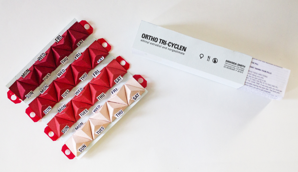
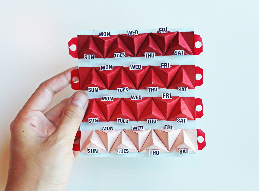
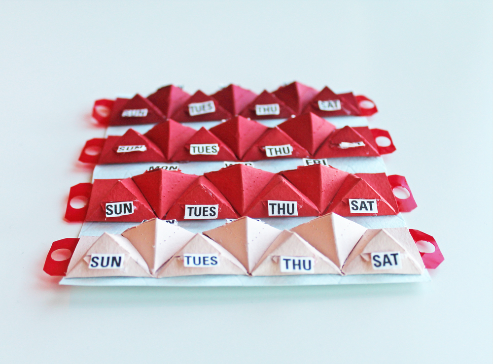
Our packaging concept has bold date labels that also function as pull tabs to access the pills. Users can easily read and access their medicine without any confusion.
I conducted research to understand the pains of existing pill packaging, worked with my partner to come up with a viable solution, created the template for the triangle folds, and was responsible for printing and assembling the final product.


