Overview
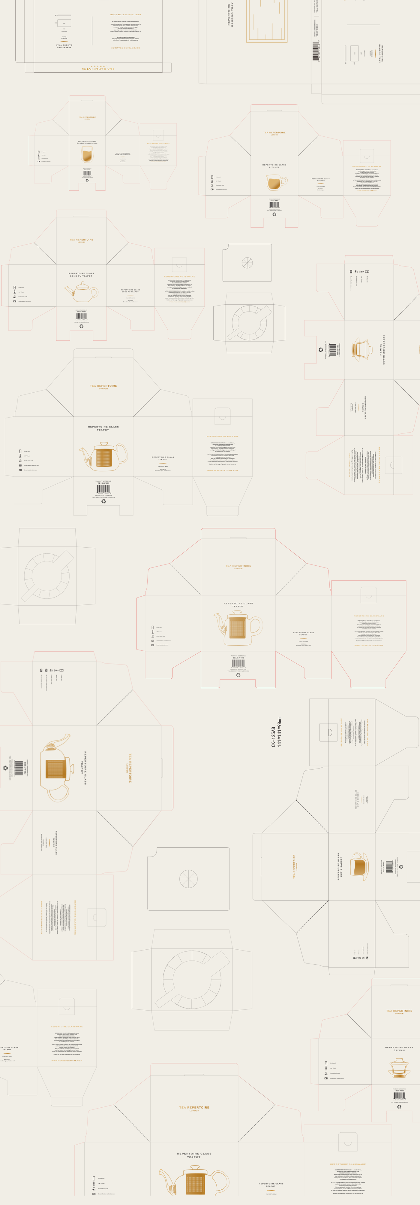
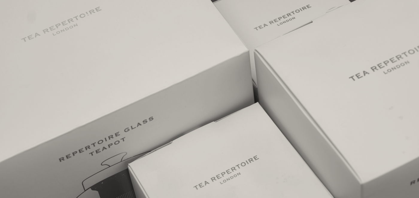
티레퍼토리는 영국에 위치한 프리미엄 티 브랜드이다. 브랜딩 작업에 이어 TEA REPERTOIRE 만의 특별한 티웨어 패키지 디자인 작업을 하게 되었다.
프로젝트 초기 TEA REPERTOIRE 는 그들만의 특별함을 원했다. 일반적인 찻잔이나 주전자의 포장을 떠올리면 보통 제품의 사진이 들어간 패키지가 떠오른다. 이러한 뻔한 디자인을 피하고자 우리는 TEA REPERTOIRE 만의 표현방법을 고안하였다.
TEA REPERTOIRE is a premium tea brand located in the UK.
The branding operation later led to the design of TEA REPERTORIRE's own special T-ware package.
At the beginning of the project, TEA REPERTORIRE wanted their own speciality.
When you think of the packaging of a regular teacup or kettle, you usually think of a package with a picture of the product.
To avoid this obvious design, we came up with our own TEA REPERTORIRE expression.
Illustration
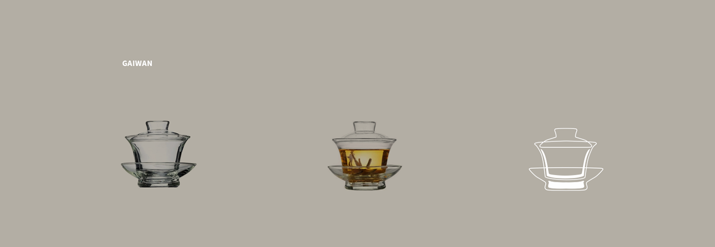
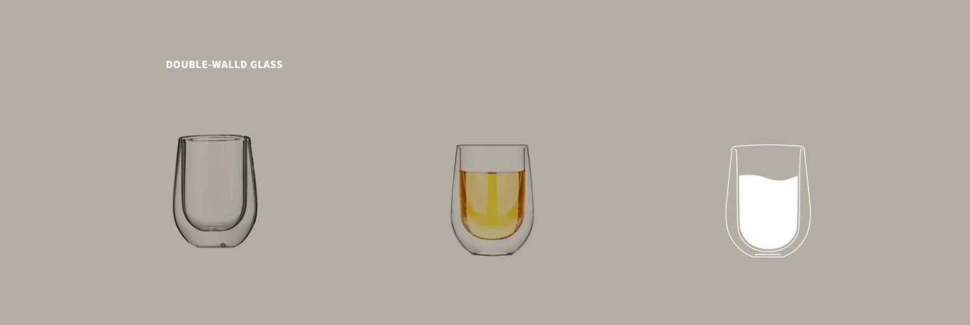
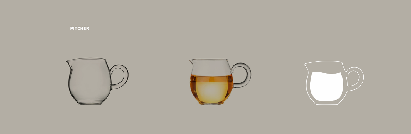
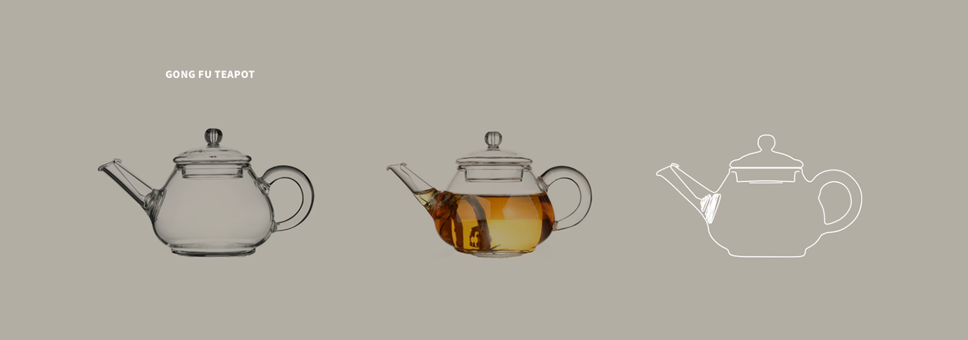
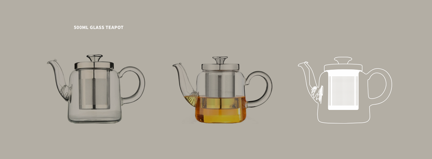
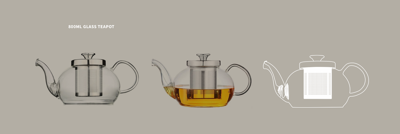
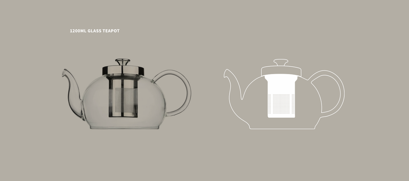
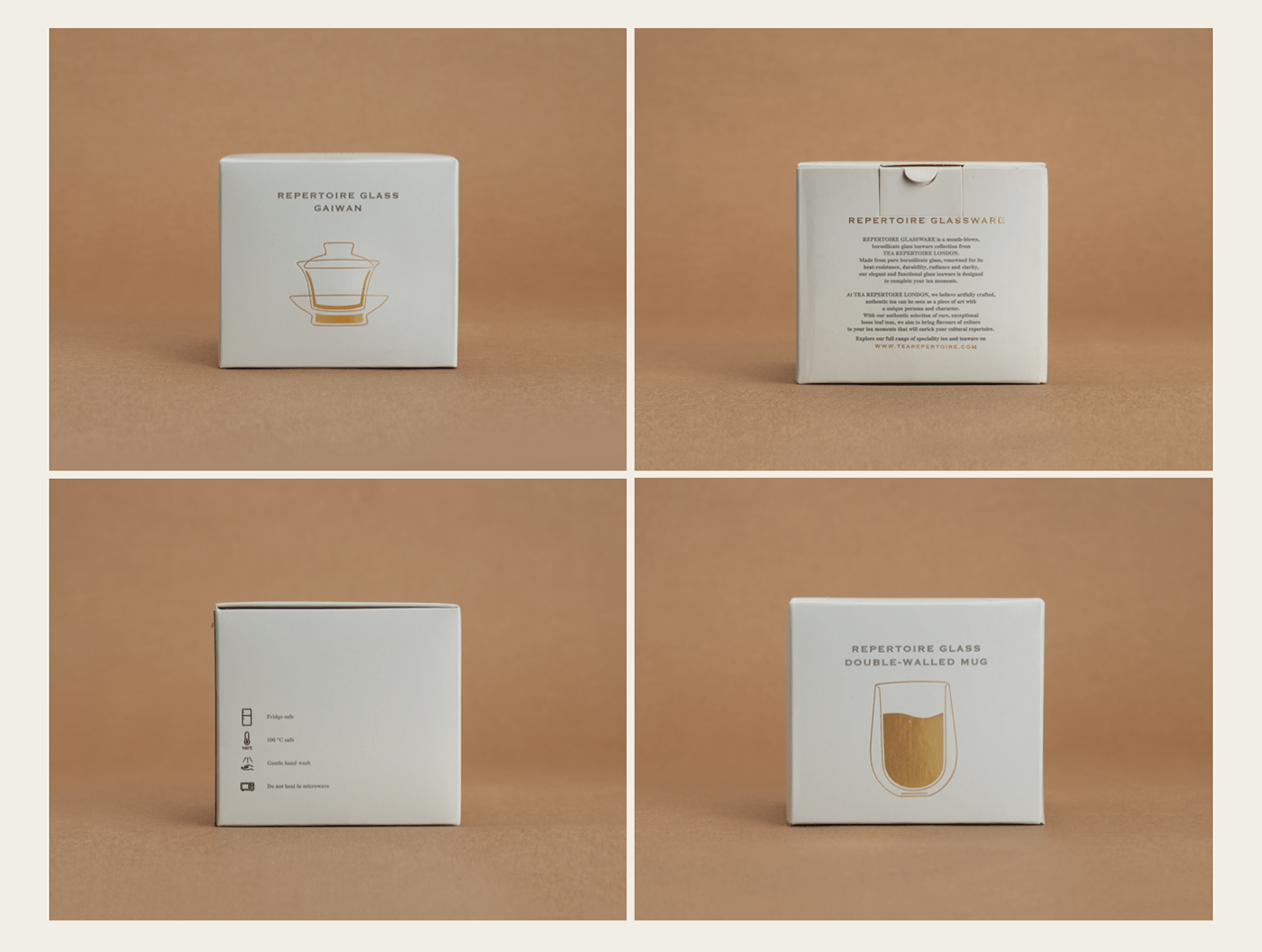
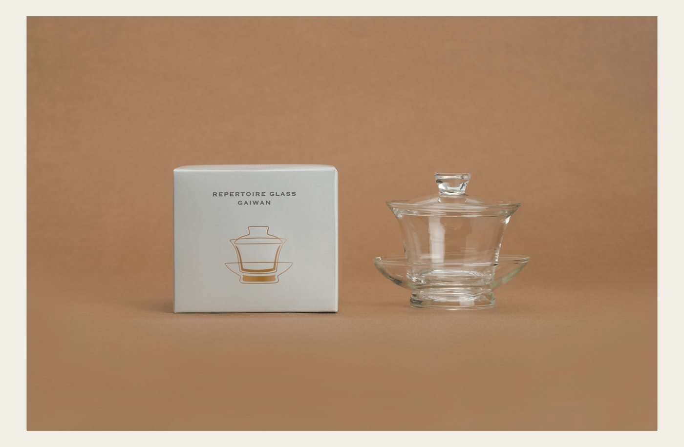
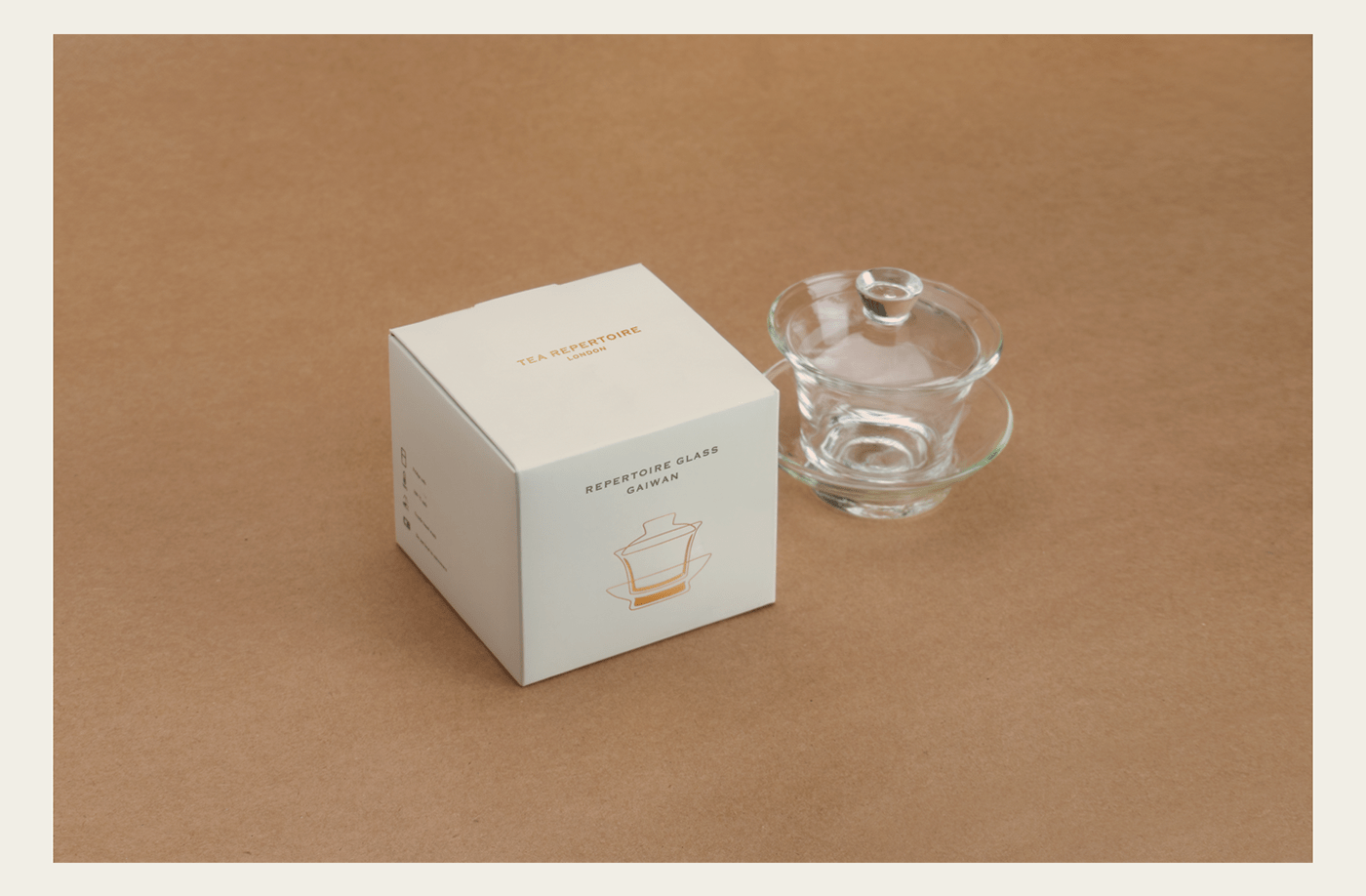
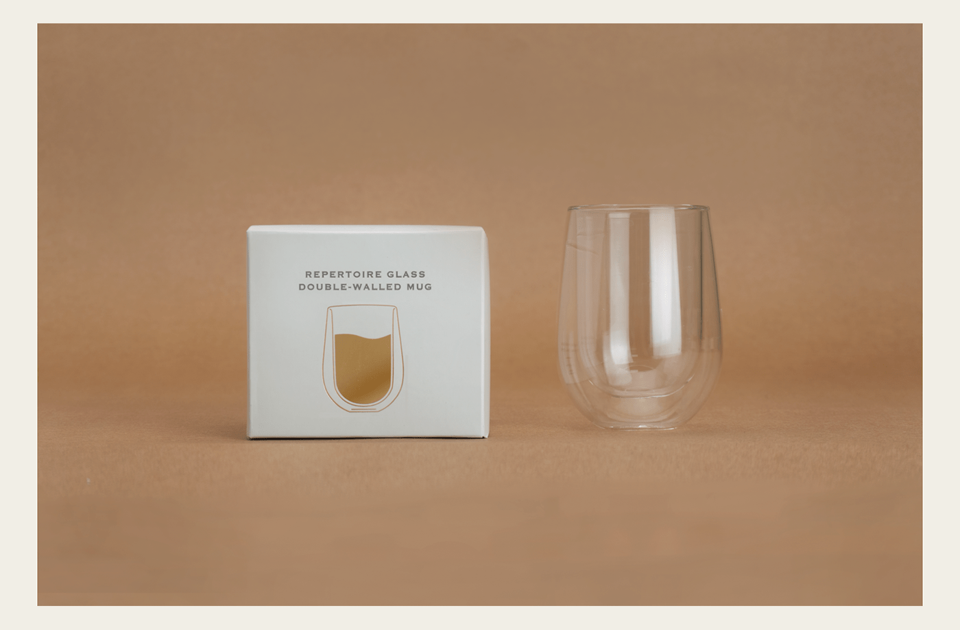
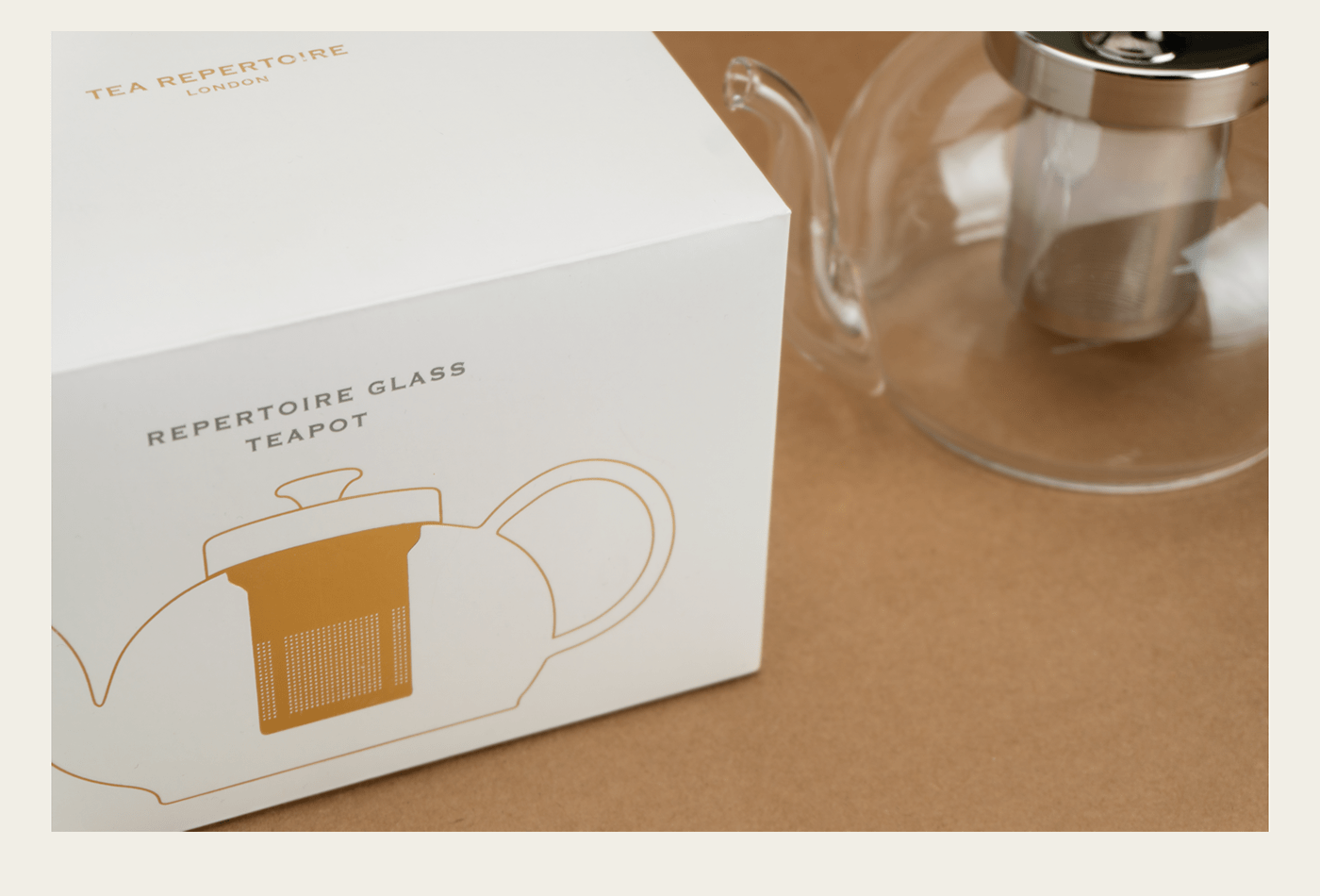
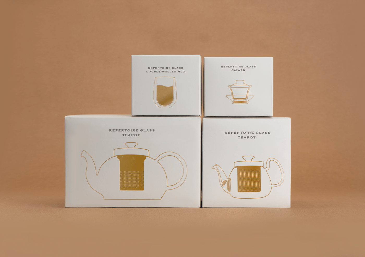
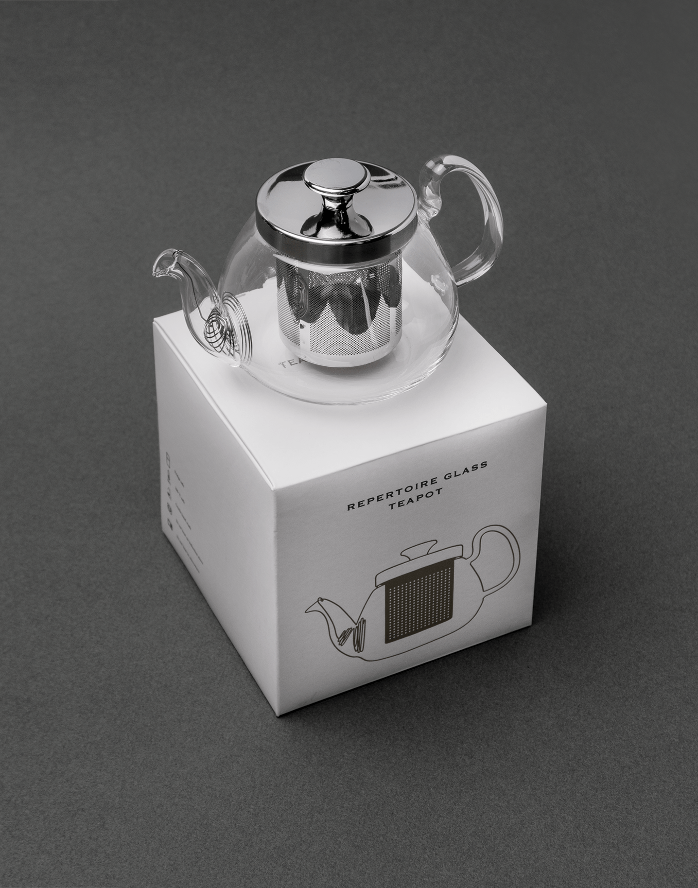
TEA REPERTOIRE 의 TEA WEAR 대부분은 유리로 이루어져 연약하고 깨끗한 이미지가 연상된다. 형태 자체도 단아하고 수려한 모습이다.
이러한 모습을 잘 담아내기위해 티웨어의 전체적인 실루엣은 라인일러스트로 표현하였다.
유리의 차가운 느낌보다는 티웨어에 차를 담았을때, 그 따뜻한 온기가 전달될 수 있도록 전체적인 컬러사용은 웜톤으로 제한 하였으며, 라인 일러스트는 패키지에서 금박으로 표현되어보다 고급스러운 이미지를 전달할 수 있도록 하였다.
Most of the TEA WEARs in TEA REPERTORIRE are made of glass, reminiscent of fragile, clean images. The form is also graceful.
To capture this form well, the overall silhouette of the tee-ware is expressed as a line-ilist.
It also used a warm tone color as a whole to express the warmth that is transmitted when tea is placed in the teaware.
Line Illustration is expressed in gold foil in the package, allowing the delivery of a more luxurious image.