


BUSINESS CHALLENGE
A new brand of sports nutrition supplements designed for consumers with an active and busy life, but aware to what they consume. In a crowded and intimidating category, both in complexity and communication, the new brand comes to change the rules of the game. Through clean and healthier recipes, Imbold wants to give to the "ordinary" Millennial that confidence needed to support his active lifestyle.
We had to think of a branding solution that responds to more business-specific needs at the start of the road: "How can you get into a crowded category, dominated by strong brands?" or "What brand features must capture the brand identity in order to attract the target's attention?"

OUR APPROACH
The basis of our strategic solution was to understand the consumer's expectations and the business vision of the stakeholders. External analysis have helped us discover the main player communication styles, what the types of consumers are, but also what they want from a brand of sports nutrition supplements. Talking with the customer helped us find out the promise that the new brand can sustain and the naming and packaging areas we can work on.

BRANDING SOLUTION
The brand is built on a specific need
We have discovered a category of Millennial consumers whose needs are less satisfied in the category. I have defined them as weighted optimists, who do not seek immediate surprises, but they maintain their active lifestyle with proper nutrition. The manufacturer's desire to develop simpler recipes, with fewer ingredients and synthetic compounds, and a healthier sweetener based on crinkle, fills the consumer's profile. At the intersection of the two brand insights, we identified a positioning area to support the consumer in training at his own pace. Once this territory is defined, the brand idea has found its natural expression in the formula, Keeps you on track.

A name created to inspire an active lifestyle
With the strategic direction defined, we took the next step in branding, the naming. The main source of inspiration for creating name suggestions was the brand idea. Imbold has a familiar resonance, an easy to read message, to stay constant in training, you only the urge. The name is easily decoded by consumers and gives the brand new visibility to the shelf. It succeeds to differentiate itself because it comes out of the force pattern, spectacular results, specific to this category.

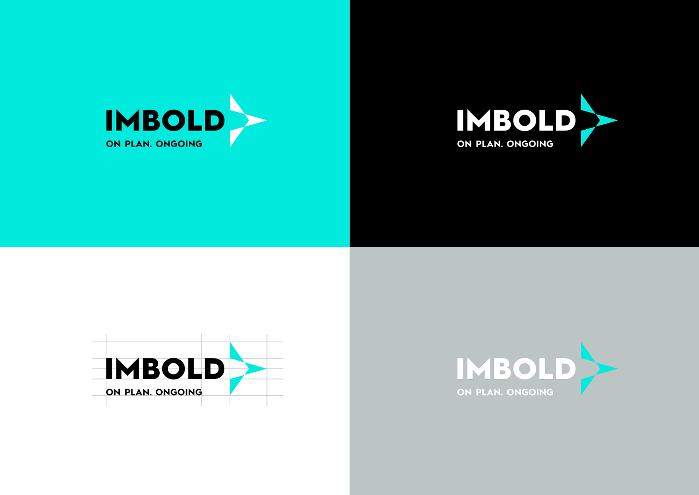
Design that conveys the idea of focus
It marks a direction in brand development
How do you make sure that your message reaches the target, from the multitude of brands, mostly well consolidated? With a master packaging design solution that manages to translate the idea into reality and supports the future development of the brand. The identity symbol starts from a balanced, targeted form that conveys the idea of following its own path in physical training. It is a courageous choice that, in addition to acting as a brand asset (through oversize), also helps to create the master packet structure. It also helps to differentiate between product categories according to the objectives defined for the target.


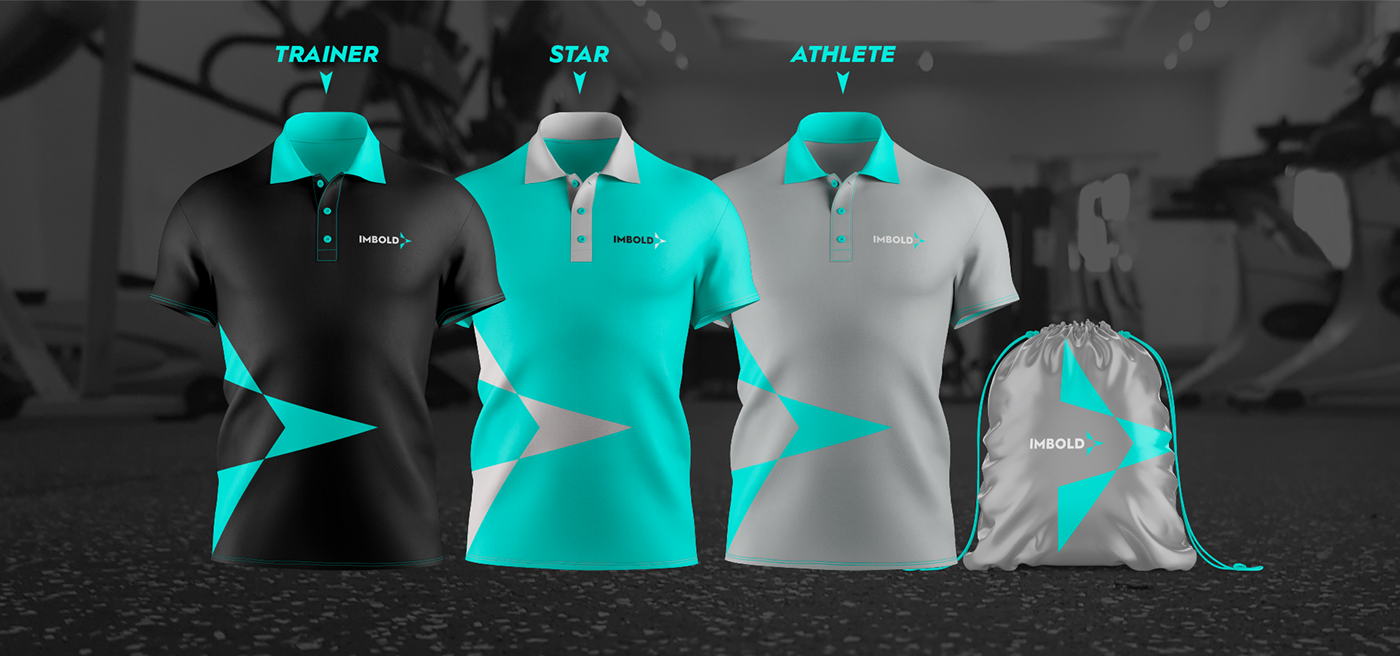
Understanding the consumer grounds architectural decisions
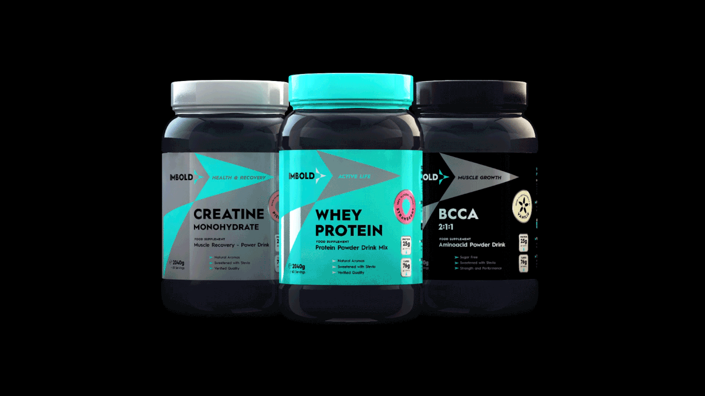
Based on a clear picture of the consumer and industry, we identified the relevant portfolio organization criterion, depending on the objective pursued. So we created the categories: Active life, Muscle growth and Health & recovery.

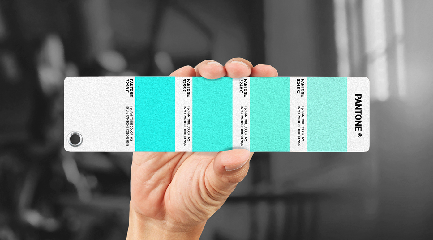
The brand's color has been designed to ensure individuality and, at the same time, consistency in communication. Once the architecture was defined, the association between the target and the color was natural. Turquoise - Active life, transmits optimism, a state of serenity, essential feelings for the target. Silver - Health & recovery, color that characterizes purity, energy, benefits the category promises. Black - Muscle growth, lack of any distraction from personal goals, strength and seriousness in training.
Graphic devices for differentiation
From the very beginning, the products will be available in a wide range of flavors (chocolate, vanilla, fruit, etc.). Natural flavors, chosen in the spirit of the brand, which promotes healthier recipes and better ingredients. The challenge was to highlight each flavor at the packaging level, but at the same time to offer flexibility and efficiency in implementation. Thus, we have generated a set of stickers inspired by brand graphics, but visible and full of impact when it comes to the packaging.


—
Credits:
Master Packaging & Identity:
Stefan Ferencz
Webdesign, UI, UX, animations:
Luciana Cotoi
Renders & animations:
Oanna Turta
—
Follow us:
—
Copyright © 2019 Brandfusion


