
Looking to a community for inspiration
Longform improvisation is a particular type of art form: collaborative, spontaneous and limitless. The longform community in Phoenix, AZ finally has a home. The Torch has been performing in various spaces since 2007, when a handful of improv troupes came together to produce shows together under a collective banner. What started as a napkin sketch logo from one of the founders was eventually put up on a website, and they were in business. I was honored to help polish the branding as the community developed. Now there are shows and classes 6 nights a week in a space run by and for the ever-expanding Phoenix improv community.
Keeping the brand guidelines loose and flexible, like a good improvisor, was the goal. It is constantly evolving and developing, but patterns and themes are identifiable. Just like a great show. The principles of improvisation work on stage, in life and in design.

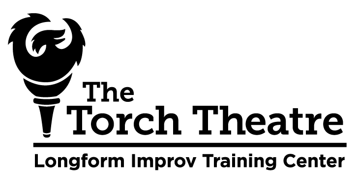
The polished brand, adapted from the original (below), is made up of a laughing Phoenix flame on a torch handle. Touching up the line quality of the original Phoenix, and making a custom and simplified Torch handle that is in line with the visual language of the round lines of the bird.
I chose Museo as the typeface because of its strong, approachable feel. The geometrically round lowercase "o' ties the wordmark to the logo, along with the bold weight of the type. The serifs allude to the tradition of theatre, but the modern shapes make it feel current and updated.
I chose Museo as the typeface because of its strong, approachable feel. The geometrically round lowercase "o' ties the wordmark to the logo, along with the bold weight of the type. The serifs allude to the tradition of theatre, but the modern shapes make it feel current and updated.
Choosing a contrasting san-serif for the training center brings the modern.

Before: The original design from 2007 done by another designer.


The flexibility of the mark can adapt to the many needs an improv community has in promoting the many troupes and shows. This flier is for a founding group, Galapagos, in a traveling show they performed.

The Torch shirt is an obvious but loving homage to the classic Ramones presidential seal shirt. Our seal includes references to a beloved warm up game called "Bunny Bunny" and the motto "With one heart we build" in latin, as well as a nod to the Arizona flag in the background.

A shirt design for Pride Week, 2017
The physical space has elements of the branding as well. Over the years the brand has developed and adapted as the community has grown and changed.

A refurbished record player cabinet serves as our box office. This was produced by a local craftsmen based on a sketch I provided.
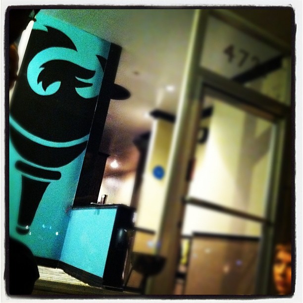
The front window display includes a human sized logo hand painted on the wall.

The website is a responsive design, optimized for mobile experience. To keep it playful, the background color changes depending on what day it is and once the sun sets there are stars.


