

For my first time participating in the 36 Days of Type challenge, I set myself the two-pronged task of learning more animation techniques and also celebrating some of my favourite creative womxn from around the world.
Style is an elusive beast, but I wanted to highlight their work without plagiarising it; to try and put my own spin on things as much as possible. This visually diverse alphabet is an ode to the wild, insanely talented, wickedly funny, wonderfully sensitive femme artists who were the many muses for this project.

A is for Amber Vittoria. Amber illustrates the female form like no-one else. Her subjects are lumpy and squishy and hairy and magnificent. They’re somehow both whimsical and incredibly real, and never for the male gaze. Her artistic offerings are a feast of colours and composition.

B is for Beci Orpin. She illustrates, she collages, she kicks butt. Her warm, dreamy style traverses so many mediums. She’s also a crafty DIY queen, and I adore her googly-eyed puppets and pet rocks. The happy little critters in this animation were made from garden cuttings and craft drawer snippets.

C is for Grace D. Chin. Grace is a bastion of intersectionality and inclusivity, and soaking up her work feels like some kind of therapy. Her spectacular floral paper wreaths are poetic and political. The world could do with more Grace D. Chins; or at the very least, learn from her example

D is for Deejennarate -- and also for derrière! (Winky face. That's a butt jiggling up there. My butt.) Jenna Josepher’s work is titillating and deeply intriguing and always unexpected. The way she folds animations into cinemagraph-style videos is, to me, the most exciting stuff on the internet. She is bold as hell, and I cannot get enough of her.
E is for Ellen Porteus. Ellen’s work is polished and punchy. The linework in her juicy illustrations is so clean, and her looping animations are utterly mesmerising. Then there’s her colours; oh my god her colours. Talk about pastel paradise.
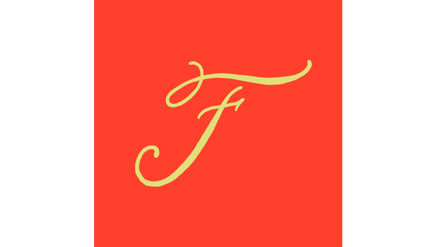
F is for Louise Fili. Mother of lettering (and probably dragons), reviver of deco, creator of so much timeless typography, Louise Fili sets the benchmark, and she does it in style.

G is for Rosalie Gascoigne. In her text-based, mixed-media, found-object collages, she took banal, everyday objects like road signs and drink crates, and rearranged them into abstract art. By making patterns of it, she made you look at the curves and negative space of lettering, rather than just what the words said. She didn’t foray into the art world til she was in her late 50’s, but when she did, she became the first Australian woman to show at the Biennale. She was an absolute icon.

H is for Lisa Hanawalt. Lisa's work tickles my fancy just right. Her half-human, half-animal creatures are surreal, absurd and somehow so relatable. Lisa has this effortless ability to steep her illustrations in all sorts of contradictions - twisted but mundane, gritty but beautiful, unpredictable but totally plausible.
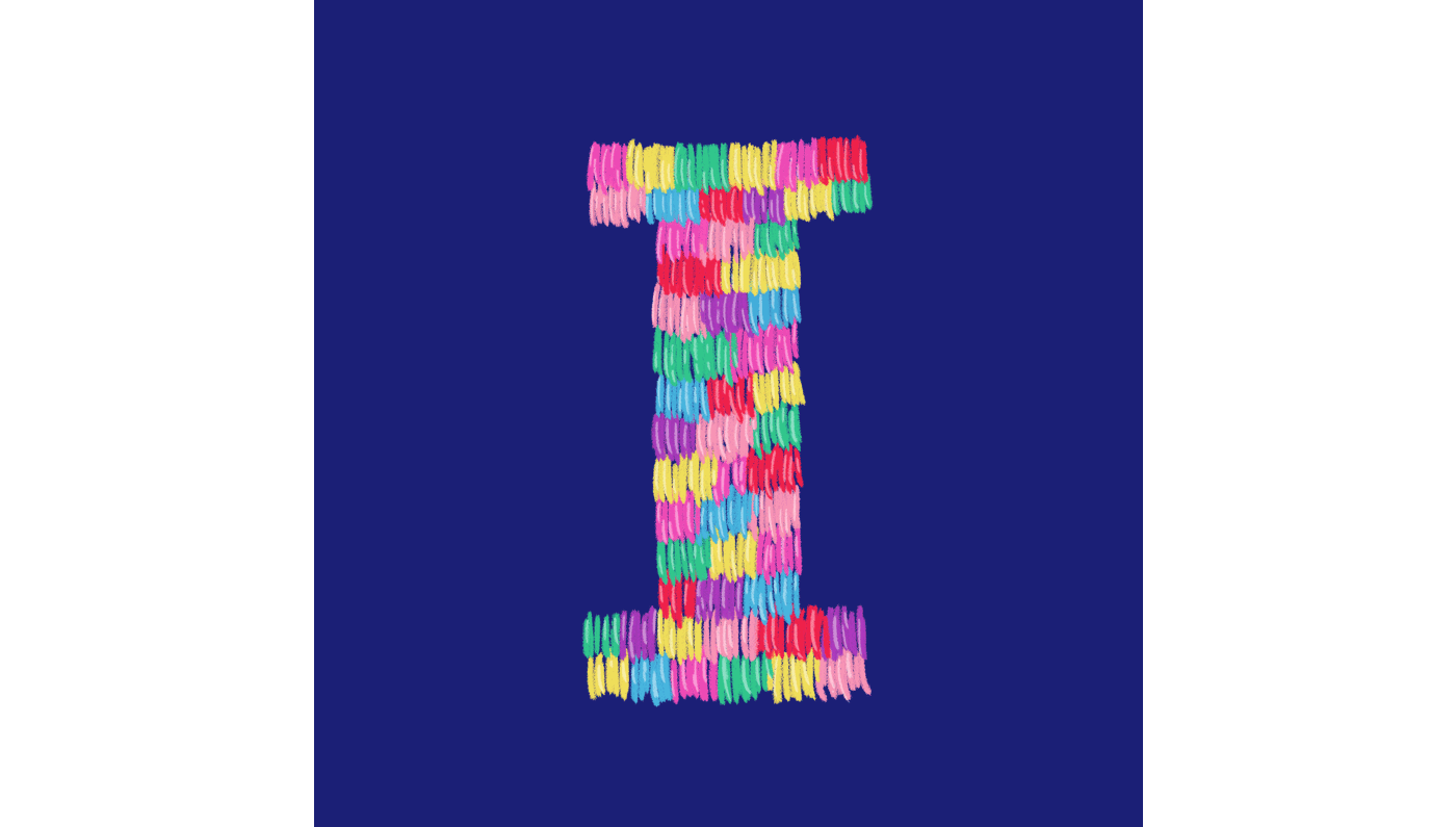
I is for Imakestagram. Rachel Burke fills me with so much joy. Everything in her wake is vibrant and dazzling - it’s a too-much-is-never-enough kinda vibe. I love her giant poms, her tiny dogs, and her “bad art” - a delightful snub to stuffy gallery types who look down on pipe cleaners and glitter. This shimmying ‘I’ is an ode to her glorious tinsel jackets.
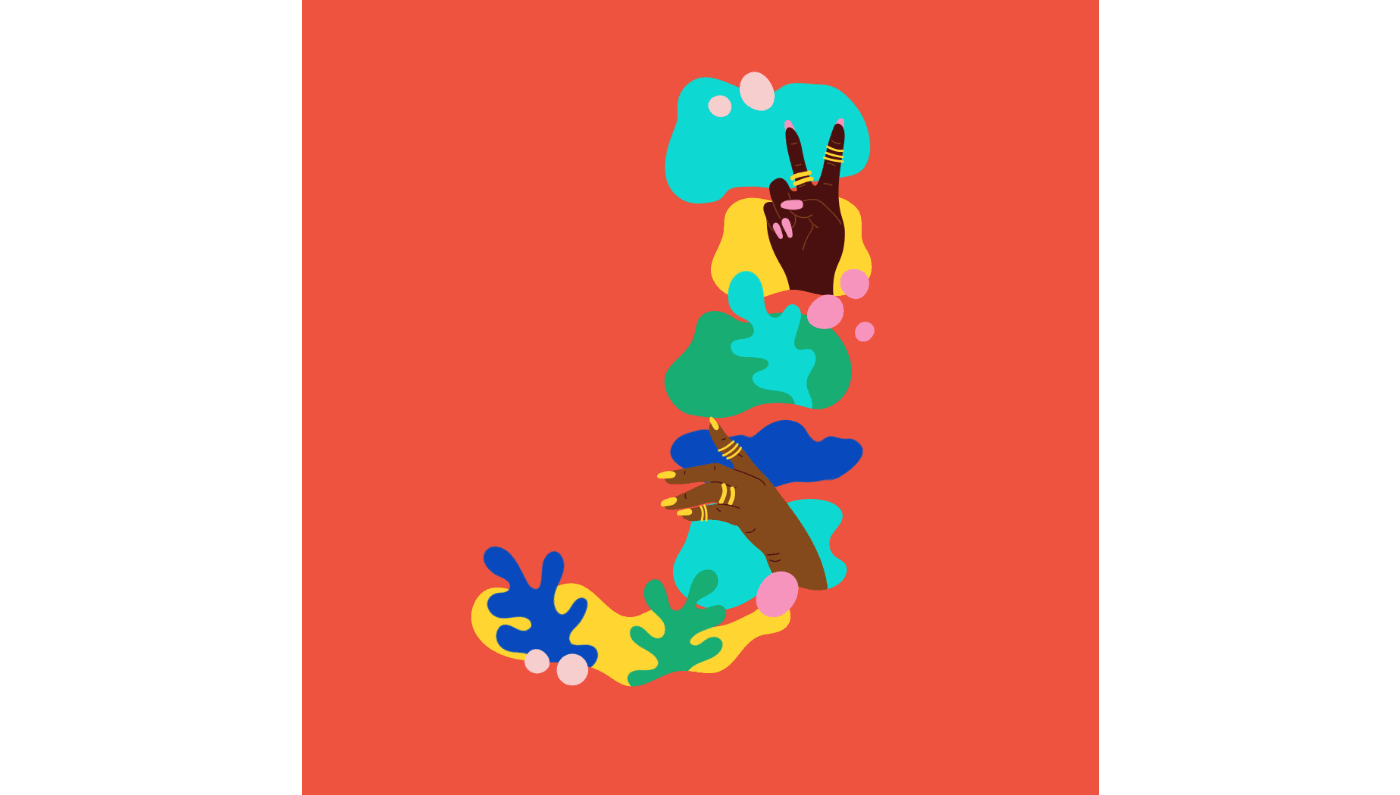
J is for Laci Jordan. Laci is a boss. Her bold, vivid work spans many mediums, but the common thread is always a celebration of black culture. It’s feminist, political and FUN, and I bow down to anyone who can pour that much authenticity into their art. She has raised the bar for us all to aspire to.

K is for Yayoi Kusama. Yayoi is the biggest selling female artist in the world. Her works - bursting with saturated, repetitive patterns - are visually iconic, but more than that they are testament to the therapeutic, redemptive power of art. There’s something so meditative in the way she builds infinite landscapes, one dot at a time. Yayoi turned 90 recently, and is still creating work today.

L is for Libby van der Ploeg. Libby is a champion of empowerment and equality, and she packages it with so much tenderness. Her illustrations and animations are textured, playful and uplifting.

M is for Mona Chalabi. Mona is a journalist who draws data. In a world full of sloppy, biased reporting, her scientifically accurate and visually engaging graphs are a breath of fresh air. She makes statistics intelligible, and that is such a critical skill.
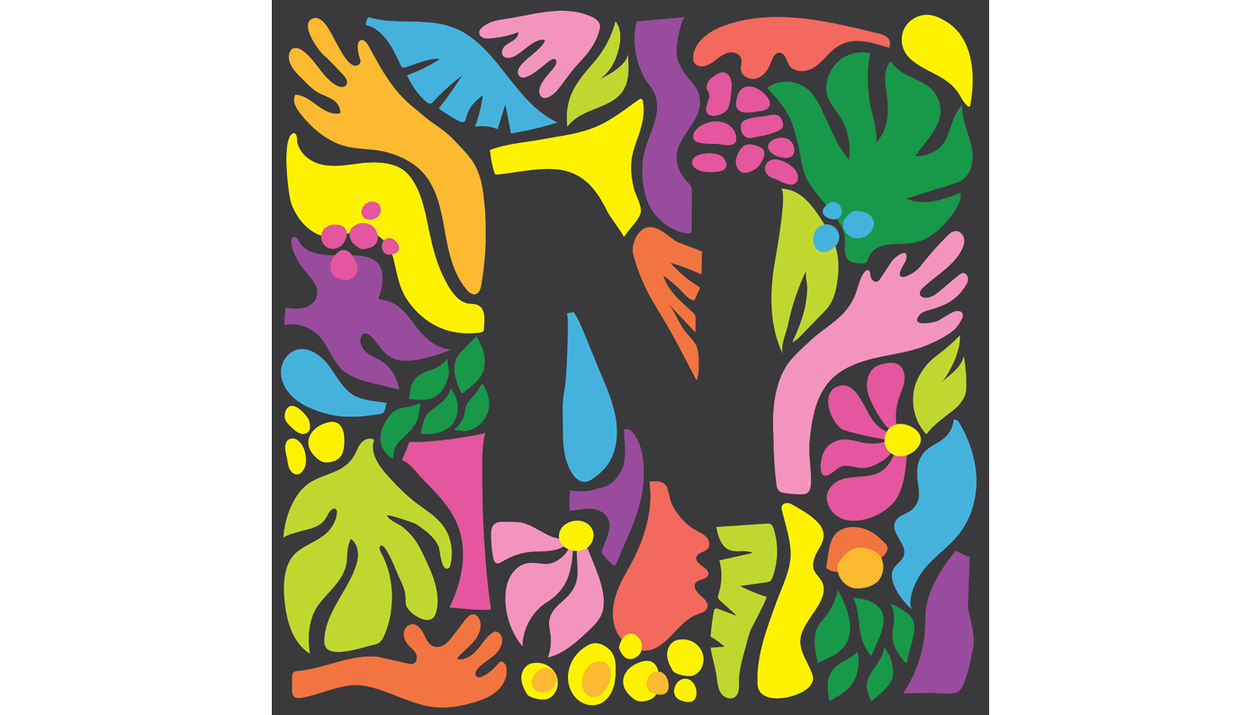
N is for Nadia Hernandez. Nadia works in many mediums and a range of scales, but her style is instantly recognisable. Her signature paper cut-out/ collage illustrations are striking; full of movement and energy and often woven with text. Throughout her compositions Nadia layers in narratives of culture, identity and politics. She's an artistic force to be reckoned with.
O is for Oh Happy Day. I’ve been lapping up their digital doses of joy for years now. The strong team of ridiculously stylish womxn at the helm have expanded their DIY crafting curation into a fully fledged party supply shop and the insanely popular interactive gallery Color Factory Co. It’s all a celebration of colour and light and goodness, and I will take a big fat second serving of that every time.

P is for Kitiya Palaskas. Between her larger than life props, piñatas of every persuasion, and paper collages, Kit makes everything pop. Her saturated colour combinations are a visual banquet. She’s also a fierce advocate for creative wellbeing, and I have SO much respect and gratitude for her honesty on life as a multifaceted, many-jobbed artist. This fringed, glitter-dusted letter is a blended ode both to her felt work and her fabulous piñatas!

Q is for Angie Quintanilla Coates. I love the way she folds politics and pop culture into her art. Her prayer candles, pins and apparel radiate with intention. She’s a champion of human rights and social justice, and donates a lot of her design income to non-profits. Her work always seems to come from a desire to lift others up, and that is so admirable. This letter is a nod to her lush botanical collages, and was made out of recycled paint swatches.
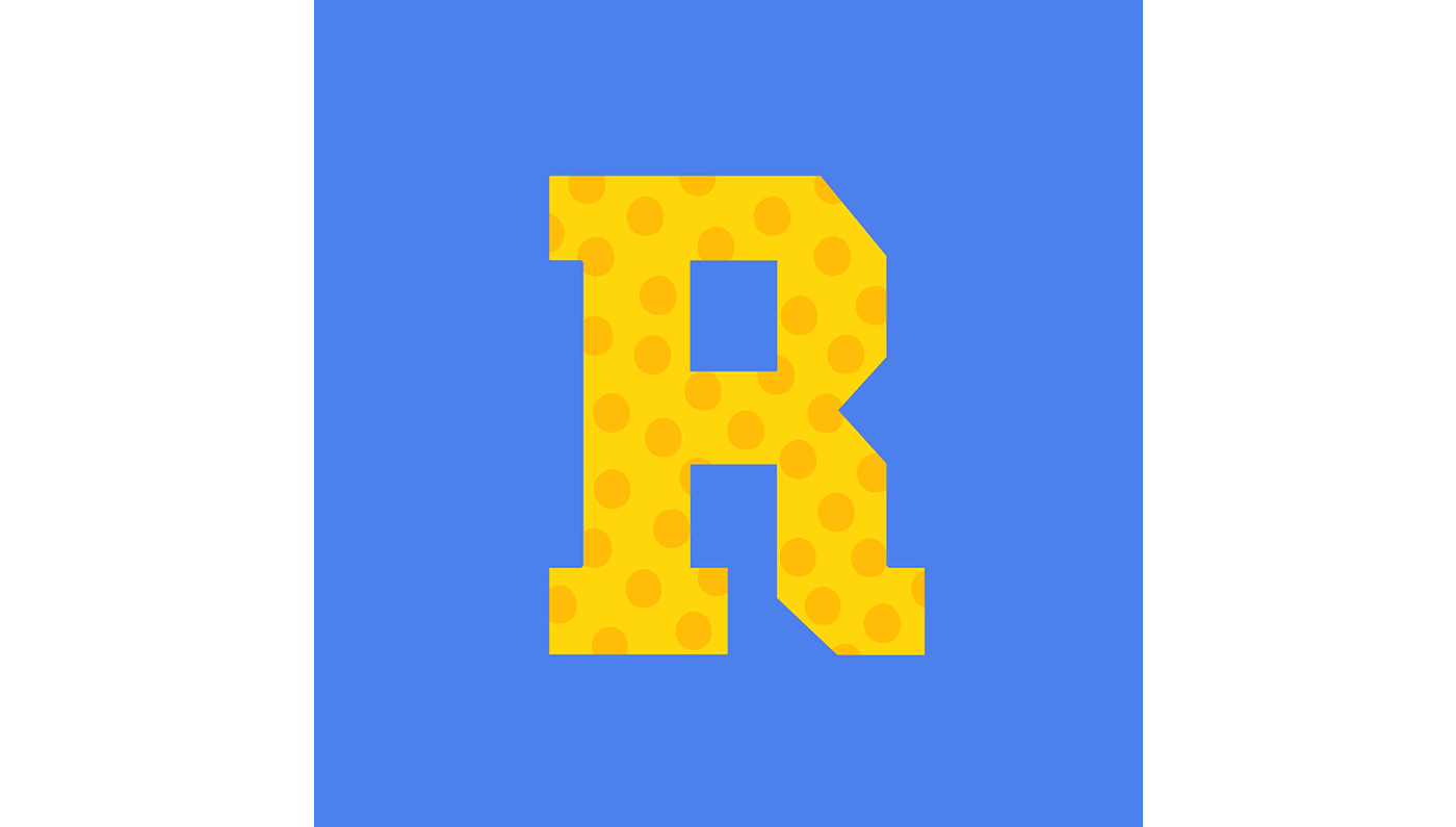
R is for Rupaul. I have learnt a LOT from years of watching and re-watching Drag Race. One of the huge takeaways is how blinkered “gender” is as most of us perform it to each other. It’s a total construct; just a big game of dress-ups. As mama Ru says: we’re all born naked and the rest is drag.

S is for Nike Savvas. I first discovered Nike’s work when I was standing in a room full of it at the Art Gallery of NSW. She'd filled the entire space with horizontally suspended strings of coloured, vibrating, polystyrene balls. I was utterly mesmerised. Nike is a conductor of colour and geometry, and creates kinetic, immersive, sensory worlds you can escape into. This S is based off that first piece of hers I absorbed, “Atomic: Full of Love, Full of Wonder”.

T is for Tierney Milne. Tierney is a master of tessellated, geometric landscapes. Between her multi-storey murals and her tactile, three-dimensional artworks, her sense of balance, layout and colour is always killer. Tierney has also invented a style of stop-motion that is like voodoo sorcery; the way she makes each element dance on command is so compelling to watch.

U is for Under Over The Moon. Nancy Liang’s work feels like a meditation. The layered scenes she illustrates are textured and organic. Nancy uses movement sparingly, but to great effect; cleverly, her animations exude a serene stillness. Her dioramas are often dark but curious, with a pinch of sparkly whimsy.

V is for Jenna Blazevich. Jenna uses art as activism. From chain-stitching to bike helmets to digital illustrations, her multi-media work is inclusive and intersectional. She deftly shifts between typographic styles, but there’s always a bold, witchy vibe.

W is for We Are Clay. I am firmly in love with Anastasia Tumanova’s ceramics, paintings and botanical installations. No matter the medium, Anastasia always brings to it an earthy, organic energy. She’s incredible at emoting visual rhythm, and translating ephemeral nature into something more permanent. This W was made with a big sprig of rosemary from my garden.
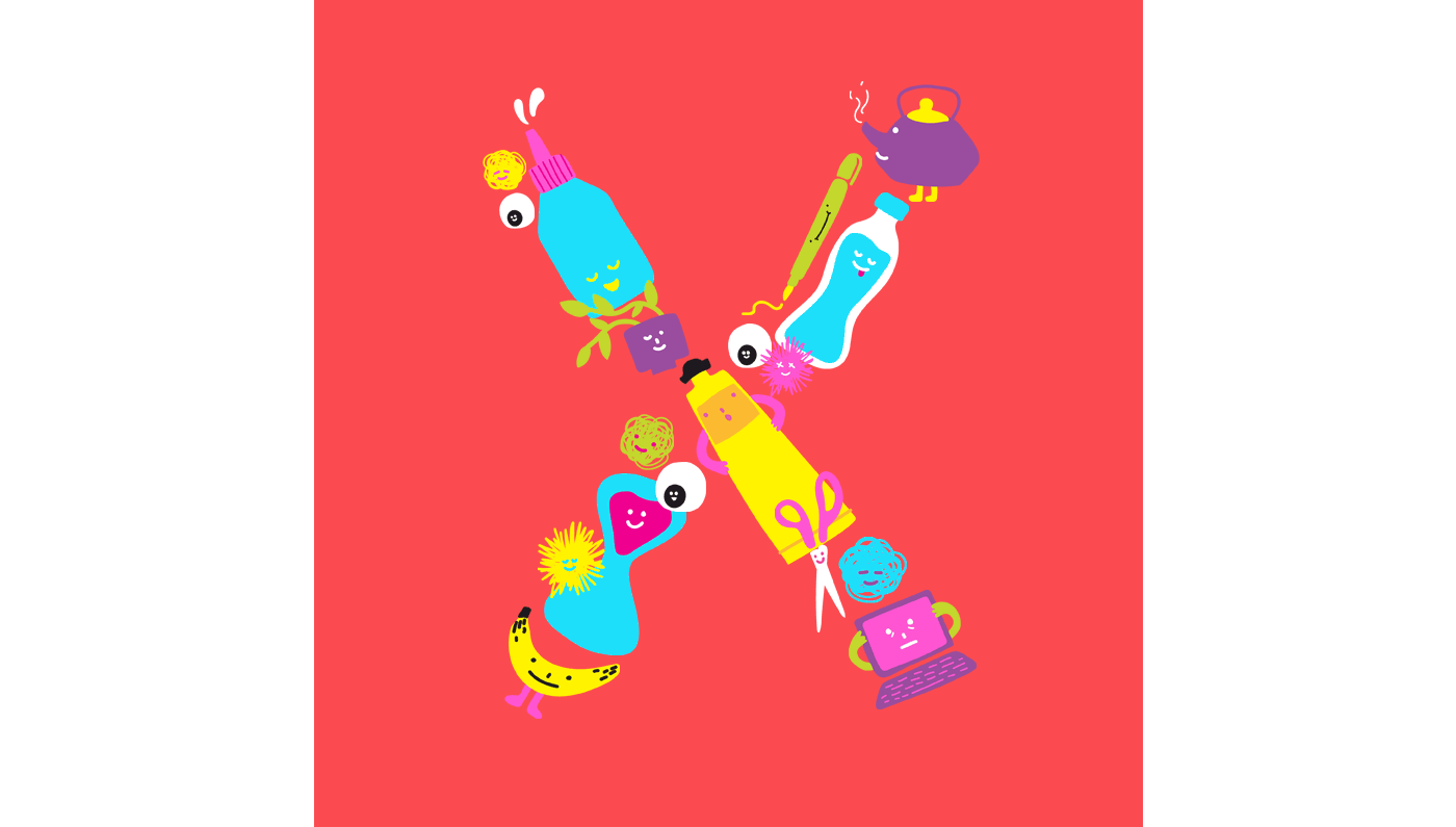
X is for Jennifer Xiao. Jennifer brings stuff to life. Her anthropomorphic illustrations are cute as heck and deceptively complex. She folds so much nuanced emotion and humour into her stripped back drawings. The vibrant visual language she has created borders on absurd, but is always completely relatable. This not-so-still life X features critters from my home office.
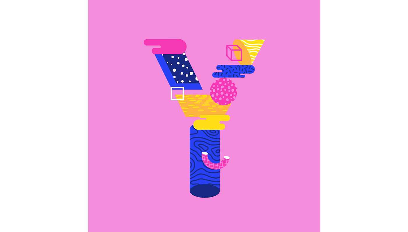
Y is for Yukai Du. Yukai has so much flow. Her animations and illustrations are intricate, swirling constellations that vibrate with pattern and texture. To me, one of the most alluring parts of animation is its capacity for storytelling, and Yukai truly is an expert at this. My mind is blown every time I set eyes on her spectacular work.

Z is for Alexandra Zutto. I would love to spend some time inside one of the pastel, fantasy dreamscapes that Alexandra illustrates. There’s a softness to the rounded splashes of scenery, but also mystery and intrigue in the finer details. Her sense of light and form are so acute, and her animations are utterly enchanting.


