


Identity for Kapper Geoffrey.
(Hairdresser Geoffrey)

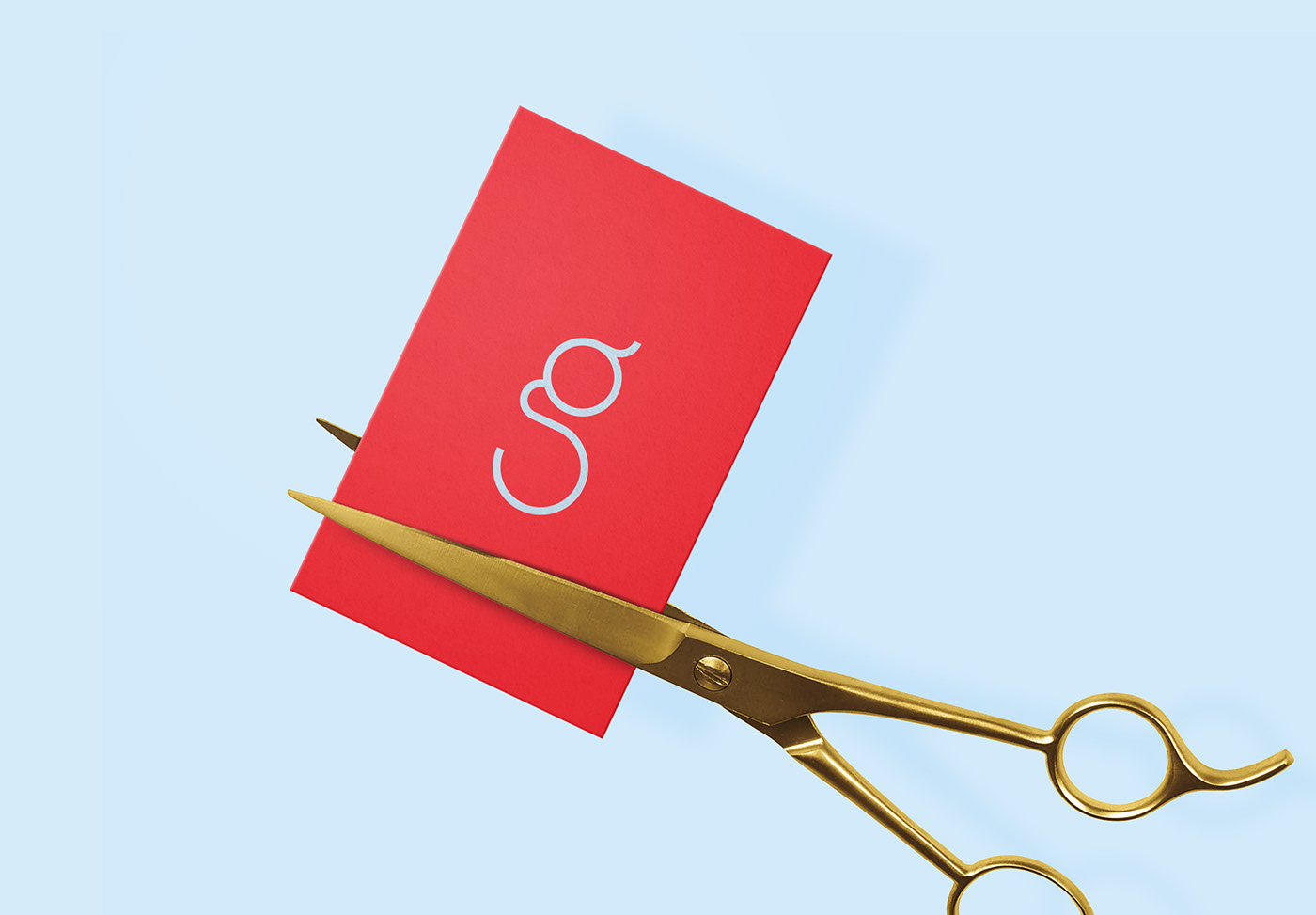
When designing the logo, I wanted to avoid cliches and be a little more subtle.
I did work with references to the hairdressing world, but these were not literally depicted.


To emphasize Geoffrey's personal approach, his own name has been used.
'Kapper Geoffrey' sounds very familiar. It is short and powerful and also fully covers the load.
All unnecessary information is omitted to focus on what it's all about: Kapper Geoffrey.
'Kapper Geoffrey' sounds very familiar. It is short and powerful and also fully covers the load.
All unnecessary information is omitted to focus on what it's all about: Kapper Geoffrey.


The colour palette is based on the iconic red-blue barber's pole.
This colour combination is like an updated version of it.
This colour combination is like an updated version of it.


