


Want to boost your business
with memorable design?
Get it with 10% OFF via promo code «BeEnhanced»⬇
Sarmati
The play of light and texture in the design of a new brand of lenses
Client
Founders of Sarmati are our long-standing clients, this time they are launching a new product on the market - a brand of lenses for glasses. The new project has quite good advantages against the rest: reasonable price for lenses and innovative materials that are used in manufacturing.
Problem
This time we made a corporate identity that should be abstract and cause associations with lenses. At the same time, no images of doctors and glasses - Sarmati needs a fresh, new look.
Solution
In the corporate style for Sarmati, we got rid of stereotypes: we did not use images from medical subjects. The new design is a fancy refraction of light in a round lens. It is read throughout the entire style: soft forms, smooth movements, mother-of-pearl shades.

Logotype
Two versions of the new logo, for different backgrounds:

Logo and color schemes for Sarmati price niches:

Care instructions:

The safe area protects the logo from unnecessary elements that may interfere with perception:

Colors
Sarmati's signature palette is classic colors: black and white. Calm dilutes the unusual technique: we used iridescent "film". This trick made the style bright, interesting and memorable.

Typography
We picked up the Manrope font for the general style - it is sans-serif, smooth, but letters such as “U”, “O”, “B” have soft, pleasant, round shapes. The font is the connecting element of the corporate identity, it helps the design to be united, each element finds a response in each other:

Brand carriers
Non-standard business cards:

Blanks:

Desktop wallpaper can be put on all computers in the office - this will support the overall corporate identity:

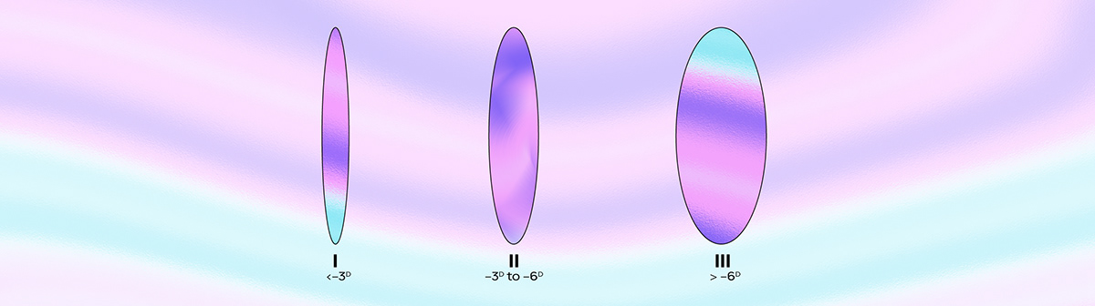
Diopter designations:
Covers:

Total
The new corporate style of Sarmati is surprising: there are no familiar images, but, nevertheless, there are references to the sphere. The design came out soft, smooth, bright and calm at the same time.
Due to the unusual iridescent color, everything is easy to brand: any surface, carrier, image on the Internet. Things with this design look like a separate kind of art that you don’t want to put away on the far shelf.

Want a design just as cool?
Logomachine will create a perfect logo in 21 days or you will get it for free.
Interested? Tell us about your project!⬇


