About the Client
Moovi is a new IPTV operator, currently focusing on providing services by the means of B2B methodology. Later the company is planning to start dealing directly with the consumer.
Objective
Create a company name that would reflect its activity. Create a logo based on the chosen name. The client imposed no limitations on our creative process, so as an entry point we used the company founders' business vision.
Process
After we had thoroughly studied our client's vision of their future business, identified the target audience, we started thinking about the company name. It had to meet a number of criteria: sonorousness, simplicity and memorability.
A special attention was paid to the context the name will be used in. Ultimately the client pick the name Moovi from multiple offered options.
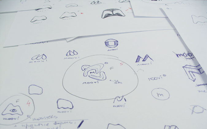
Logotype creation at Oblako normally happens in two stages: creative concept development followed by its visualization, presented in different options. This time we were so involved in the process, we offered the client more than one creative concept that came out of a brainstorm.
A special attention was paid to the context the name will be used in. Ultimately the client pick the name Moovi from multiple offered options.
Logotype creation at Oblako normally happens in two stages: creative concept development followed by its visualization, presented in different options. This time we were so involved in the process, we offered the client more than one creative concept that came out of a brainstorm.

It seemed acceptable to us because the company was just being born and its history was being written by us. The feel and impressions of the founders played a major role in the final design decisions.
The concept the client chose was "innovation, motion, 2D/3D font style". We used an ambigram idea as one of the additional creative features.

We presented 3 concepts:
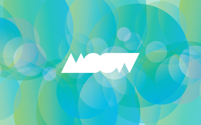

Letters were formed from the primitive shapes (circles and triangles). Flat forms were made to look as if there were cut out of paper overlapping each other and casting shadow. Letters were filled with a texture made up of circular shapes.


A few letters of a custom font were specially developed for the second concept. Letter "M" was made to be a reflection of the letters "VI" at the end of the word. This typeface stands out for its laconism and technological effectiveness. Texture was made up of the overlapping logo element in various colours.
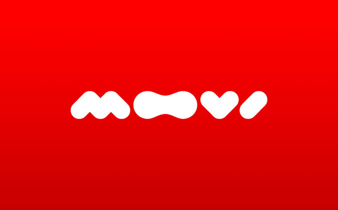
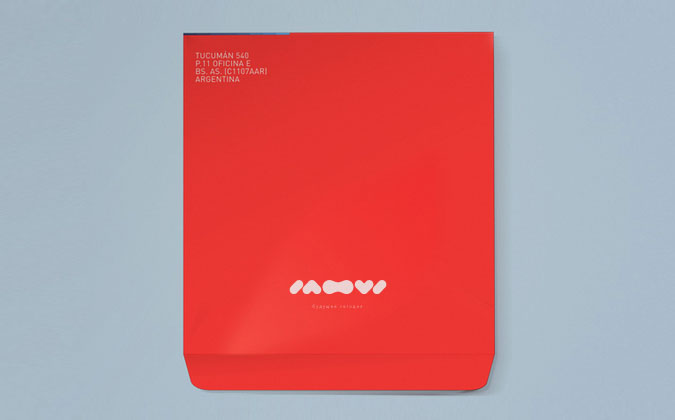
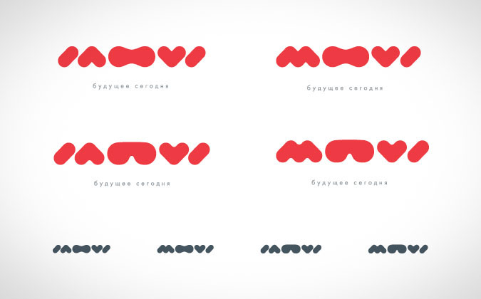
In our opinion it was the most democratic and fun option. Water drop shaped letters suggest friendliness and openness of the company. Rounded curves of the typeface associated with cartoons and other memories for our childhood. The combination of the two letters "O" formed glasses (or stereo glasses, if you like). We even created two options of those glasses and named them "Lagerfeld" and "Kravitz".