Juxtapoz.com
Website redesign

Juxtapoz.com needed a redesign to visually align it with the print magazine's visual overhaul, but it demanded streamlined page mechanics and new functionality to increase user time on site, page views, ads served, and return visitors. A big demand for a simple blog site with tens of thousands of articles, videos, and images.
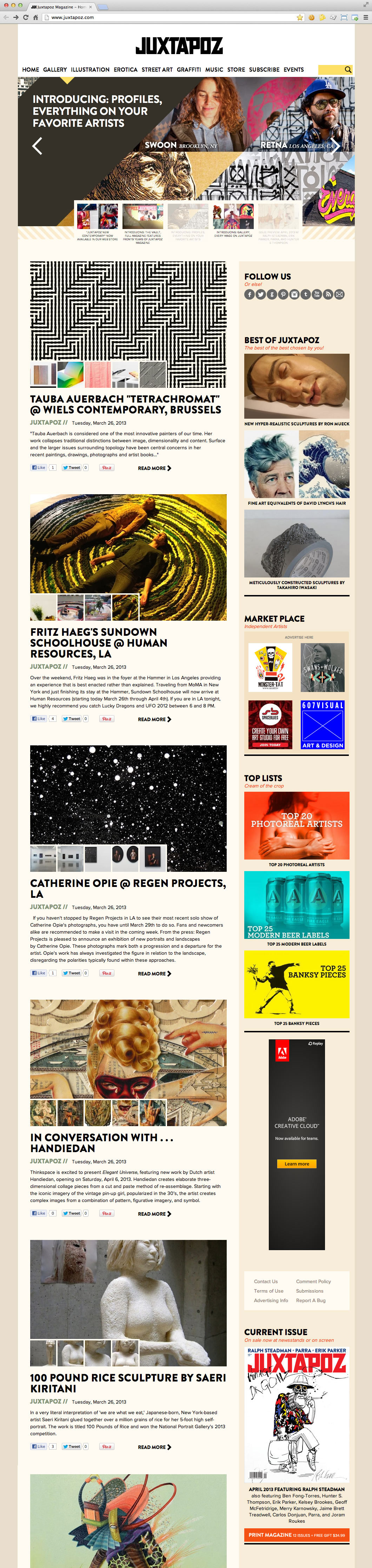
We wanted to maintain a simple Tumblr-style non-stop scrolling site. The rules of thumb for the redesign were bigger images, streamlined user-experience, and more ways discover our amazing and diverse content.

I developed a addictive new element called Galler: a collection of all the images throughout the site on a single page that the user can light-box to blow up.

You can filter our biggest categories of art and some of the biggest artists on the site
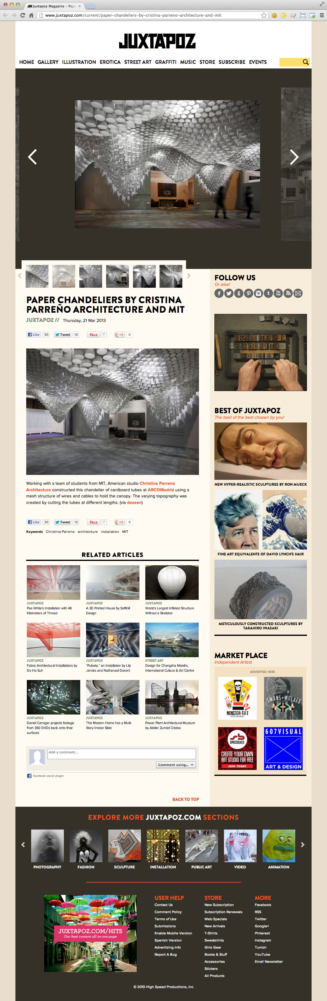
For bigger images, I made article images full-width in our main content column on all index pages, balanced by ample white space to group content blocks and calm the layout. I included a new sliding image viewer on all multi-image articles for faster image loading and speedier slideshows.

Our new Events page evolved from a nearly-unusable calendar to a page of content-generated, feature-rich events, automatically posted by adding a few keywords to an article in our content management system: fast, easy, and effective.


