This design was created in a course as a special project developed in conjunction with The Vignelli Center for Design Studies at RIT and the graduate Industrial Design program. I was assigned a Vignelli-designed artifact and evidence of its developmental process from the archive and afforded the opportunity to study the item first-hand. After researching the designated context in which the item was generated, I developing a clear metric for assessing the item’s success in its original context. I was then responsible for using the same metric for developing a new object, adjusted in order to accommodate today’s landscape of conditions and habits.
Additional I gave myself the task to redesign the original "To Go" packaging to be simple, functional, and playful. The challenge for me was to provide appropriate information to the design, making its use understandable. I also wanted to give the new design a stronger interactive use scenario and enhance the experience of the user on the basis of a simple and clean original style.

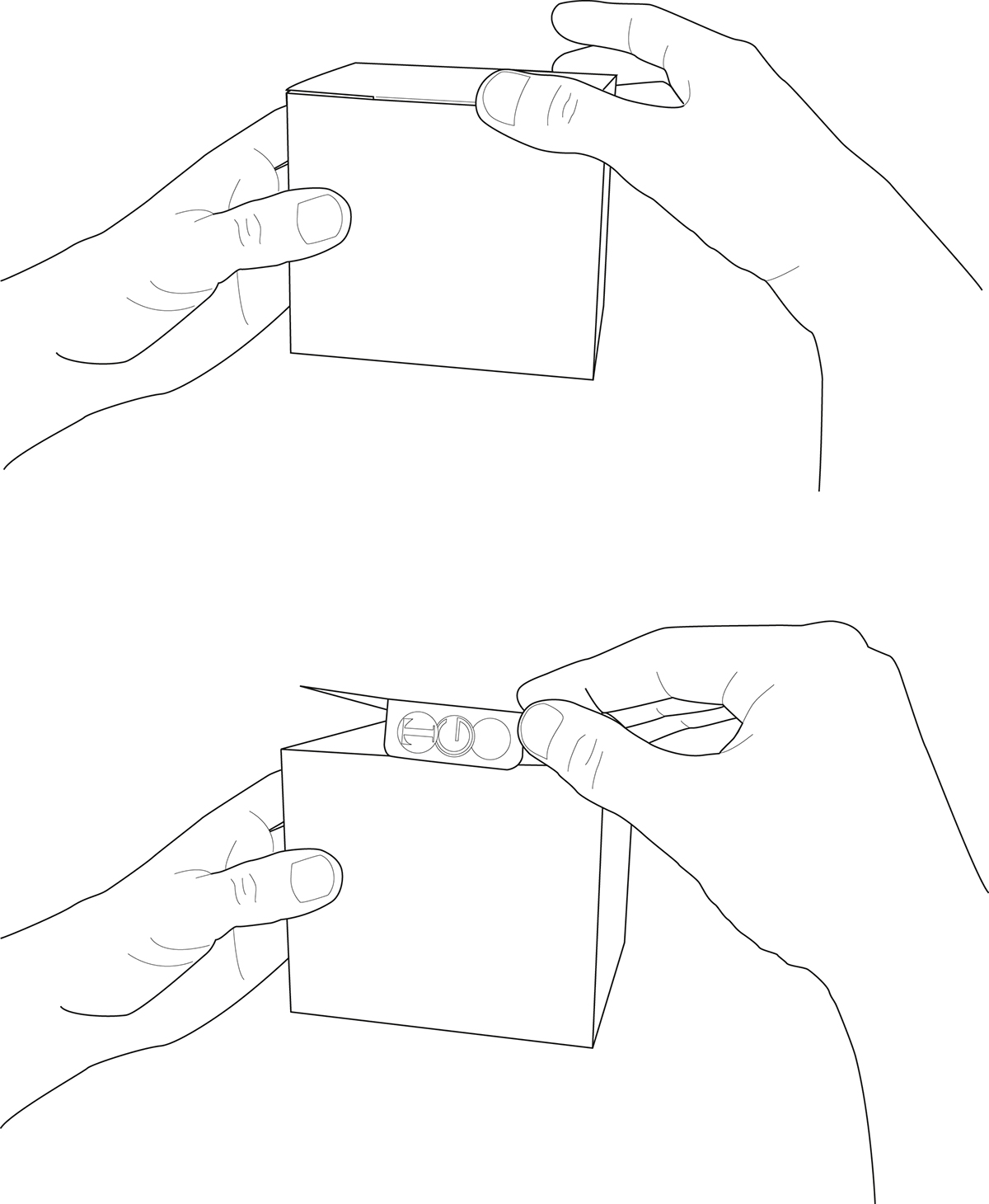
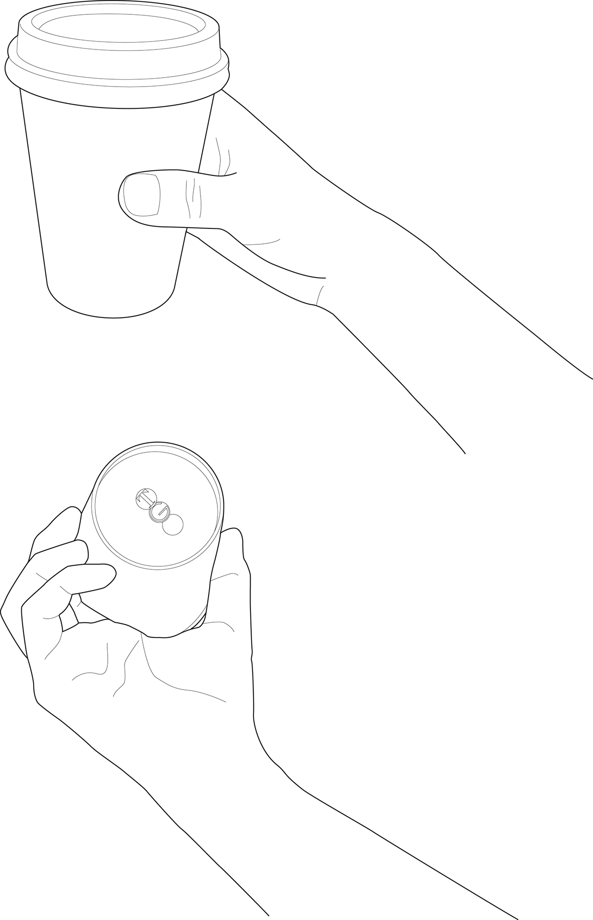
Before the packaging is used, the surprise element was hidden in all pieces of the plain packaging program.

Once it is opened, it reveals the identity to it’s user as a surprise.

My inspiration was to allow users to have a pleasant and memorable "To Go" take-out lunch experience. I focused on the element of a lovely surprise when my users interact with the packaging. Keeping in mind that people who have to take food to go from a cafeteria are usually too busy with work to sit and enjoy a meal. When my users experience the hidden markings on the take-out packaging it would hopefully help to reduce the pressure on this particular segment of society.


The original packaging was designed in 1990 for Pei’s Place. The logo was created under the art direction of designer Michael Bierut, while working at Vignelli Associates in the late 1980s. For more information visit http://designarchives.aiga.org/#/entries/to%2520go/_/detail/relevance/asc/1/7/10163/2-go-to-go/1
My additional research into the Vignelli's design of the logo and simple packaging, inspired me to be playful and use lively design elements. I retained the original colors and font of their logo, bringing back the traffic light comparison concept that is an interesting discovery for users. My packaging design also needed to include the cafeterias requirements of all types of packaging, that has been improved to include a simple folding system, food separation, and the surprise graphics.
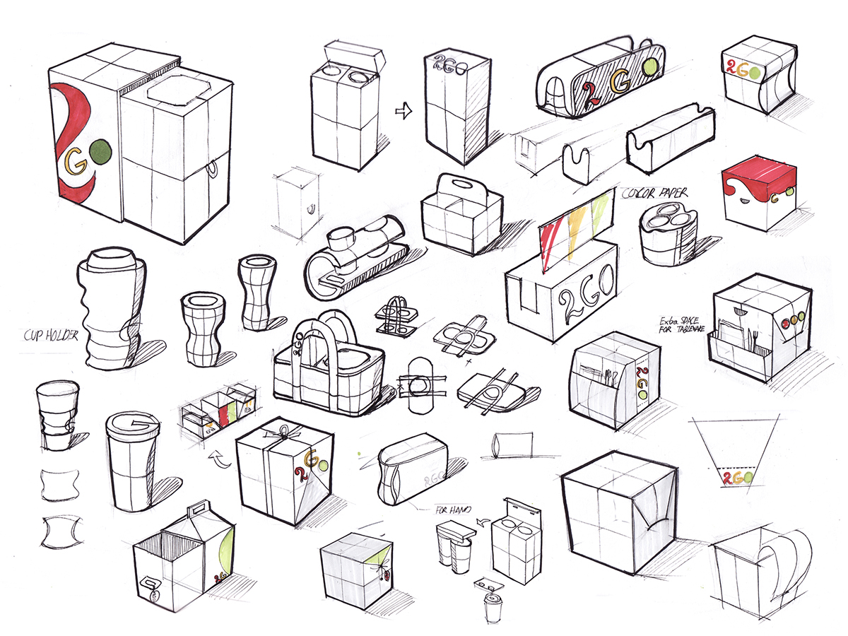
Concept sketching
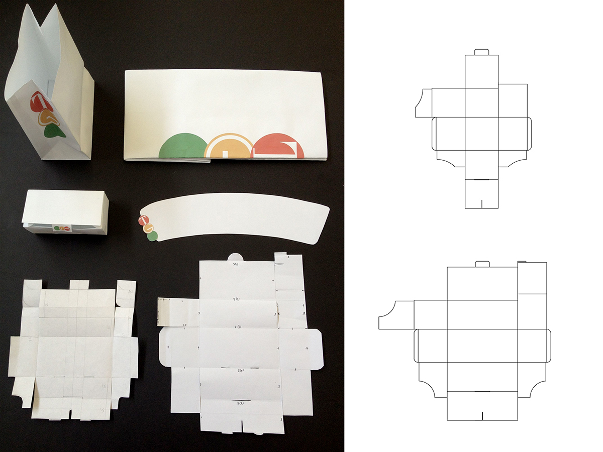
Packaging template tests

Activating the Vignelli Archive: Decoding and utilizing design process from primary source material to inspire new products. View the link for more information: http://activatingthearchive.rit.edu


Exhibited in Imagine RIT at Vignelli Center for Design Studies of Rochester Institute of Technology, May 5, 2012. View the Link for more Information: http://industrialdesign.cias.rit.edu/2012/05/06/id-exhibits-at-imagine-rit-2/

Exhibited in the Grad's show of Thought at work conference at University Gallery, RIT, Oct 23rd- Nov 2nd, 2012
Credits:
Professor:
Josh Owen
Vignelli Center for Design Studies Representative:
Katie Nix
Teaching Assistant:
Jae Ho Seo
Photography:
Elizabeth Lamark, ETC, RIT
Website Designed and Developed by:
Visiting Assistant Professor Miguel A. Cardona Jr.
Graphic and Website Assistant:
David Strauss
Professor:
Josh Owen
Vignelli Center for Design Studies Representative:
Katie Nix
Teaching Assistant:
Jae Ho Seo
Photography:
Elizabeth Lamark, ETC, RIT
Website Designed and Developed by:
Visiting Assistant Professor Miguel A. Cardona Jr.
Graphic and Website Assistant:
David Strauss


