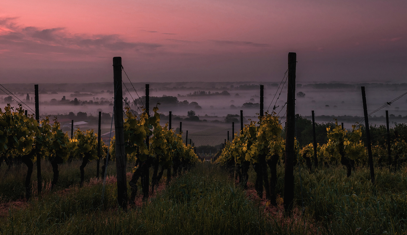
Tierras de Uva is a spanish–mexican company that is mainly dedicated to the distribution of spanish wines in mexico. its philosophy is based on finding small wineries, selecting and choosing wines with soul, from the soil and the land, with their own identity, care and well pampered.
After more than fifteen years of activity, its owners felt that the identity of their project was in dissonance with the current evolution and positioning of the company.


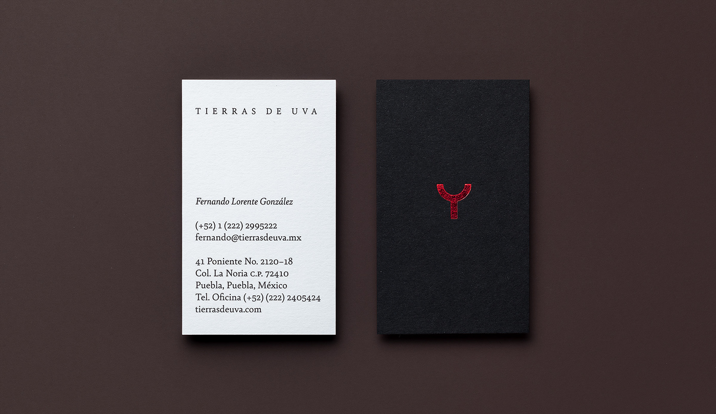
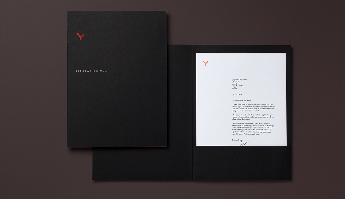
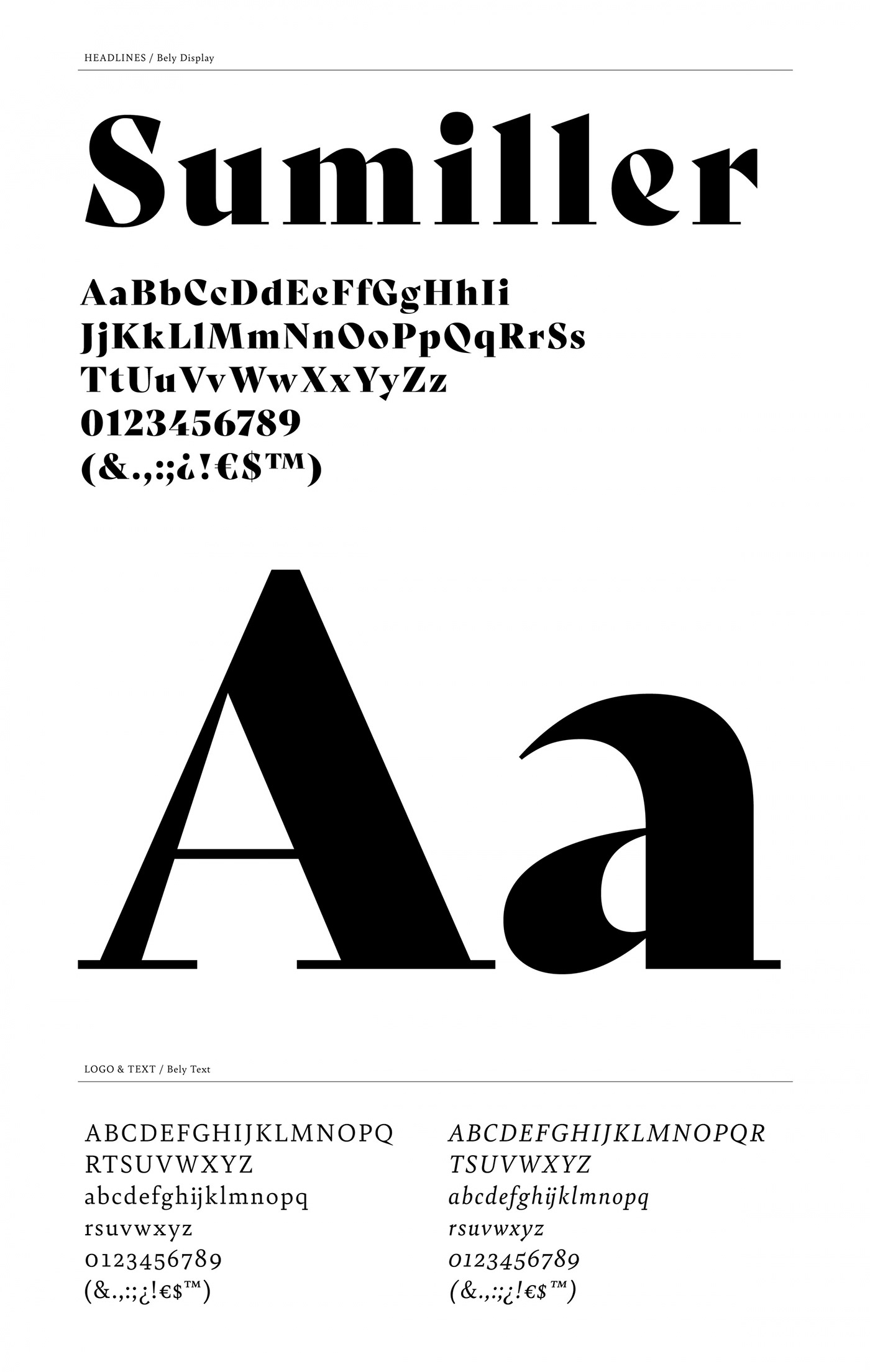
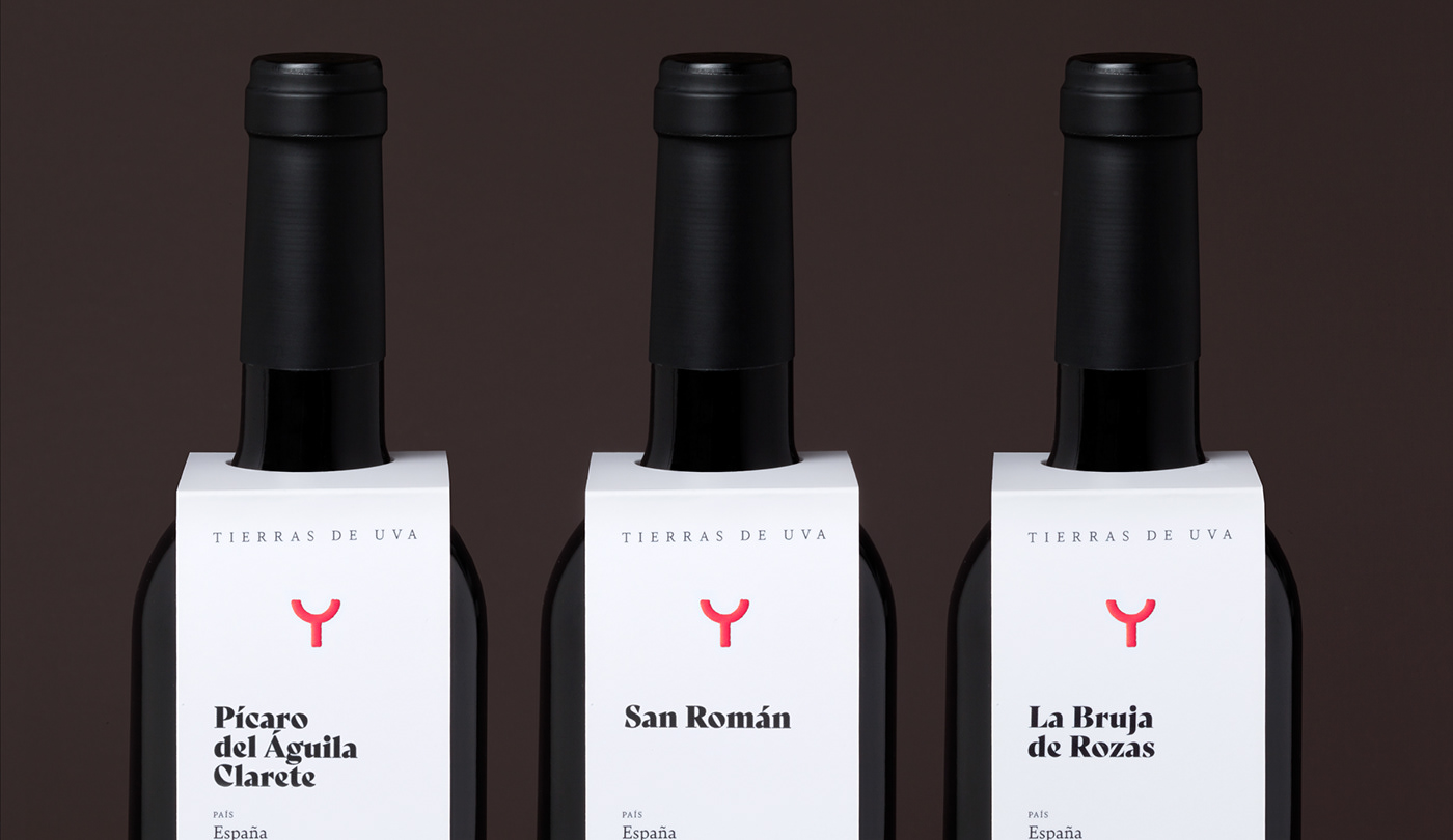
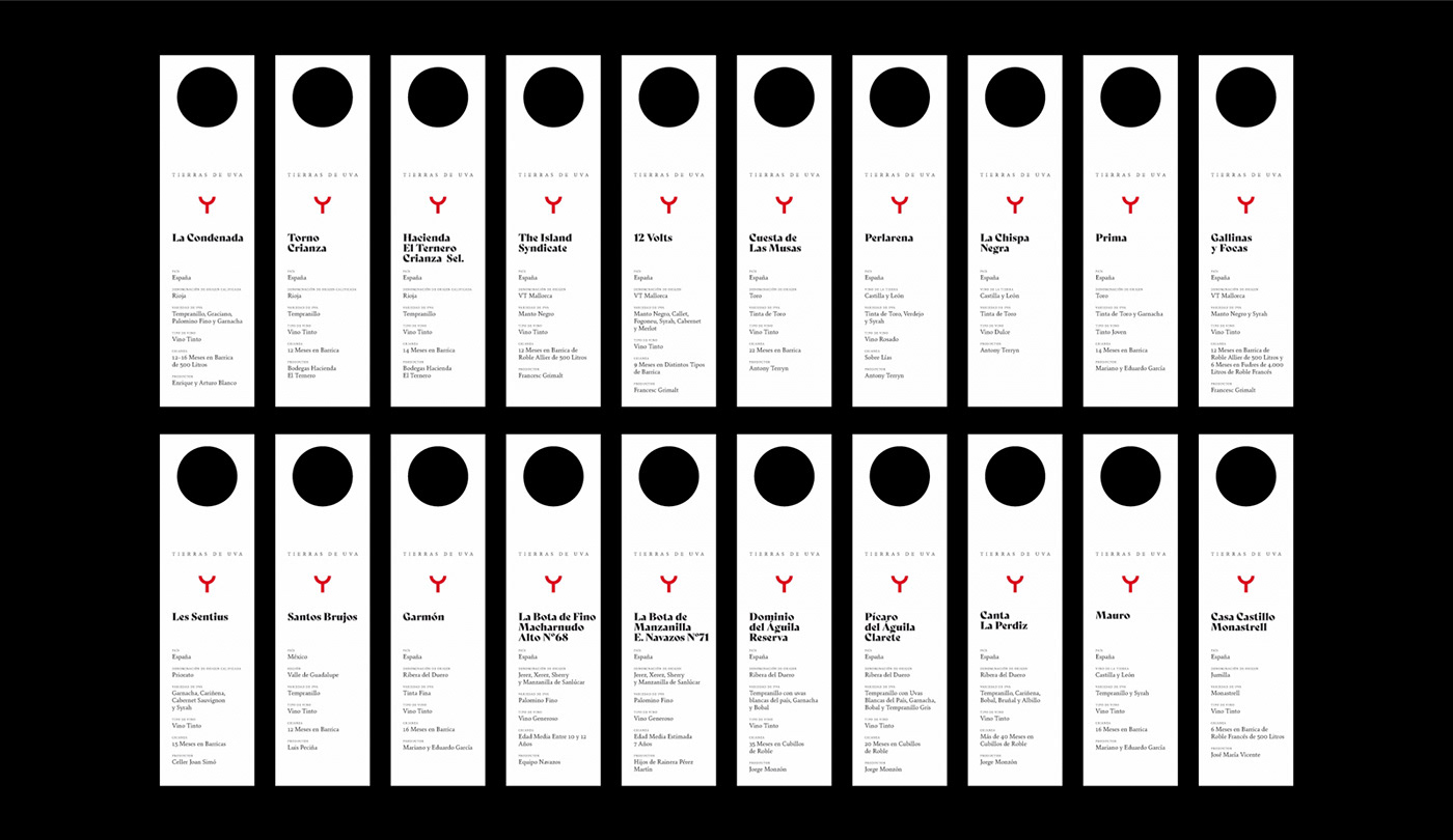
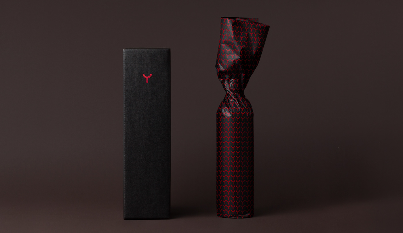
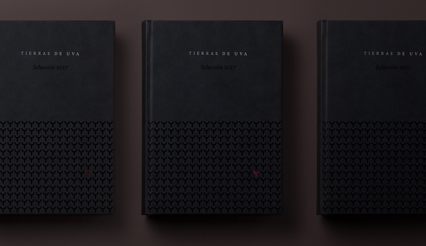
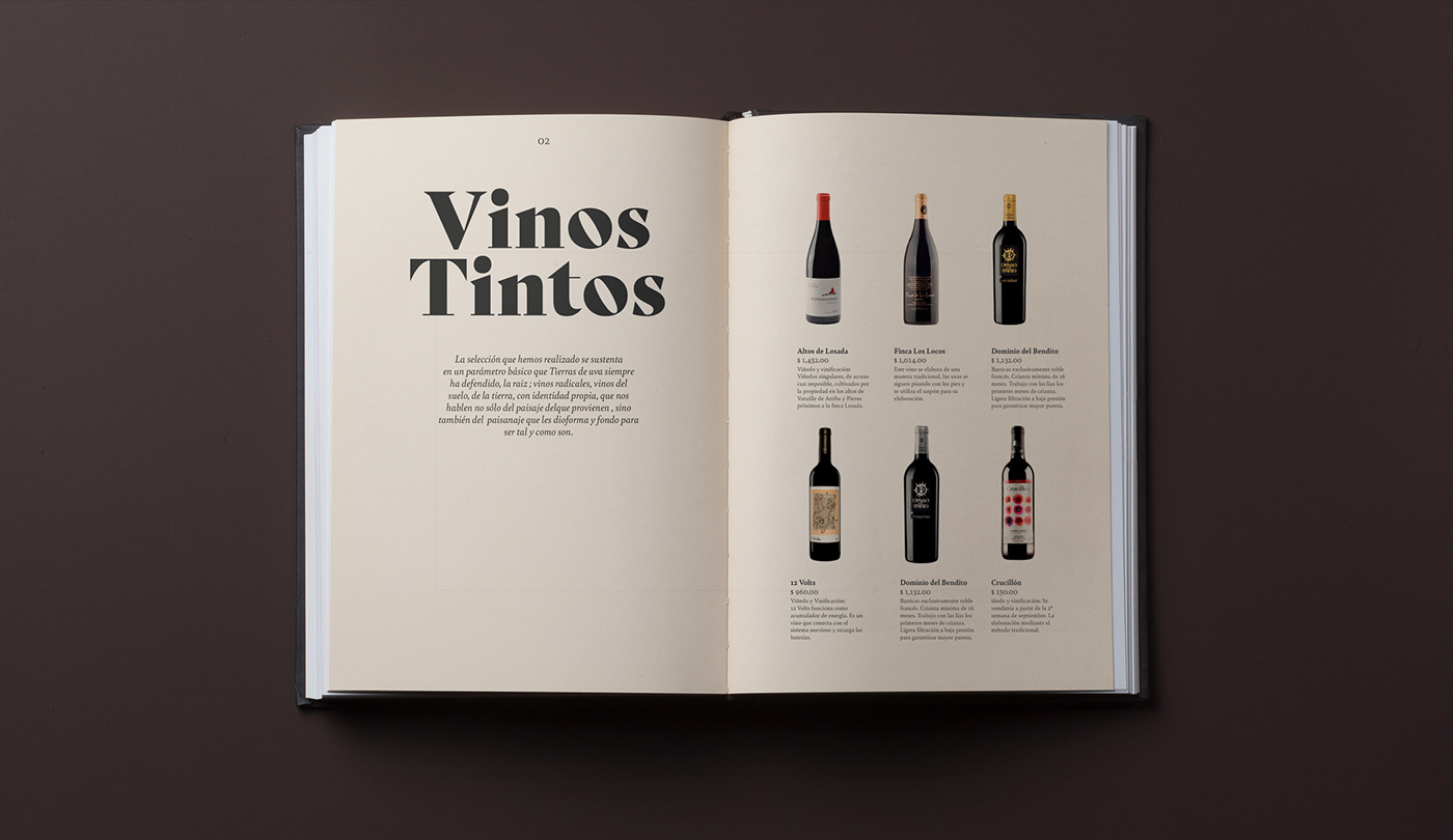
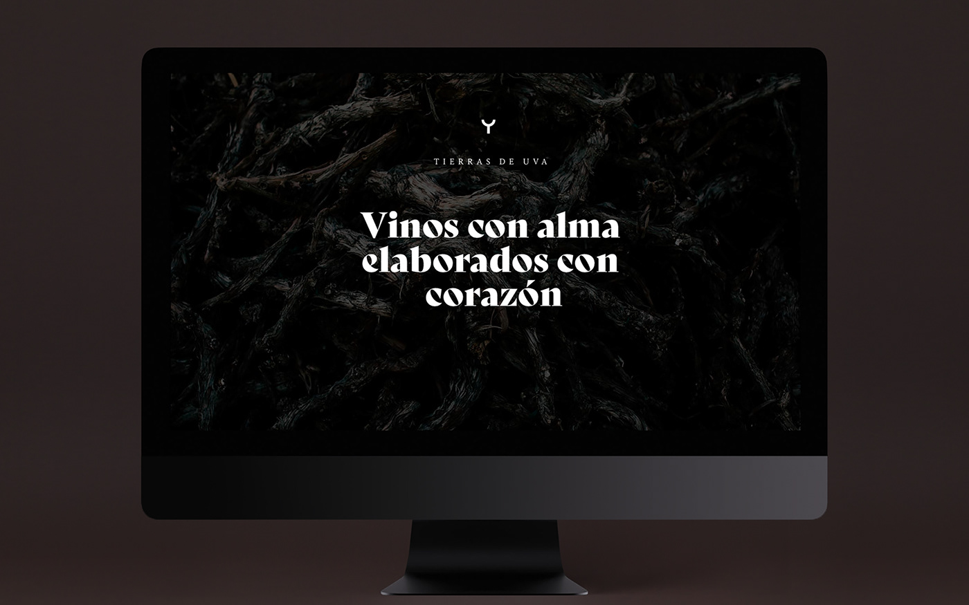
Our proposal is based on a distinctive and recognizable symbol, abstract but with clear references to the world of wine. Bely, the typographic family chosen acquires a leading role because it occupies a relevant place in comunication, especially the exquisite and full personality display version used in headlines.
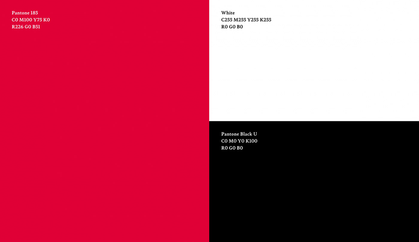
The color palette is sincere and recognizable and does not seek to surprise. In all the printed pieces it has been made a careful selection of papers and materials that complete an identity with a timeless, serene and refined without falling into ostentation discourse.