When rebranding a local salon in Stevens Point, The Salon Betty Lou and Co., the most important things to relay were elegance, class, modern, organic/eco-friendly, down-to-earth and friendly. I took many approaches to tackling this rebrand and identity system. Upon deciding that the use of Aveda products, being plant derived, set them apart by competing local modern and elegant salons we chose to emphasize the eco-friendly side of The Salon.
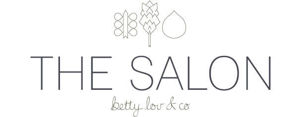
Creating unified plant marks based on plants used prominently in Aveda's products marked the start of the
eco-enhanced design. Creating these marks in a clean and even stroke made them very modern and elegant. These marks became very versatile to use throughout the collateral.
eco-enhanced design. Creating these marks in a clean and even stroke made them very modern and elegant. These marks became very versatile to use throughout the collateral.
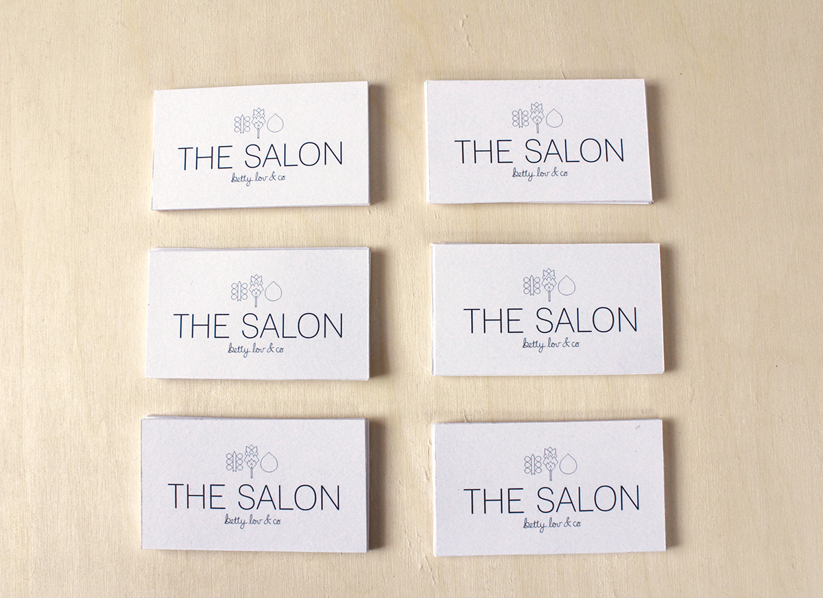
Increasing the modern and elegant feel of The Salon I chose a clean sans-serif type in all caps, uniting the type and the plant marks into a cohesive design.
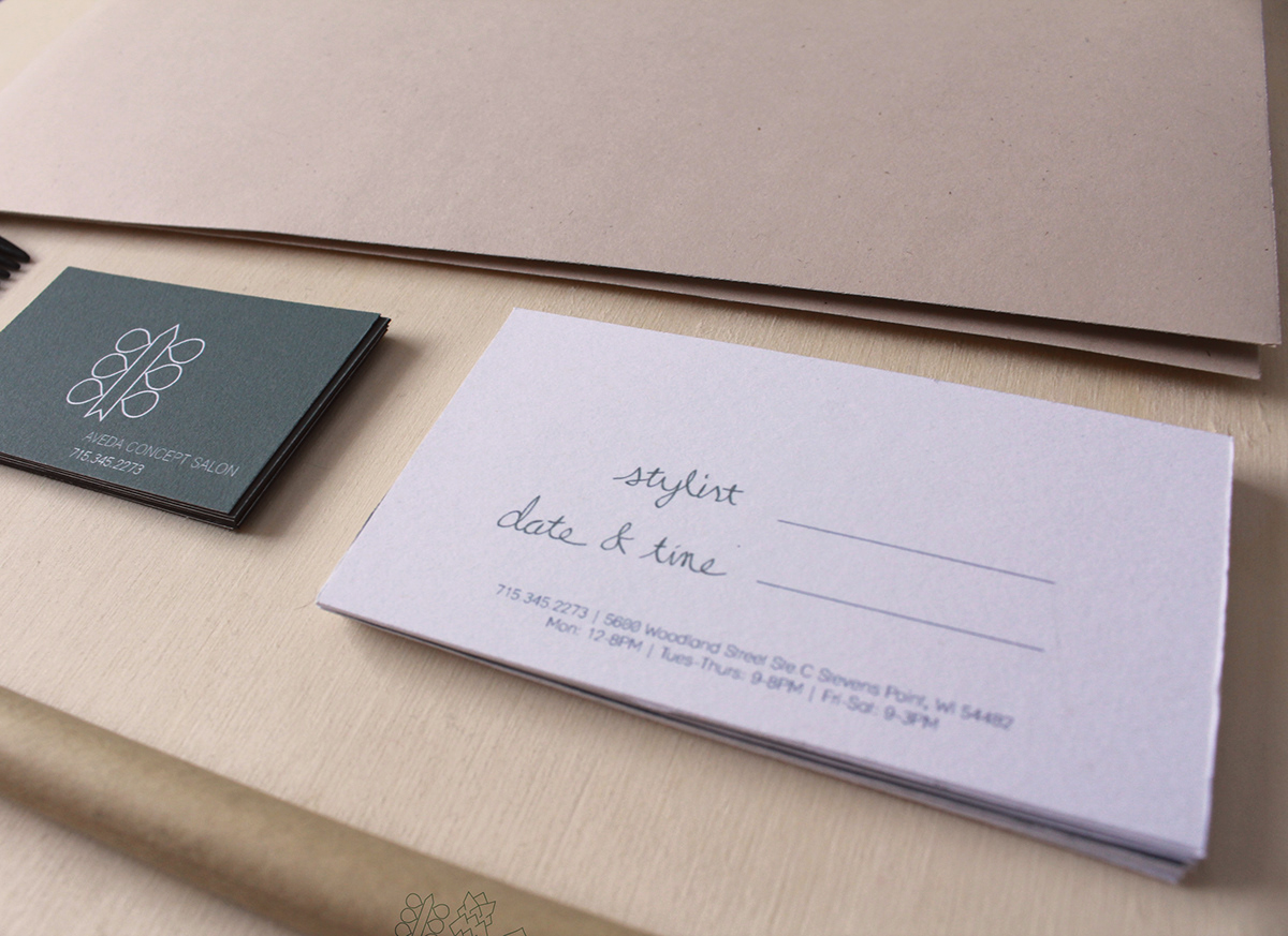
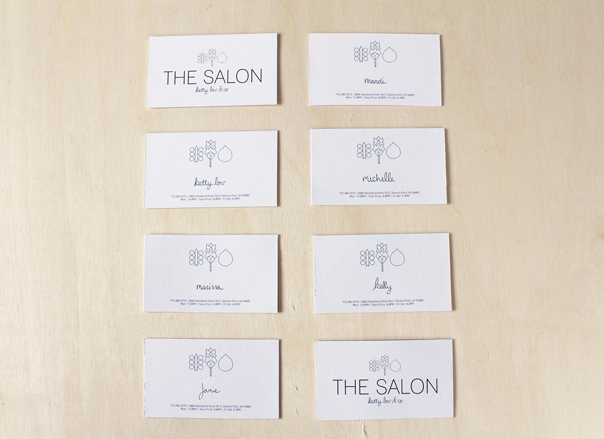
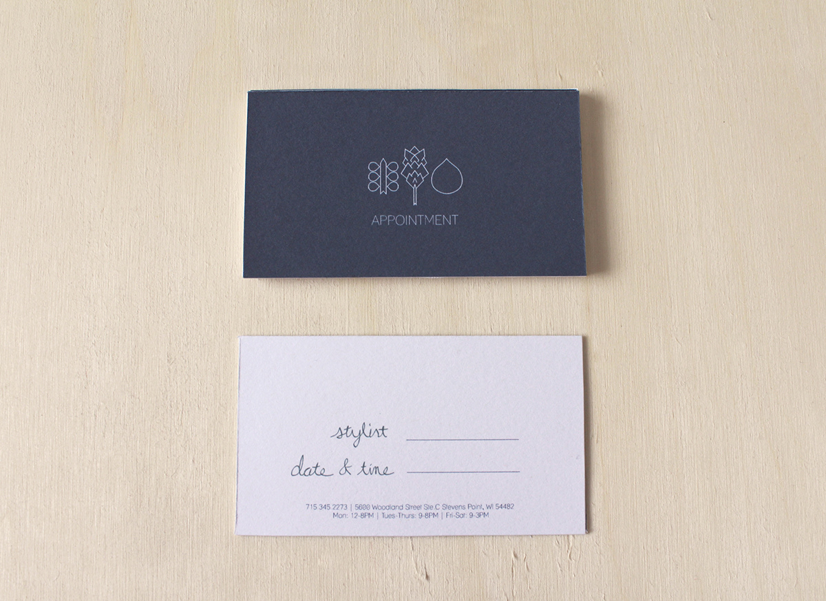
To signify a down-to-earth and friendly feeling important to Betty Lou and her customers I used hand drawn type on "betty lou & co." as well as through the system.
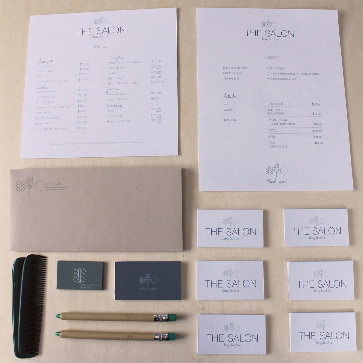
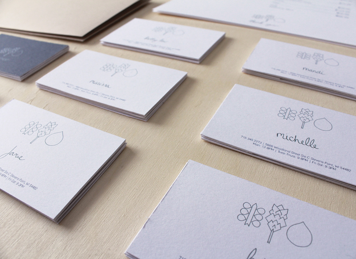
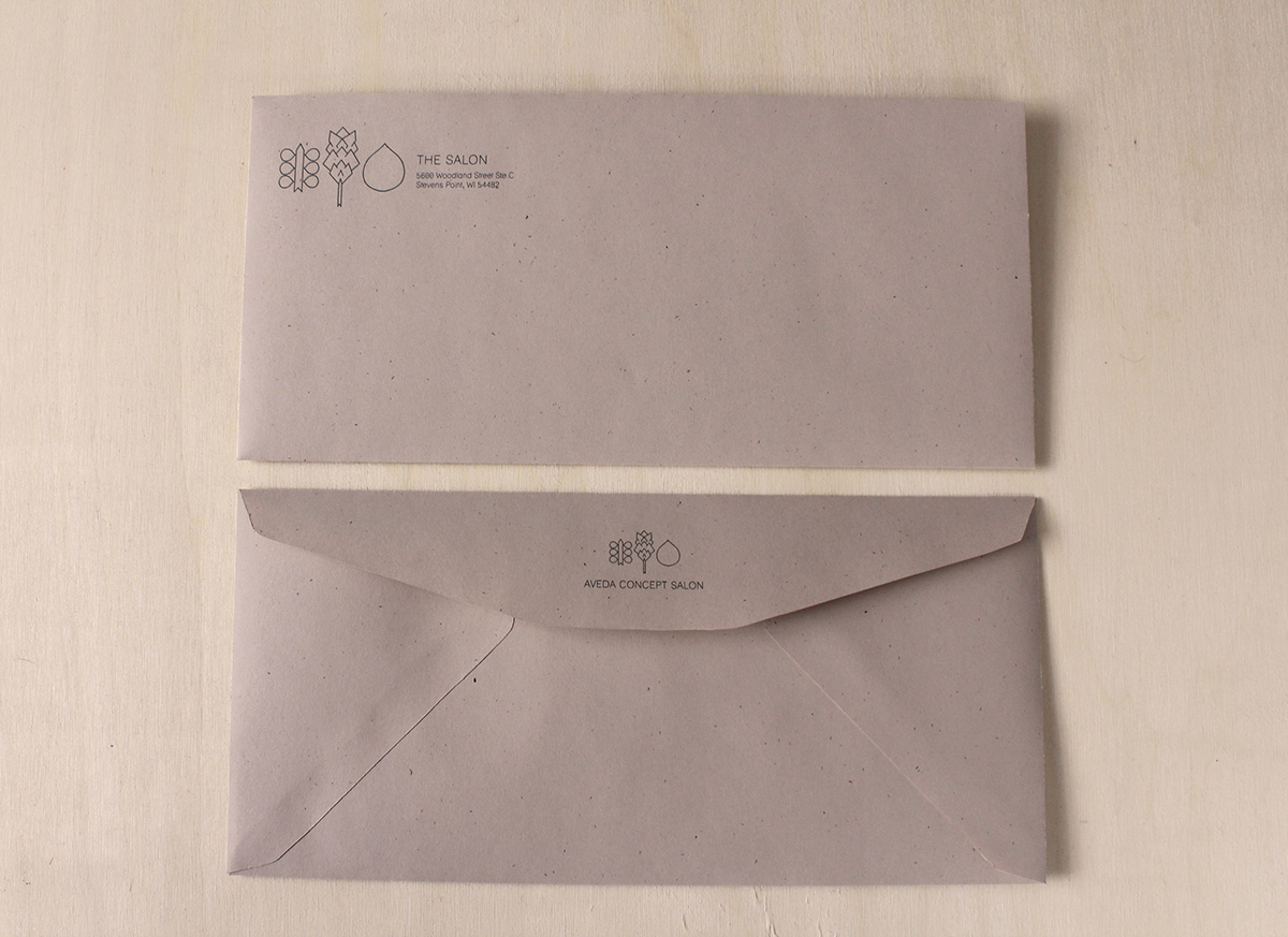
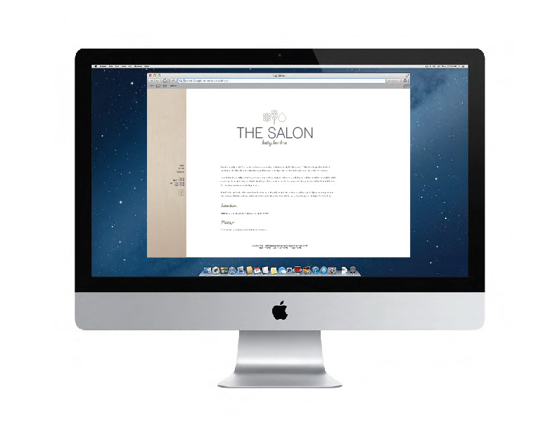
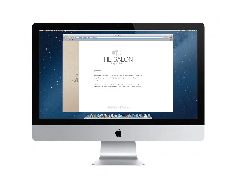
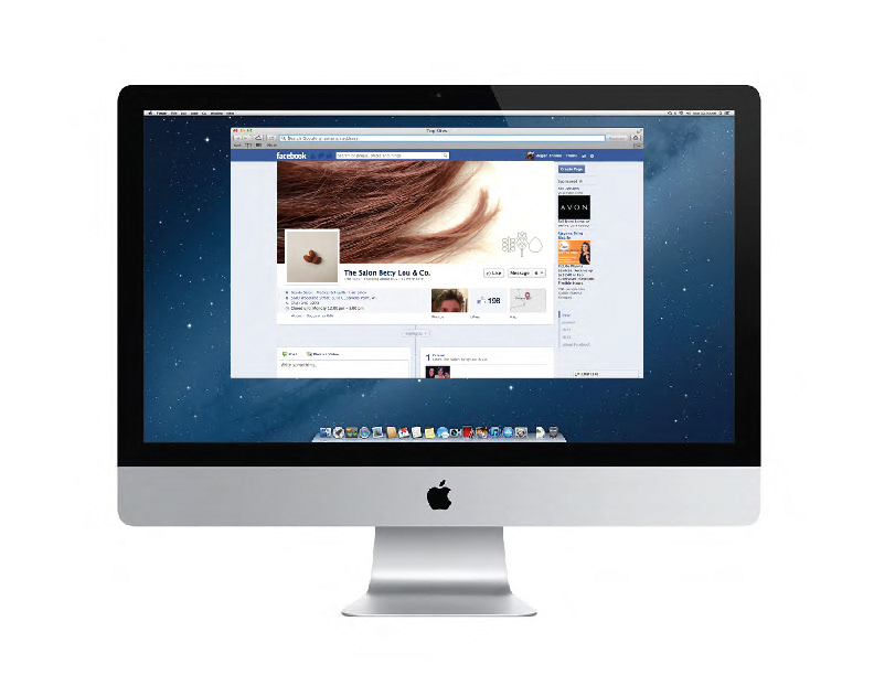
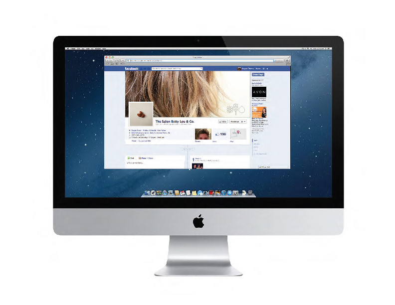
After completing the identity it was carried throughout the system, including business cards for each stylist, appointment cards, invoices, envelopes, menu, magnets, pens, combs, various forms of signage, a website and Facebook page.


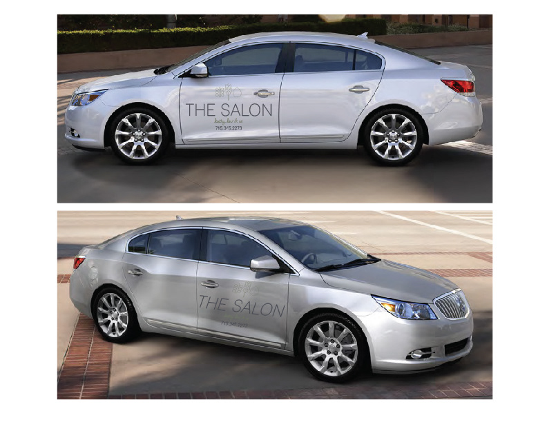
Vinyl vehicle detail developed for Betty Lou's car.
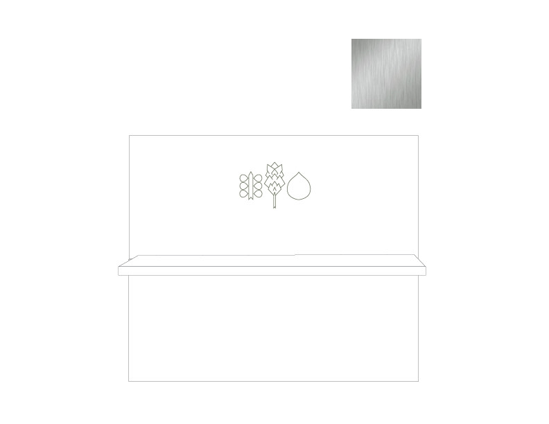
Store signage was an important element in the redesign of The Salon Betty Lou & Co. A road sign, front of the store signage, as well as a sign consisting of the plant marks for above the desk were all created.

Front of store signage and desk signage produced in brushed steel.