Logo Trends 2019
01
Extreme minimalism
Minimalism is currently a trend in design but also a necessity, the need to reduce loading times and to improve visibility on mobile devices. Brands, tech and fashion in particular, move to an essential aesthetic that eschew ornaments favouring simplification and clear sans-serif typography.


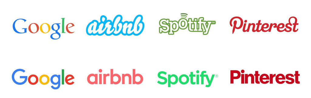
1) American Express by Pentagram; 2) Diane von Furstenberg by Jonny Lu Studio; 3) Burberry by Peter Saville; 4) RIMOWA by Commission and Bureau Borsche; 5) Google by Adam Grabowski; 6) Airbnb by DesignStudio; 7) Spotify; 8) Pinterest;
02
Shapeshifting
Multiple variations of a brand are used to optimise logos in each situation and to guarantee maximum flexibility.
Responsive logos are fully scalable and adapt to different device.
Often based on an algorithm or on a predetermined brand language, generative logos constantly change.
Variable logos have a dynamic identity, they switch between a variety of images, patterns and colour palette, depending on differently targeted campaigns or events.


1) Public Space by Sulliwan Studio; 2) Museo Picasso by Julien Lelièvre; 3) Palais de Tokyo by Julien Lelièvre; 4) Wigan Little Theatre by Alphabet;
5) Responsive Logos by responsivelogos.co.uk; 6) Apple;
03
Animated logos
Animation in logos has increasingly widespread in the last years. Digital users are more and more used to having a dynamic experience. Videos, motion graphics, css effects and GIFs populate web pages.


1) Google by Adam Grabowski; 2) Kevin Young visual designer; 3) Sello by Latham Arnott
04
Geometric Illusions
2D and 3D effects create visual impact on a brand with perspective and shading illusions, playing with visual tricks and generating a “trompe l’oeil” effect. These logos create the illusion of three-dimensional objects and play with depth.


1) Edge Board by Hampus Jageland; 2) Roser Ribas by Albert Romagosa; 3) Ryan Biggs; 4) Brainbow Design; 5) Ciutat Flamenco by Avanti Avanti Studio; 6) Lifewords by Sparks Studio;
05
Classicism
New brands use classic designs inspired by historical elements and ornaments, referring to pre Industrial Age imagery. They get inspiration from guild emblems, badges, coats of arms, vintage textures, artisanal touches. Existing brands refresh their historical and timeless logos.
Unlike minimalism, these logos use intricate details with varying lines, color variations, type choices and small elements, as small canvases and hand drawn illustrations.


1) Messorem Co Bracitorium by Adam Grason; 2) Detailed wine logos; 3) Quaker; 4) Bacardi by Here design; 5) Stella Artois
06
Overlapping
This trend uses colours in order to improve visual impact of the brand, with gradients or funny logos.
Bright shapes overlap each other, adding extra layers to create duality, depth and eye-catching mark.
Bright shapes overlap each other, adding extra layers to create duality, depth and eye-catching mark.


1) PayPal by fuseproject: 2) Quatrus by Kerovec Roko; 3) Mohawk by Pentagram; 4) Wcs by Pentagram;
06
Negative Spaces
This trend, that however is not a radical innovativion, continues to use shapes loophole to create duality and extra depth in visual even in 2019. Hidden images appear in logos typography to reveal symbolic meanings.


1) Eaton; 2) Carrefour; 3) WWF; 4) Kabooter by Mitch; 5) Shift; 6) usa network; 7) Sync;
07
Gradients
Gradients continue to be a massive trend also this year in graphic design. Bright colours palette are used to improve emotion, with video adaptations in GIFs and videos for digital screens.


1) Mozilla; 2) Cox; 3) Nelonen by CapeRock; 4) IBM Watson;
08
Playful & Fun
This is a pop trend, flexible and attractive. A feeling of positiveness is created with illustrations, brilliant colours and funny variations and animations.


1) Mailchimp by COLLINS and In-house; 2) Nike logo; 3) Luna Park by SML Design;
09
80s - 90s come back
As in the fashion, also in design the old could be new again. In the last years, 80’s and 90’s shapes, bright colours, Memphis inspired patterns and graphics are trend again.


1) Mtv; 2) Santa Cruz skateboards;

