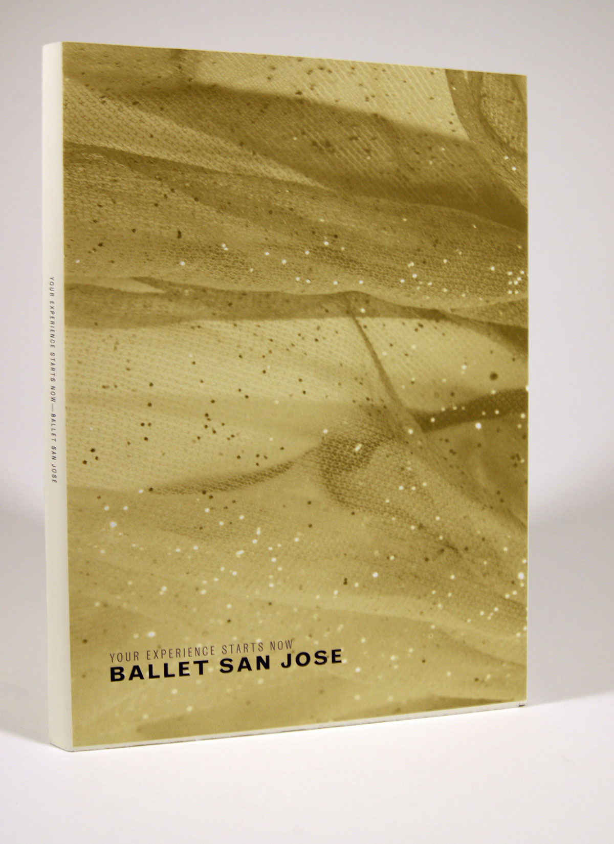
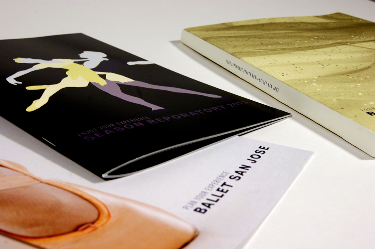
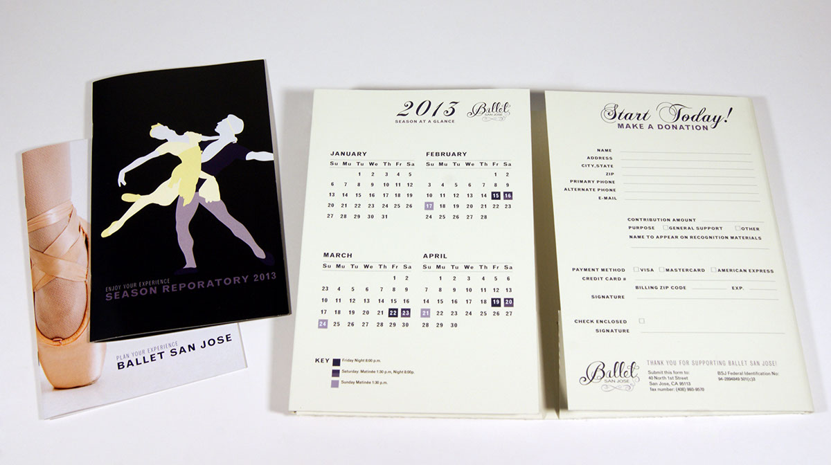
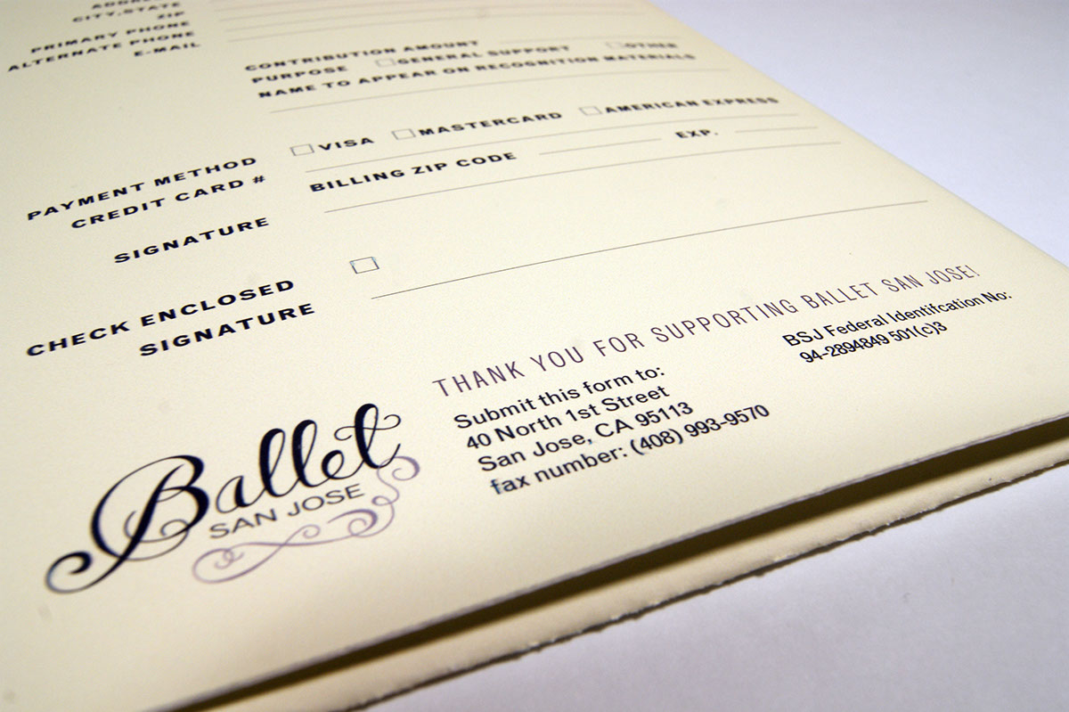
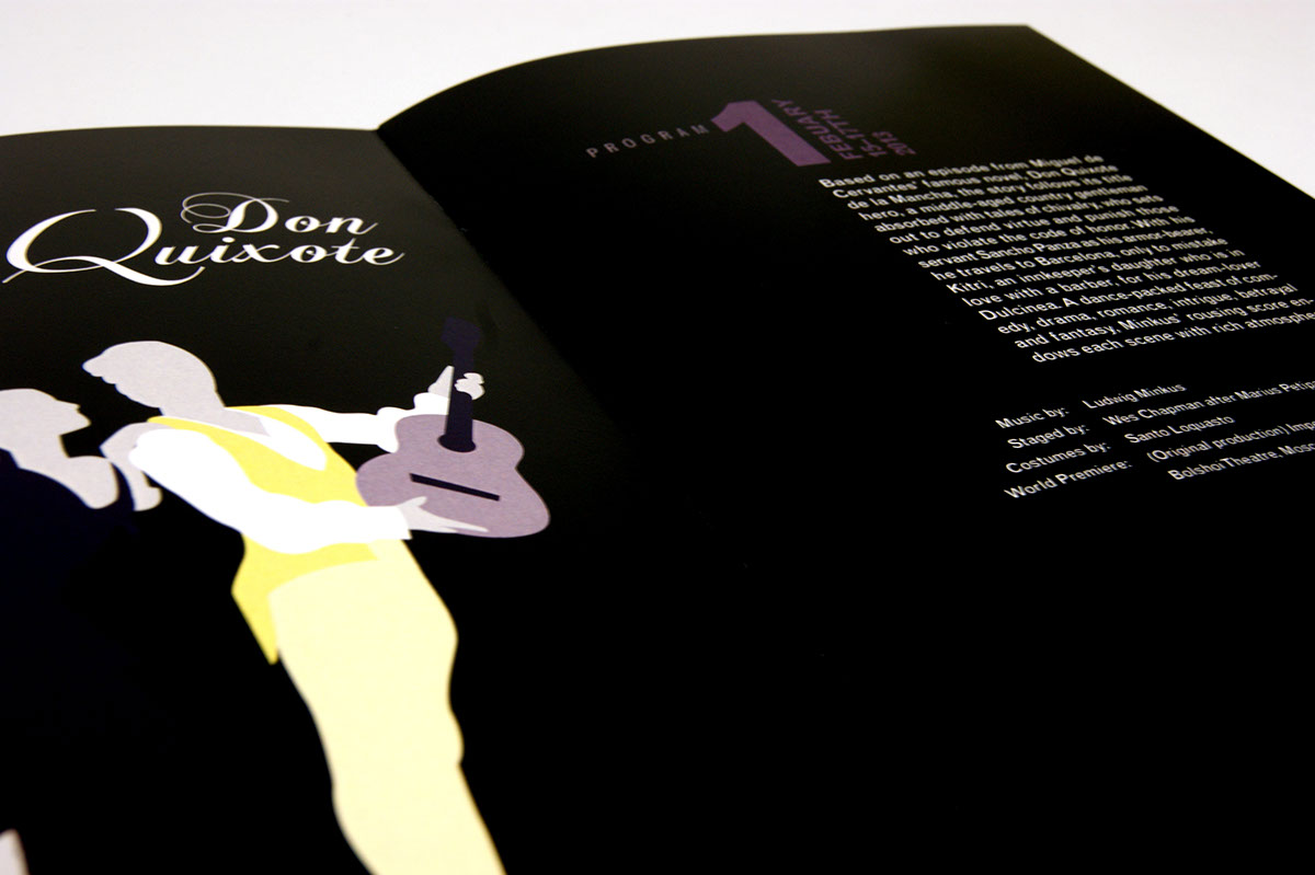
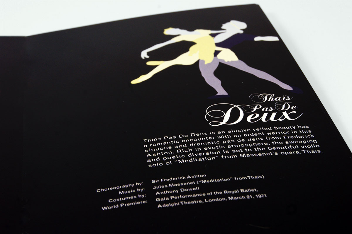
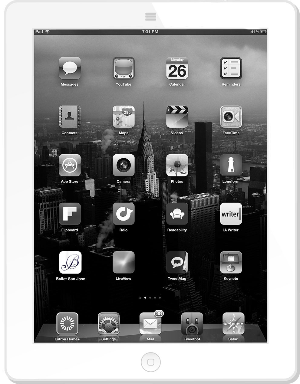
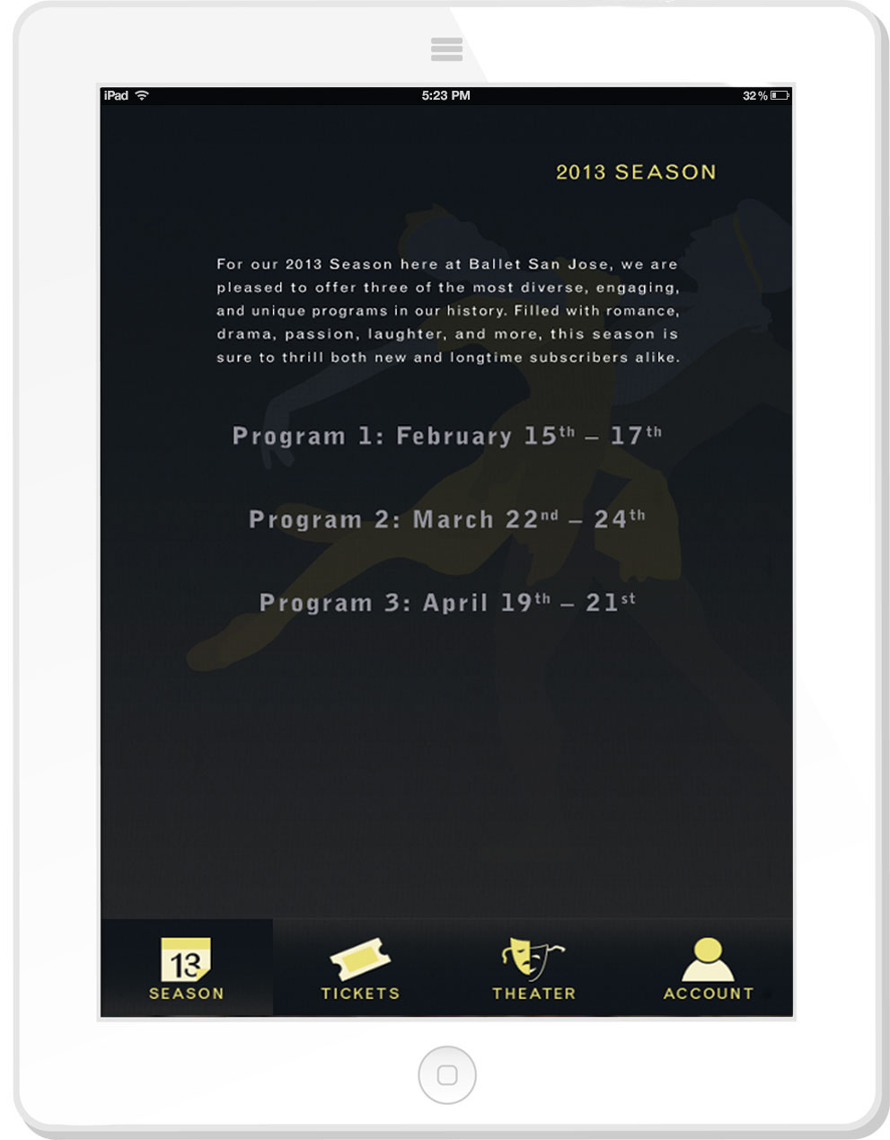
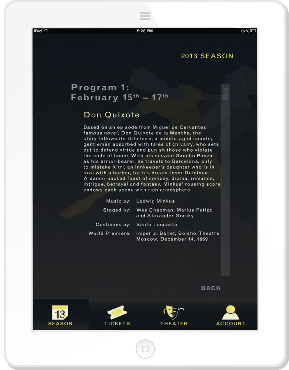
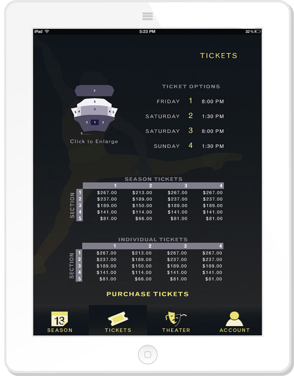
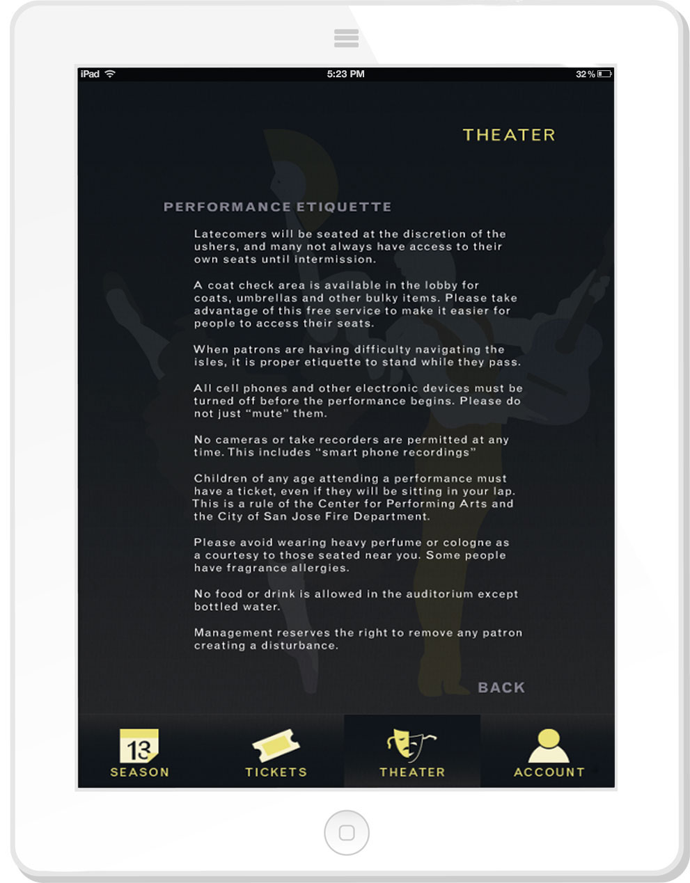
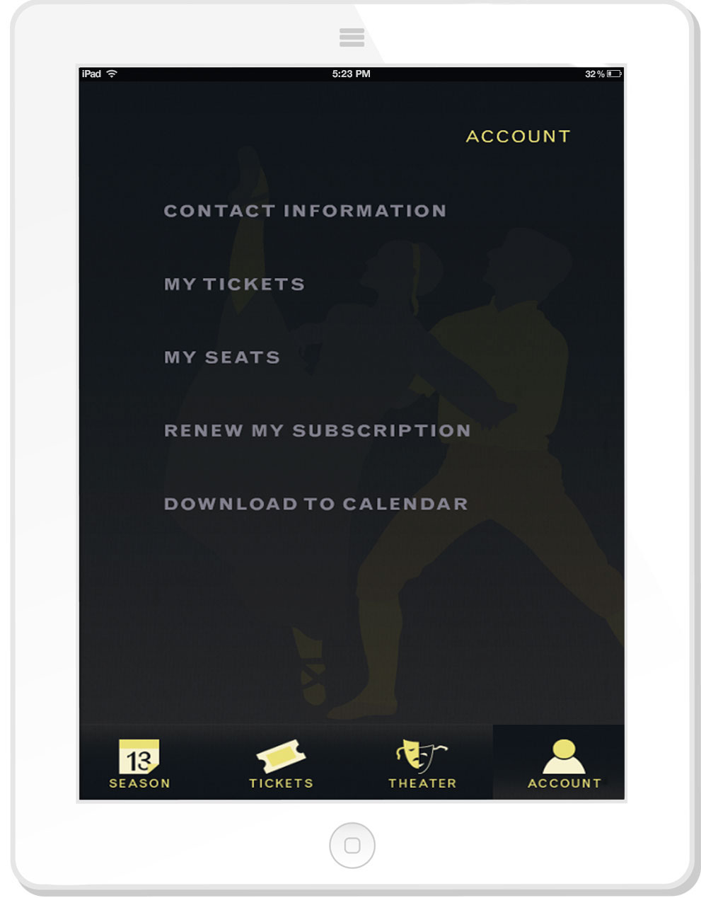
This promotional package including the tablet app was created in collaboration with fellow graphic designers Jamie Lindgren, and Marlie Heberling. Ballet San Jose offers public performances and a ballet school to learn this graceful art form. The goal of this promotional package was to increase public interest, membership, and generate season ticket sales. Here, the color palette is complimentary and focuses on creating a soothing and elegant feeling. Within the typographic choices, our team decided the re-design of the logo should be a script typeface since it would match the ornamental aspects of the dance.For the print mailer, we created a envelope which would be used to inform members of upcoming events. In this envelope there are pockets for two books which the cover over the books feature as tear offs; one to mail back for donations and the other a calendar to put on one’s refrigerator. The first book would have general information about ballet and the local venue. The second book would describe the 2012 season repertory and change each year with new "vector style" illustrations.For the interactive portion, the tablet app would show the season calendar information, purchase of tickets, seating chart, general information, and a “my account” section. The "my account" section is for reviewing purchases and adding dates to ones Outlook®, iCal®, or Google Calendar®. An animated web banner would feature the 2012 artwork and function as a link to the Ballet San Jose website.