
Corporate Identity - Architrave & Lintel
A non-commercial project
A non-commercial project
This was a self initiated corporate identity project.
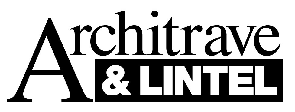
I chose to look at a fictional firm of architects called Architrave & Lintel, and worked on the basis that they were involved in medium- to large-scale commercial construction projects, with a reputation for clean, modernist inspired design.
I chose to look at a fictional firm of architects called Architrave & Lintel, and worked on the basis that they were involved in medium- to large-scale commercial construction projects, with a reputation for clean, modernist inspired design.
After some initial experiments mixing classical faces with modern ones and riffing on the more ornate architrave being held up by the functional lintel I downed tools and spent some time looking at the work of Le Corbusier, Gropius and the Bauhaus to get more of a sense of modernism.
Playing around with the era's typography and geometry I began to see the clean lines of the classic swiss style as a good mirror for the firm's values. It also made me want to swap out the ampersand for something simpler...

...so I tried using a plus, which was cleaner, and also reminding me of a marking you might see on an architectural blueprint. I then used the different face weights to balance the colour of the two words. But a) Helvetica is a very over-used typeface; and b) Lintel in Helvetica bold screams 'Intel'.

Instead I looked for a modern twist on the Swiss style and found Hoefler & Frere-Jones's beautiful Whitney face which felt like Helvetica with a touch more personality. I also experimented with a pencil texture for the plusmark, but after a handful of variations and weights decided that it looked too informal and clashed with the clean lines of the typeface.

As well as the brand, letterhead, business card and compliment slip I compiled a short set of brand guidelines, so the company could continue to use their new identity consistently.


