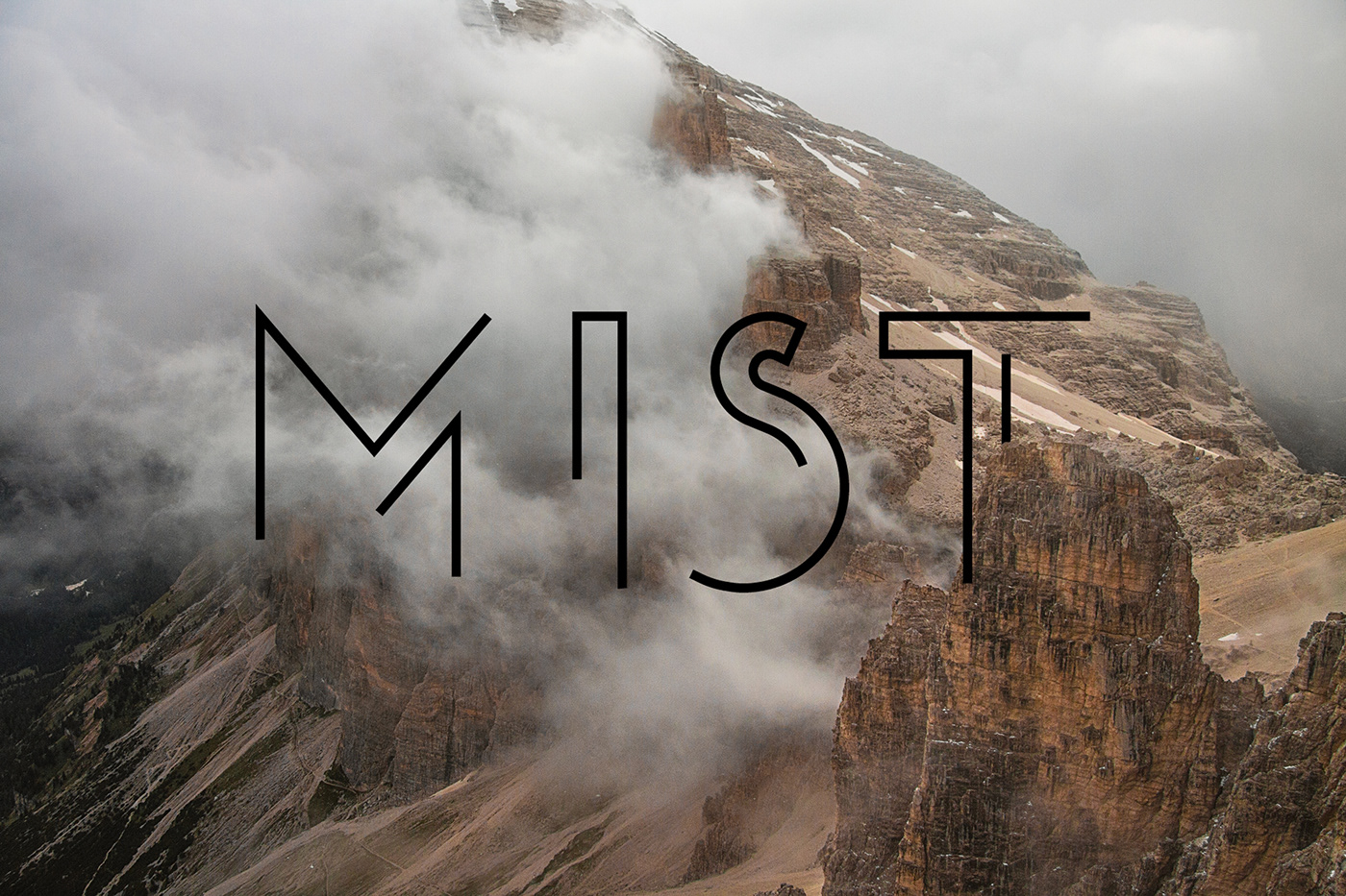
MIST is a typeface that I've previewed in a previous project on my own personal branding project, after using the letters to properly display my specialty and passion for typography. It's also the very first typeface I have created all the letters and partial symbols for, when compared to the many unfinished font concepts lying in a memory stick somewhere. It's because of this that I hope to create a fully fledged and accessible typeface in this style for anyone to use in either personal or commercial applications.


The font's title - MIST had been chosen after initially conceptualising with the idea behind an almost broken or slightly faded design for the body of a typeface. The sketches displayed here have been altered in Adobe Illustrator in the following screenshots, whether it be due to the obvious uneven shape/proportion of several letters or the choice to alter an individual letter due to it's design.


The final screenshots displayed here include the overview of the document's initial development, more experimentation with the letter's individual design and the stages on what will be the typeface's symbols later on in the final stages of the font. I also decided to conceptualise with various colour themes, in order to ensure that a plain black for the inner body is the most effective way to display this lettering. However I have used the various shades of pink for the typeface when designing my business cards for my own personal development as a creative.
The final stages of this font's progression will be updated on both new Behance projects and Instagram posts in the future, when creating the various symbols and numbers in order to fully complete this typeface for use both personally and commercially.
Thank you for having a quick look at this new piece of work, any advice on improving my work like this would be greatly appreciated in the comments or by email 👌.


