KING CONE AMERICANO POSTER
Art Direction
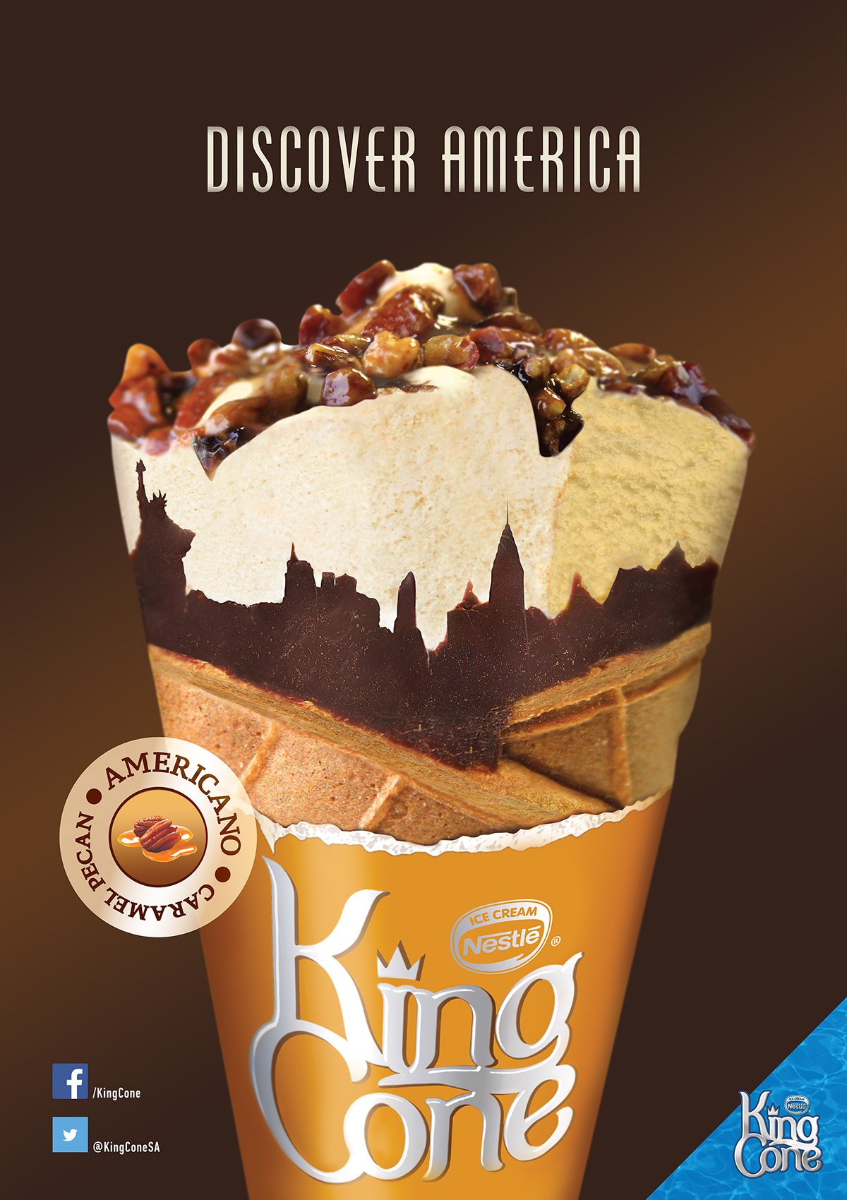
KING CONE launched the AMERICANO as a premium product inspired by the insight that consumers “love the luxury of international ice creams.” An ice cream whose premium and foreign positioning was highlighted by it’s traditionally American flavours, “Choc Brownie” and “Caramel Pecan.” We were tasked with bringing this “Americanness” to life whilst simultaneously communicating the common escape that is associated with the consumption of ice cream.
This inspired the creation of a poster depicting a close-up image of an AMERICANO with an identifiable American skyline hidden in the chocolate of the ice cream.
The copy “Discover America,” has been used to refer to a variety of things. Firstly, it refers to the American skyline concealed in the chocolate of the ice cream. Secondly, it refers to the discovery of Americano flavours through our “Choc Brownie” and “Caramel Pecan” AMERICANOs. And lastly, it ties back to our online competition, where people can where people can literally discover America and escape by winning the grand prize (a trip to the country itself). Together, these elements created a fun and engaging poster aimed at drawing consumers in.
The poster was executed as an in store poster. In store posters were selected due to the engagement required by the imagery, as well as the high volume of traffic passing through these locations. The strategic nature of these locations is further relevant as ice cream is an impulse purchase and putting up posters at point of sale would thus influence purchase decisions.