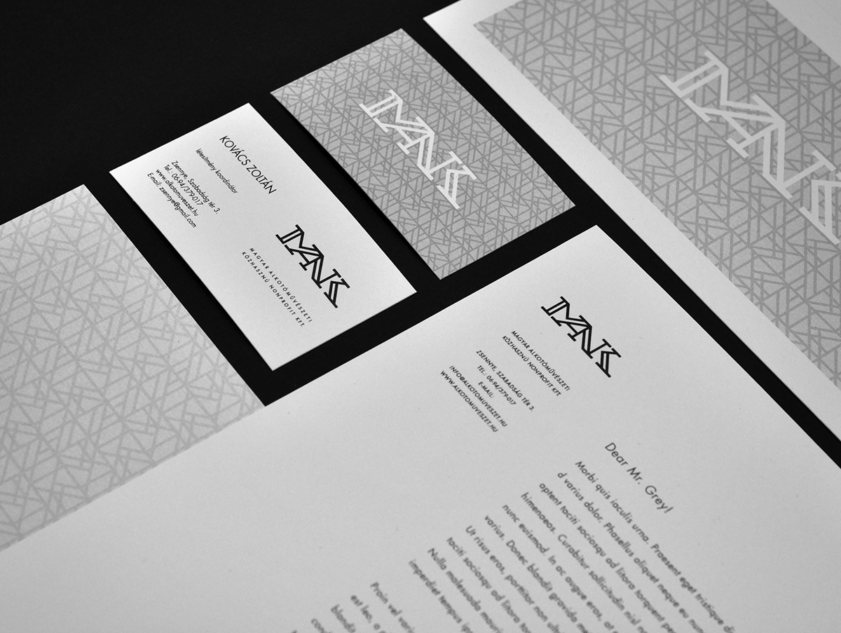
MANK typographic logo project
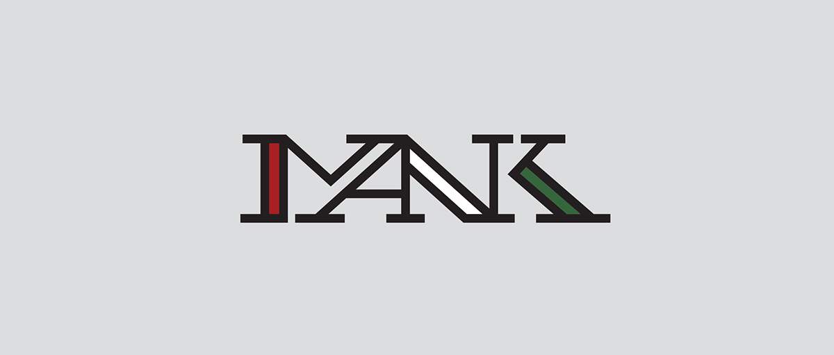
MANK is a Hungarian national property management company, dealing with art-colonys, and manages many fine-art related projects. This company made a competition to redesign it's identity. The old sign was a typographic logo, with the Hungarian flag colours. The use of letters and the red-white-green colors were my starting point.
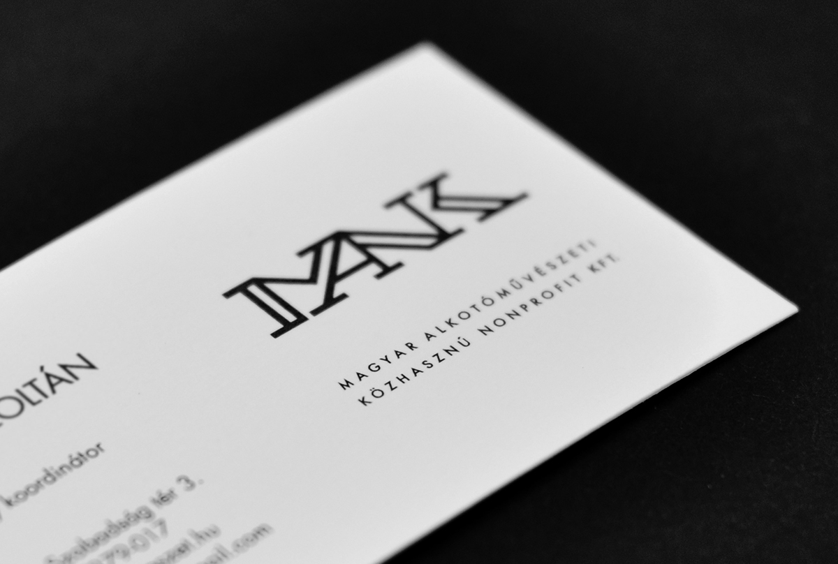
I custom made the MANK serif letters, pushed them into each other. Many "pillar" lines of the letters disappeard or merged, but all of the serifs stayed. The logo built form 4 letters, 4 letters making one ligature and the result is still readable. The remaining three thick, well separated line, fits the three colors of the Hungarian national flag.
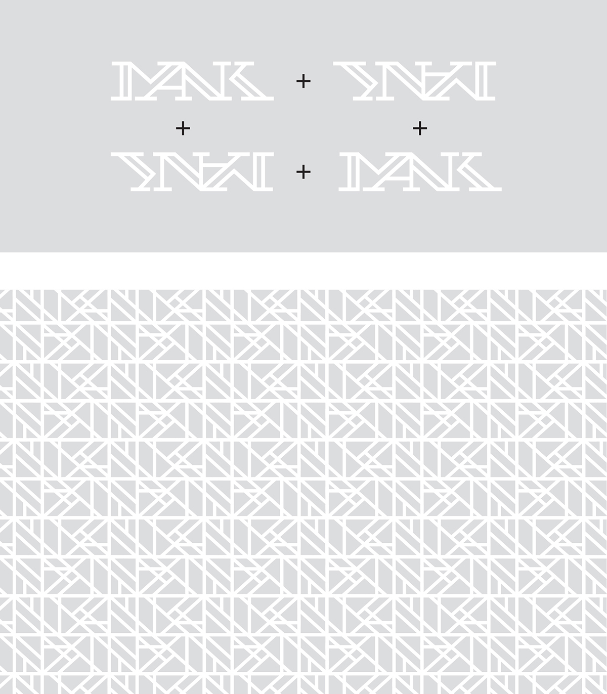
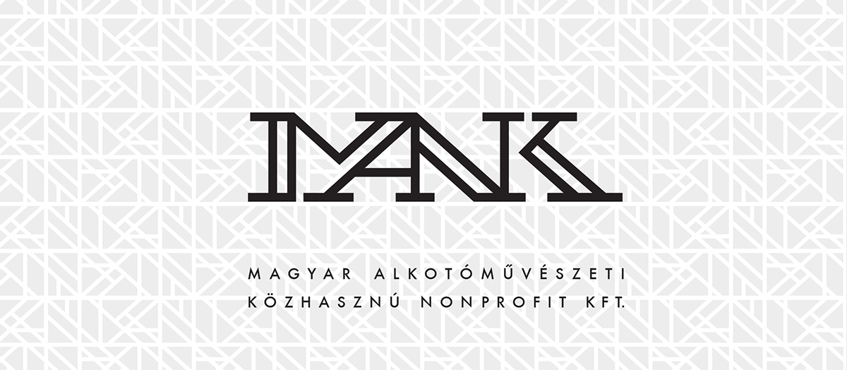
The "Art Nouveau-ish" background surface is built from the logo itself, turning the second row upside down and finding the best place to contact the rows and lines.