

Product Page Redesign Concept: Take a look at my awesomely simpler redesign. The goal was to make this easier to navigate keeping user experience in mind & to create a design that would be more inviting & friendly overall. A simpler way to make the page shorter & easier to navegate was to break up most of the information into separate documents that can be accessed through links, instead of overwhelming the user with so much text on a single page. I used a consistent color palette to go with this brand of products having to do with the life sciences, & I used it as a color coding method for clarity & organization (blues for text & headings, purple for links, & green for main action links).

A simpler concept.
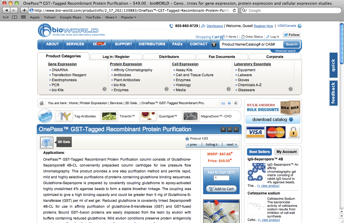
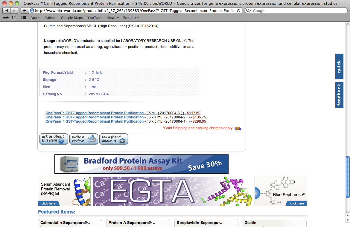
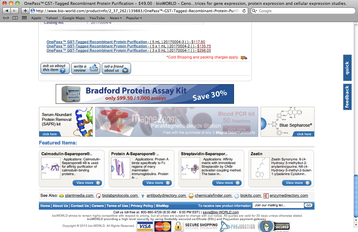
Outdated Website Design: Take a look at just how old & overloaded this current site has become. It took me 5 screenshots (from my laptop) to show that the product page is too long.


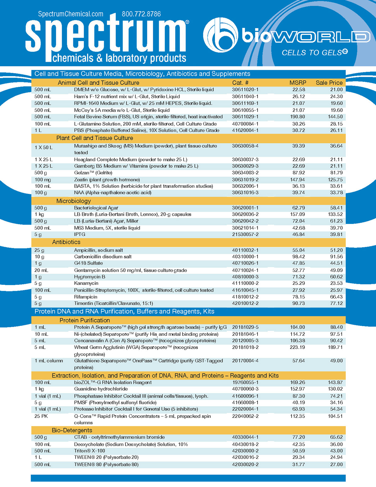
Info Sheet: an organized list of product information & pricing for distributors, set at 1 page front & back to save on costs (created February 2013)

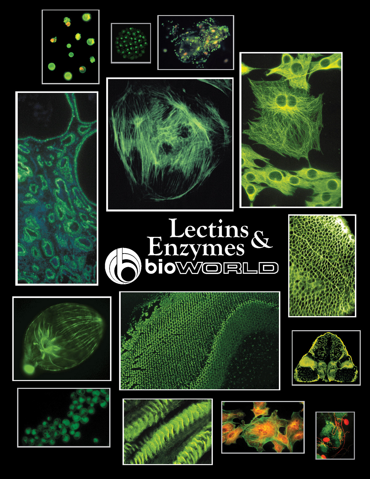
Cover Design: I created this more modern & bold cover for a 3 or 4 page information booklet about lectins & enzymes. It was originally a very boring & outdated look without this design. (February 15, 2013)


