ABOUT
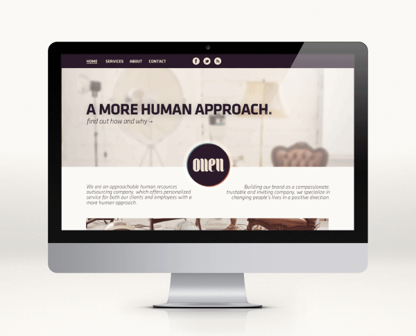
OUEN is a Human Resources Outsourcing company, which offers personalized service for both their clients and employees with a more human approach. What companies in this expertise usually do, is try to appear authoritative, they use classic corporate looks to give the impression of being a high-standard organized community of professionals, but it usually ends up alienating their customers and visitors. As always, there are many exceptions to this, but I figured that OUEN's logo could utilize a warmer more open aesthetic approach.
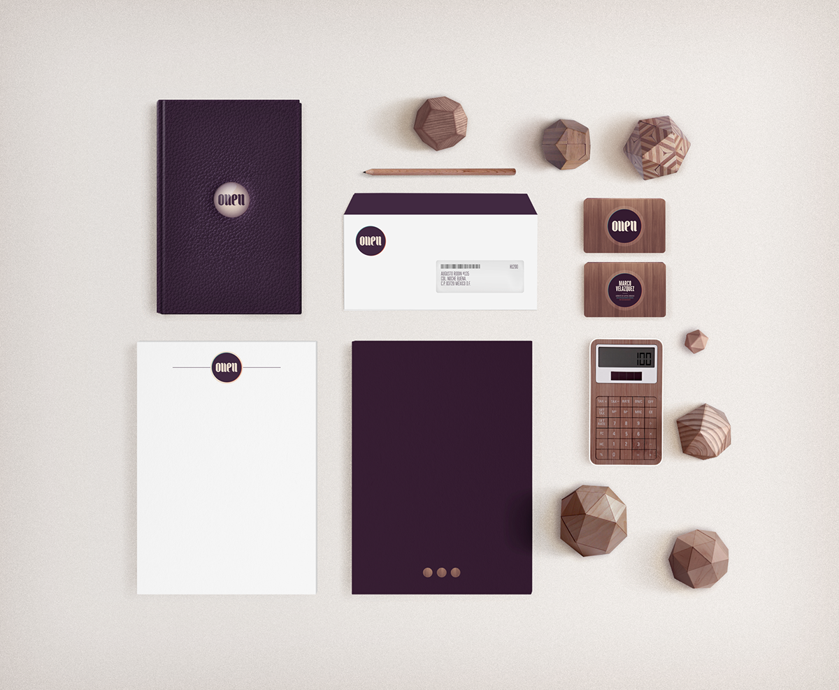
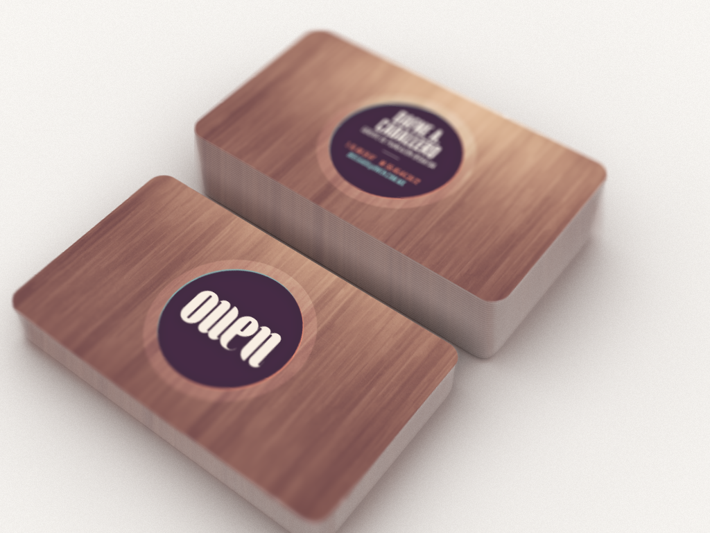
So, I decided to go with a more friendly direction. I wanted to reflect the “human” factor in the branding, by creating a warm script logotype, while using something that brings good memories: wood, and colors that are not intrusive, but quite comfortable.
OUEN is a Human Resources Outsourcing company, which offers personalized service for both their clients and employees with a more human approach. What companies in this expertise usually do, is try to appear authoritative, they use classic corporate looks to give the impression of being a high-standard organized community of professionals, but it usually ends up alienating their customers and visitors. As always, there are many exceptions to this, but I figured that OUEN's logo could utilize a warmer more open aesthetic approach.
So, I decided to go with a more friendly direction. I wanted to reflect the “human” factor in the branding, by creating a warm script logotype, while using something that brings good memories: wood, and colors that are not intrusive, but quite comfortable.
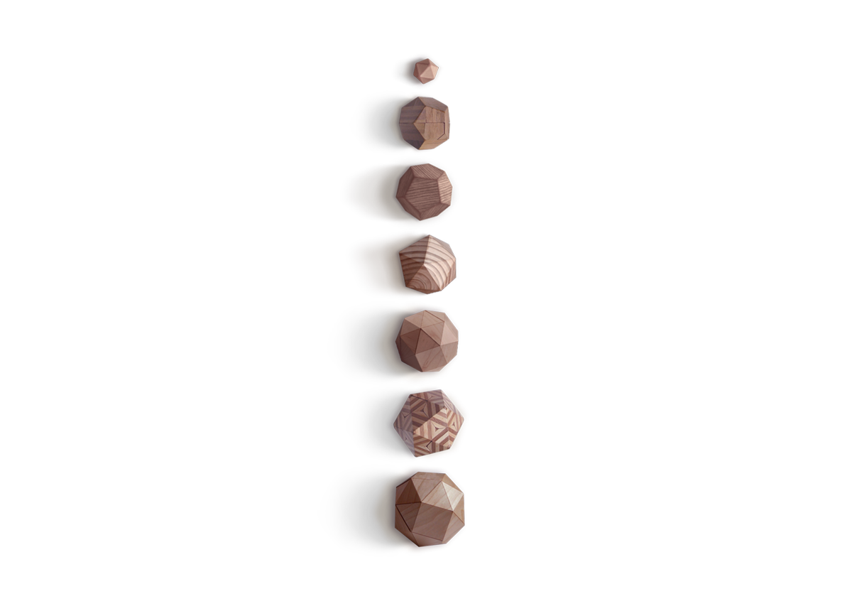
LOGO EVOLUTION

STATIONERY


WEBSITE

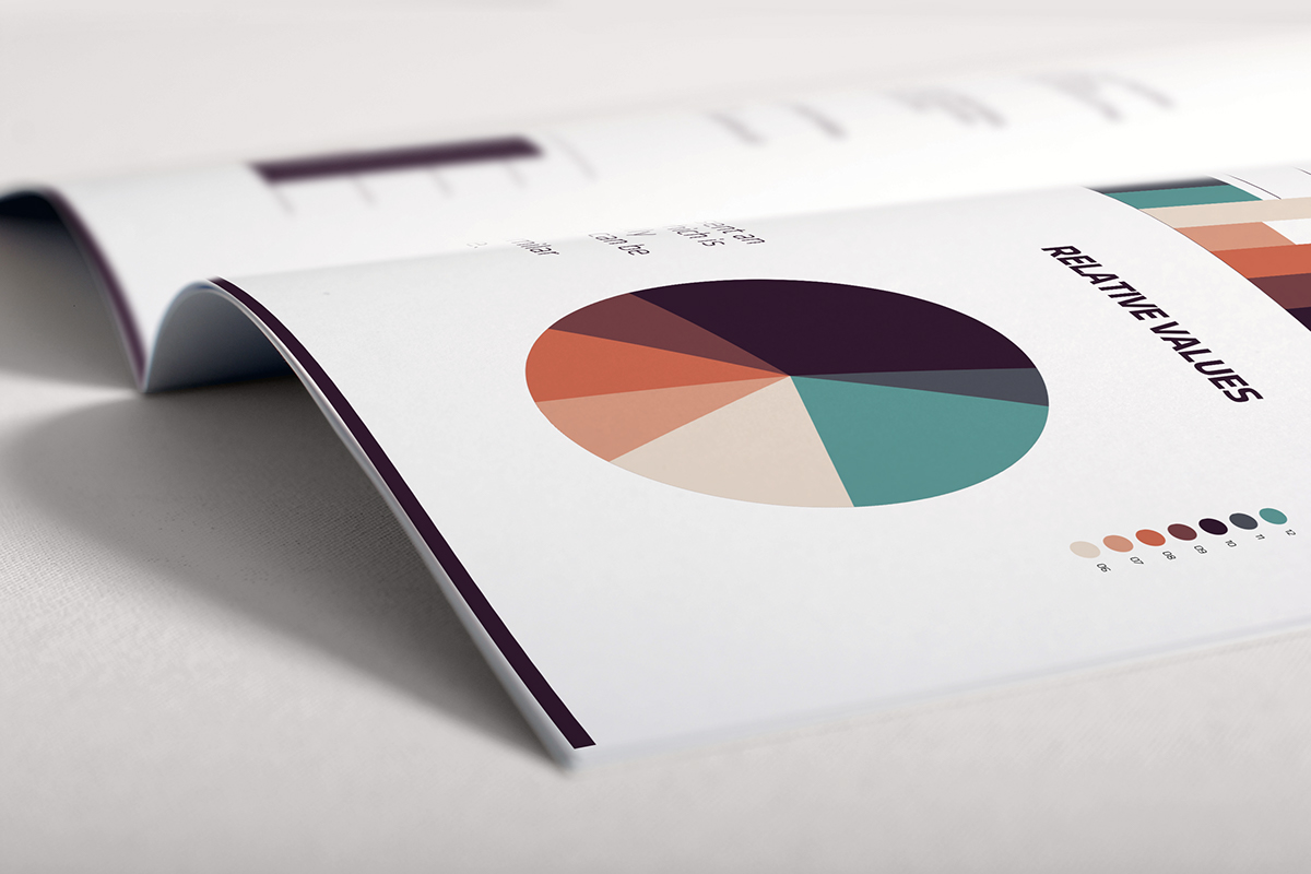
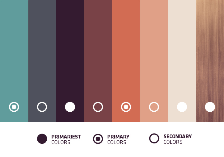
COLORS