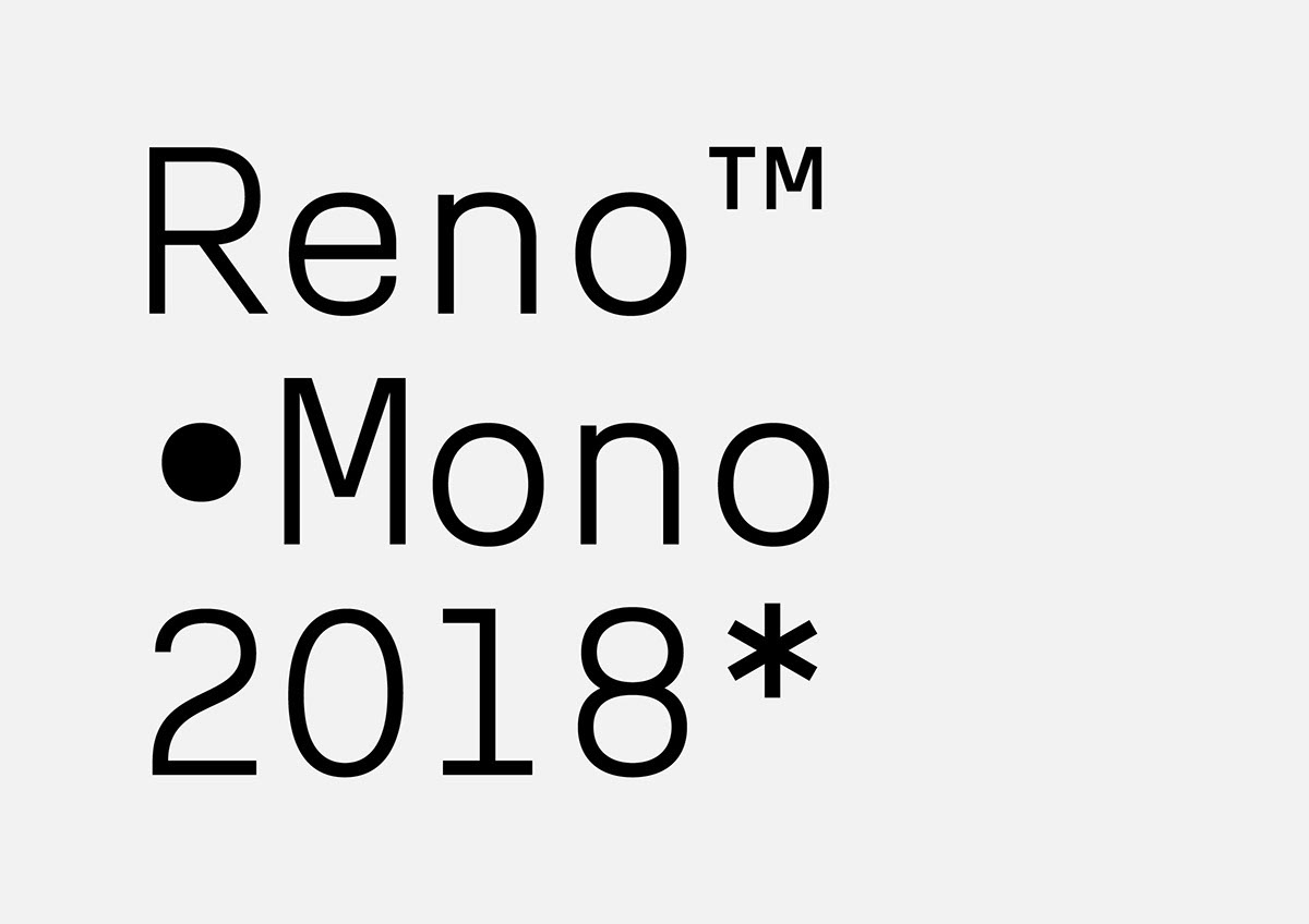
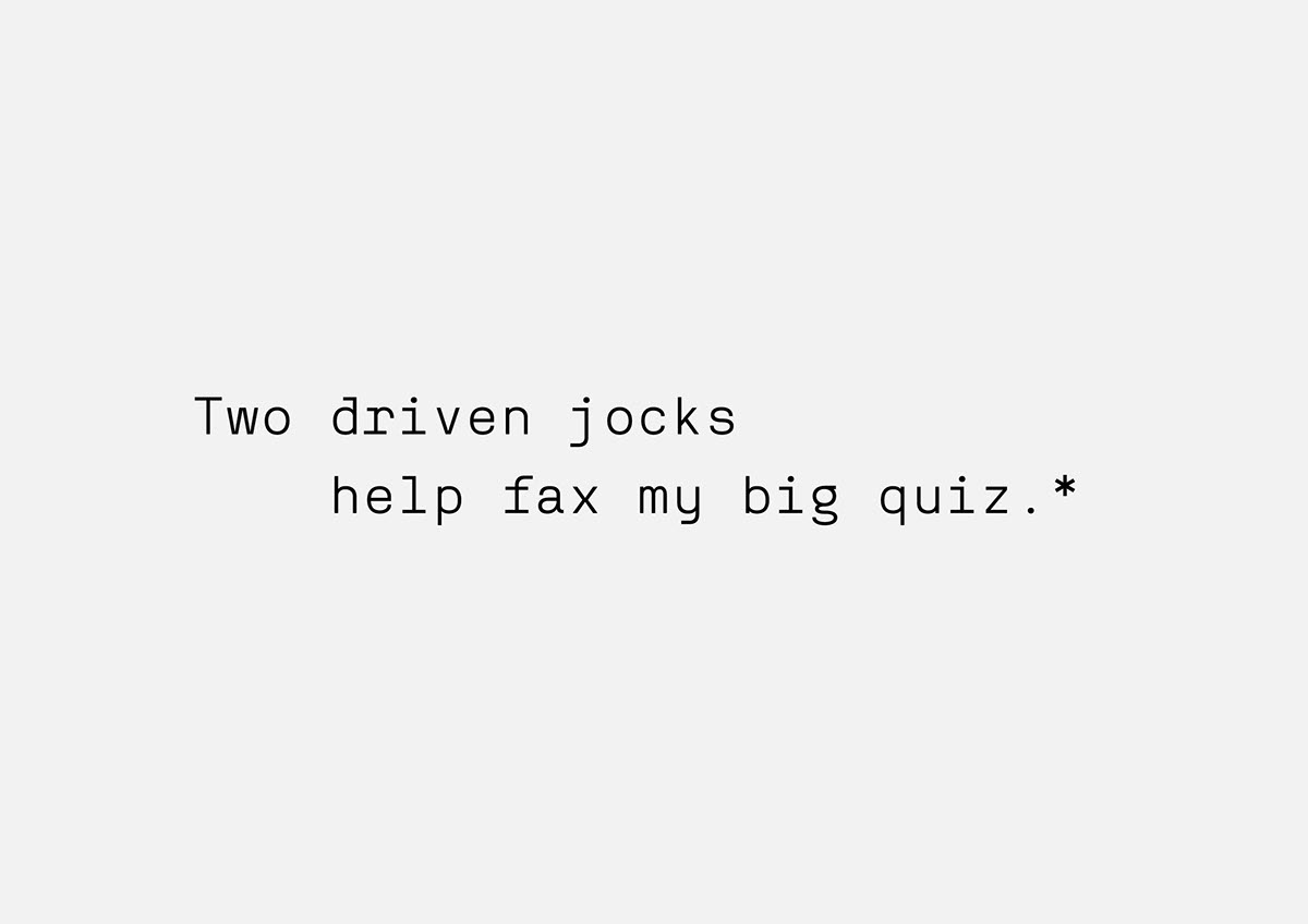
This is Reno Mono, a free, regular fixed-width font designed to be used as a webfont while also providing a memorable imprint when printed on paper. The mono-spaced and letter shapes rhythm allows for both warmth and precision while keeping an optimal readability in small screen sizes.

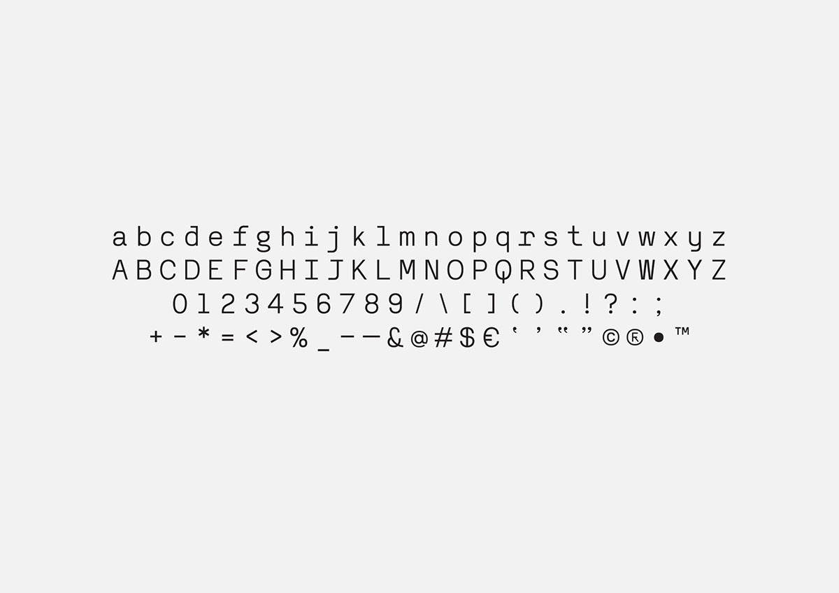
This minimal and contemporary font contained a very simple set of Latin characters. Symbols are stripped down singularly to keep a recognizable minimal feel.
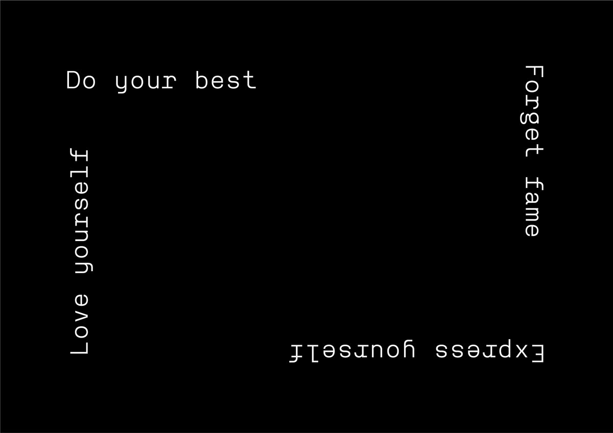
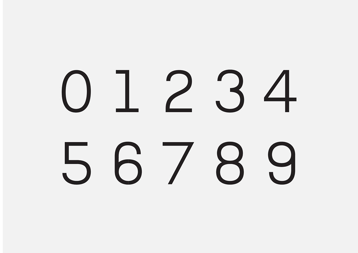

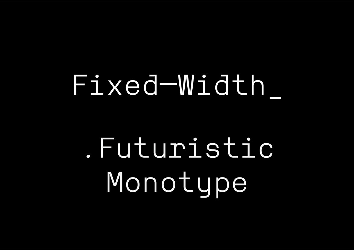
The fixed-width allowed to manufacture the font quickly. The features are classic yet different and combine influences from very standard old computer fonts with some more contemporary twists. It was important to me that the design felt unique yet very homogenous and neutral.
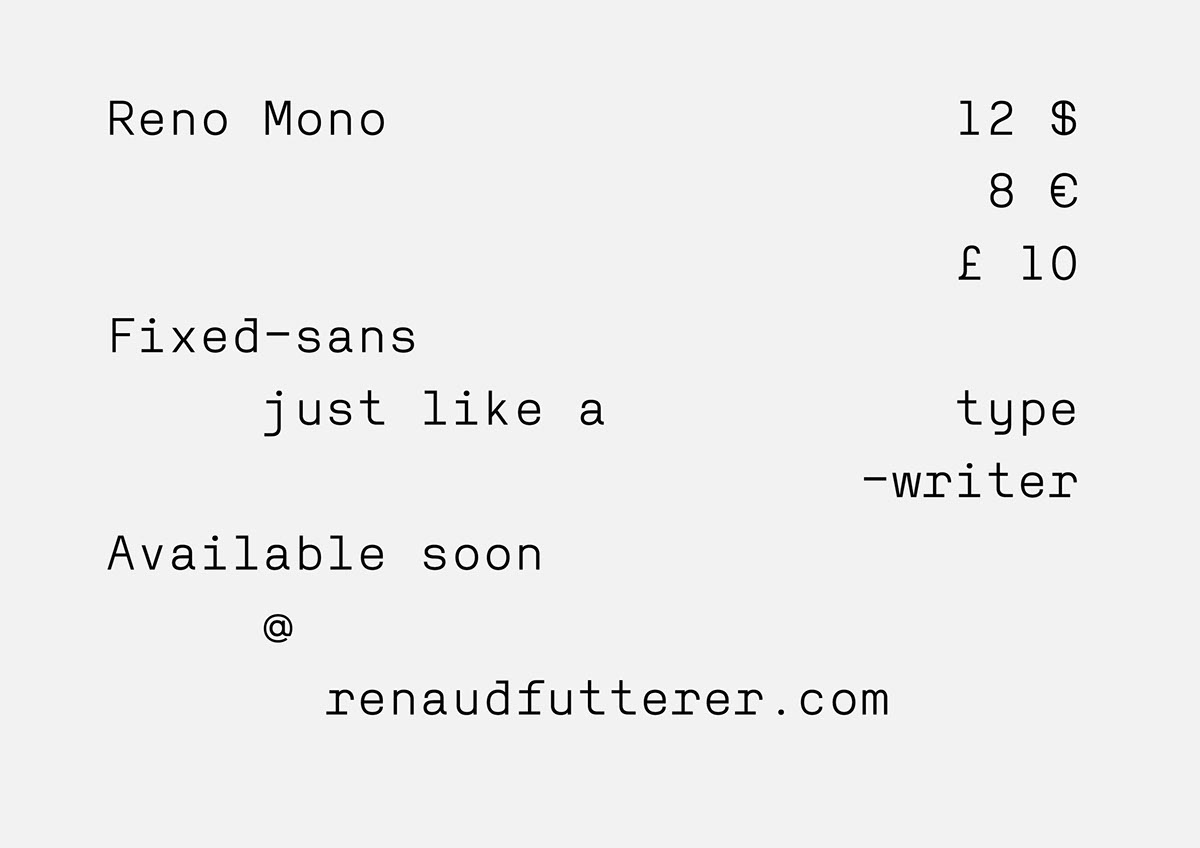

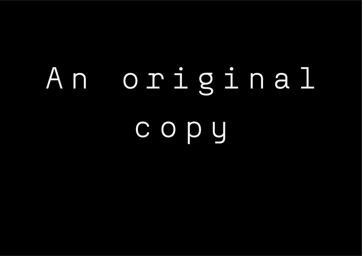
One thing that I love about mono-spaced fonts is that their aesthetics are always reminiscent of typewriters, making them feel a bit retro, especially in today’s digital age. The imprint cannot be erased and remind us of an obsolete and lost technology, this nostalgic feel is embraced and once printed on paper it give a charming impression.
The letterforms combine all the lovely features I observed in other fixed-width fonts and I wanted to appropriately merge them in Reno-mono. I wanted to be able to use it on various supports and media for my own corporate identity, Reno mono is my own take on a simple font and represents the values of consistency and precision I aspire in my own brand.