SPARK DESIGN SYSTEM
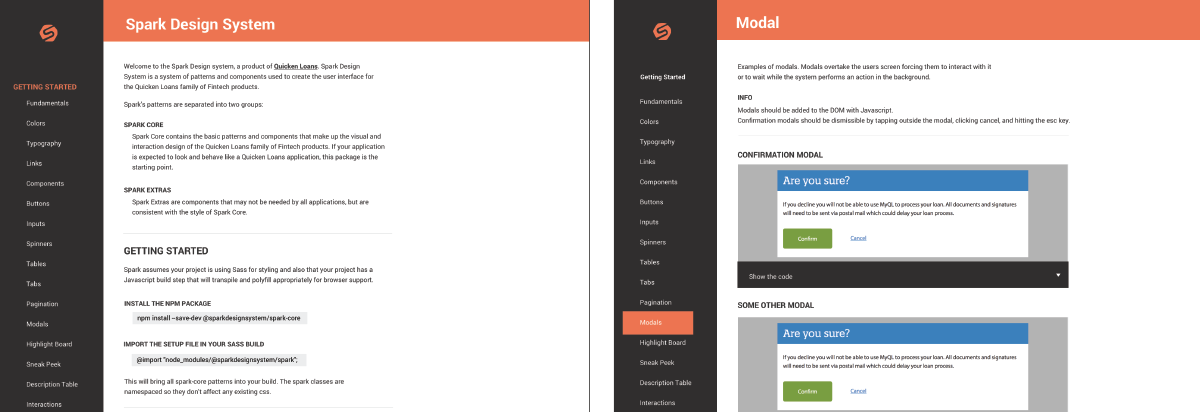
The Spark Design System is the homegrown source of truth for both designers and developers at Quicken Loans to use in constructing digital experiences that follow the brand guidelines as well as the best practices for user experience and development.
www.sparkdesignsystem.com
www.sparkdesignsystem.com
DIGITAL PATTERN LIBRARY
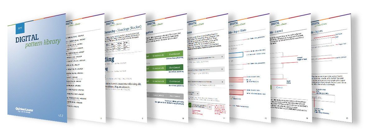
Before the design system was conceived, the teams first challenge to tackle was creating visual consistency across all client digital experiences at the Quicken Loans. To accomplish this, a small agile group of designers and developers was assigned to iteratively make decisions that would help bring all the visual elements inline. The way that this was accomplished was to create a sharable document to house all the visual decisions and the reasoning behind them. This was then distributed to all the teams responsible for creating a client facing experiences. This document housed a handful of the most impactful components, but was far from covering all of them.
Before the design system was conceived, the teams first challenge to tackle was creating visual consistency across all client digital experiences at the Quicken Loans. To accomplish this, a small agile group of designers and developers was assigned to iteratively make decisions that would help bring all the visual elements inline. The way that this was accomplished was to create a sharable document to house all the visual decisions and the reasoning behind them. This was then distributed to all the teams responsible for creating a client facing experiences. This document housed a handful of the most impactful components, but was far from covering all of them.
COMPONENT INVENTORY
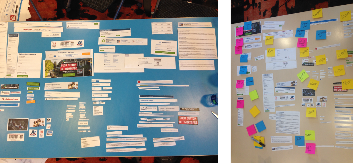
To take the digital pattern library a step further, a handful of designers and developers took a few days to take a visual inventory of all the client facing experiences. They printed out each experience and cut apart all the pieces of the site and started to group like components to start identifying patterns. The group then started naming each of the groups to create some of the earliest components. If there was a component that was only used once within all the experiences, it was set aside as a unique element for a particular experience and therefore may not be necessary to include in the system.
To take the digital pattern library a step further, a handful of designers and developers took a few days to take a visual inventory of all the client facing experiences. They printed out each experience and cut apart all the pieces of the site and started to group like components to start identifying patterns. The group then started naming each of the groups to create some of the earliest components. If there was a component that was only used once within all the experiences, it was set aside as a unique element for a particular experience and therefore may not be necessary to include in the system.
INITIAL COMPONENTS
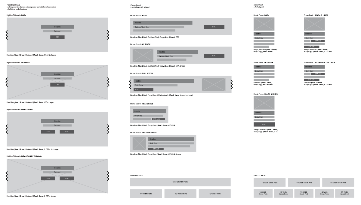
Once the component inventory was completed, a handful of designers took those findings and sketched out the components to determine how many variations were needed to satisfy all the needs across all the digital experiences. Those sketches were then translated into wireframes to quickly determine how many variations were necessary as well as to start seeing how the components worked together to craft a solution. Pieces of the documentation were starting to take form here as well.
Once the component inventory was completed, a handful of designers took those findings and sketched out the components to determine how many variations were needed to satisfy all the needs across all the digital experiences. Those sketches were then translated into wireframes to quickly determine how many variations were necessary as well as to start seeing how the components worked together to craft a solution. Pieces of the documentation were starting to take form here as well.
STRESS TESTS
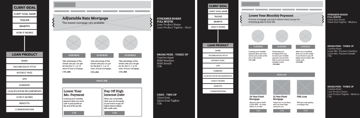
Using the components we hammered out, paired with the content strategists to stress test the components will the ever growing content taxonomy that was being written. I threw a few pages together and started tossing different content lengths in them to understand where the components can flex to accommodate and where they break. This helped immensely when expanding the documentation for these components.
SPARK DESIGN SYSTEM V.1
After all the research and validation had been done, it was finally time to build out the new design system. Our lead developer and myself paired on designing the new systems interface. From our previous iterations, we knew we wanted not use the design systems components to build the design system (as confusing as that is). With that in mind, we developed a brand for Spark Design System and used that visual language to build out the site that would house our company design and development recommendations.


