Each One Reach One
Design Brief:
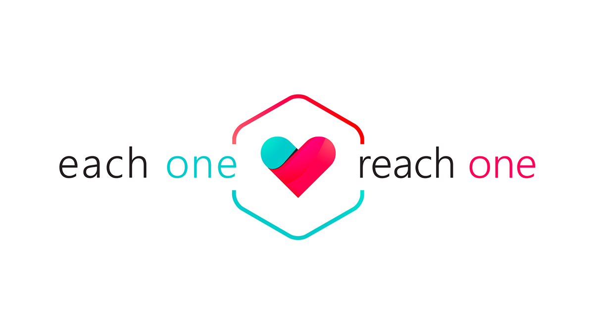
The concept behind the logo design for "Each One Reach One" is derived from love, compassion, and humility.
We wanted to show love but also demonstrate the sharing of love and compassion.
As we read left to right, the words pass through the heart. This symbolizes the process demonstrated by this organization. It appears as if the heart first received love, and then reached out to another and gave love.
Likewise, the top and lower marks demonstrate the cycle of giving and receiving from one end to the next.
COLORS
Turquoise- The color turquoise is associated with meanings of refreshing, calming, sophisticated, energy, wisdom, serenity, wholeness, creativity, emotional balance, good luck, spiritual grounding, friendship, love, joy, tranquility, patience, intuition, and loyalty.
Pink/Fuchsia/Red- These variations of the color pink represents caring, compassion and love. The pink color stands for unconditional love and understanding, and is associated with giving and receiving care. Since pink is a combination of red and white, both colors add a little to its characteristics.