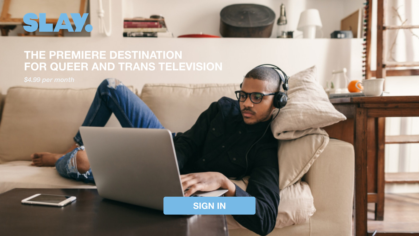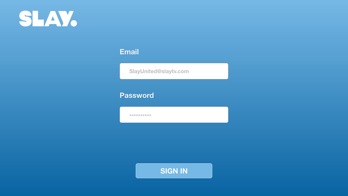
*NOTE: Sign In Below to Get a Feel of how the App Flows/Experience
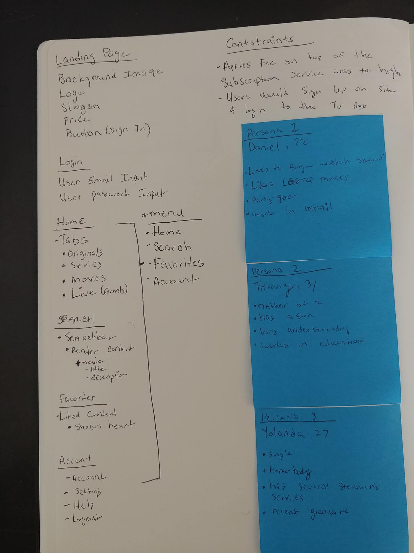
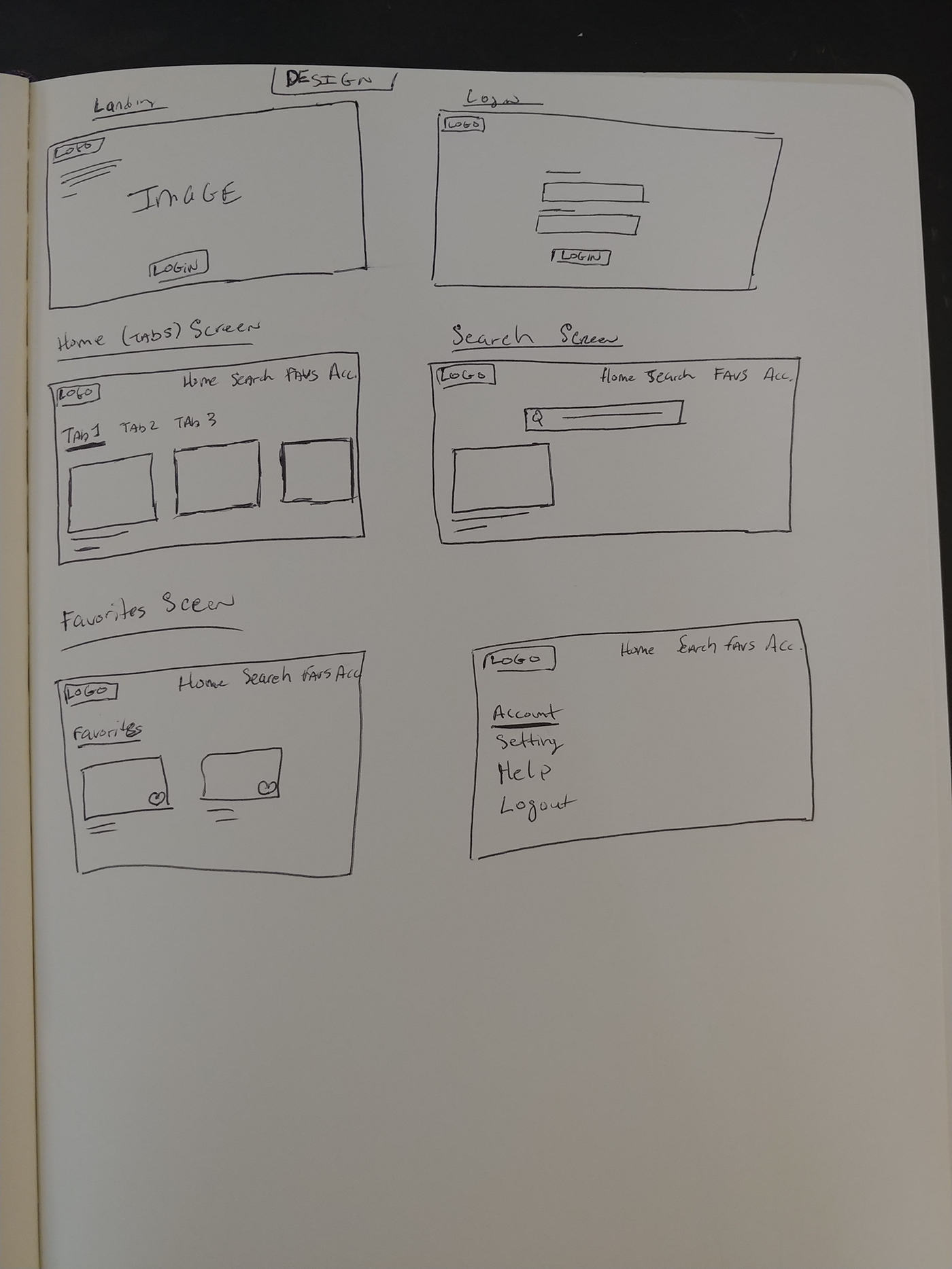
UI/UX Design Process:
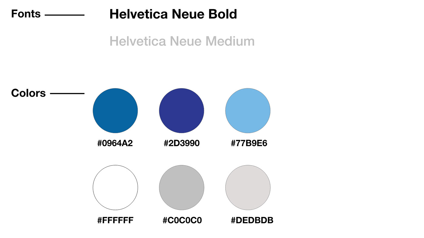
Fonts and Colors
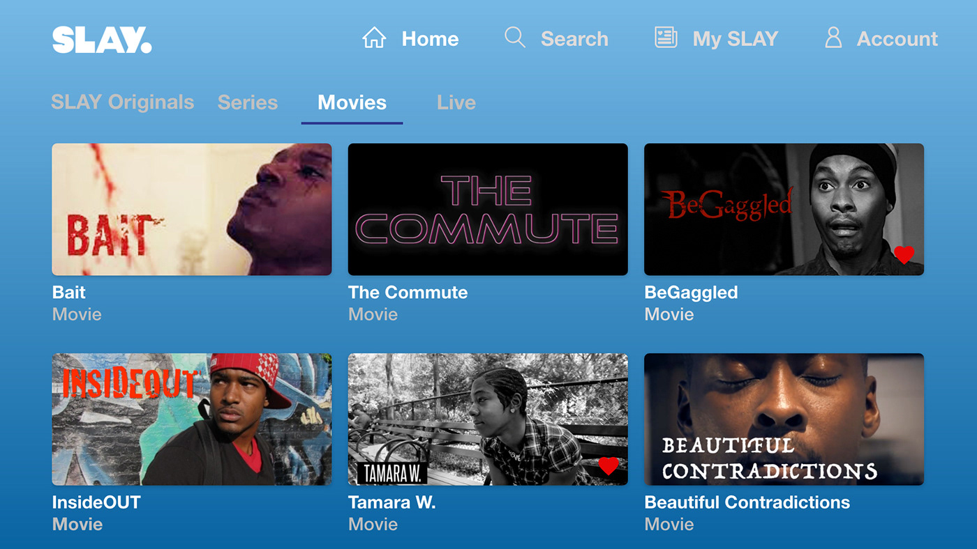
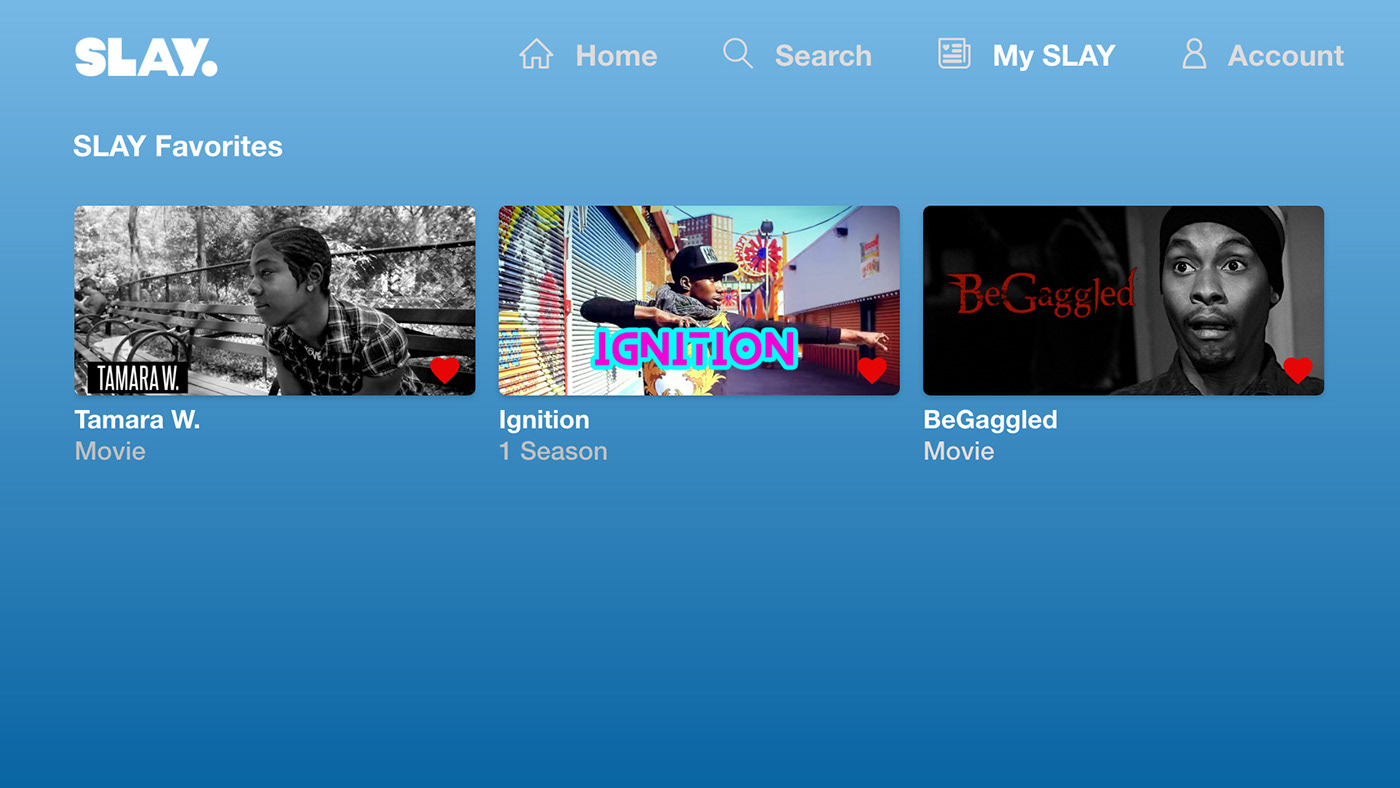
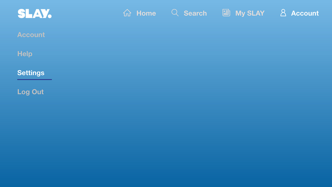
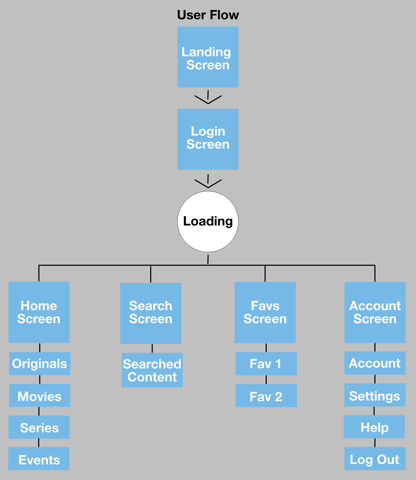
User Flow
Research
Comparative Analysis
I analyzed other content streaming app competitors as well as existing popular Apple TV streaming apps to see how they compare and to also draw inspiration.
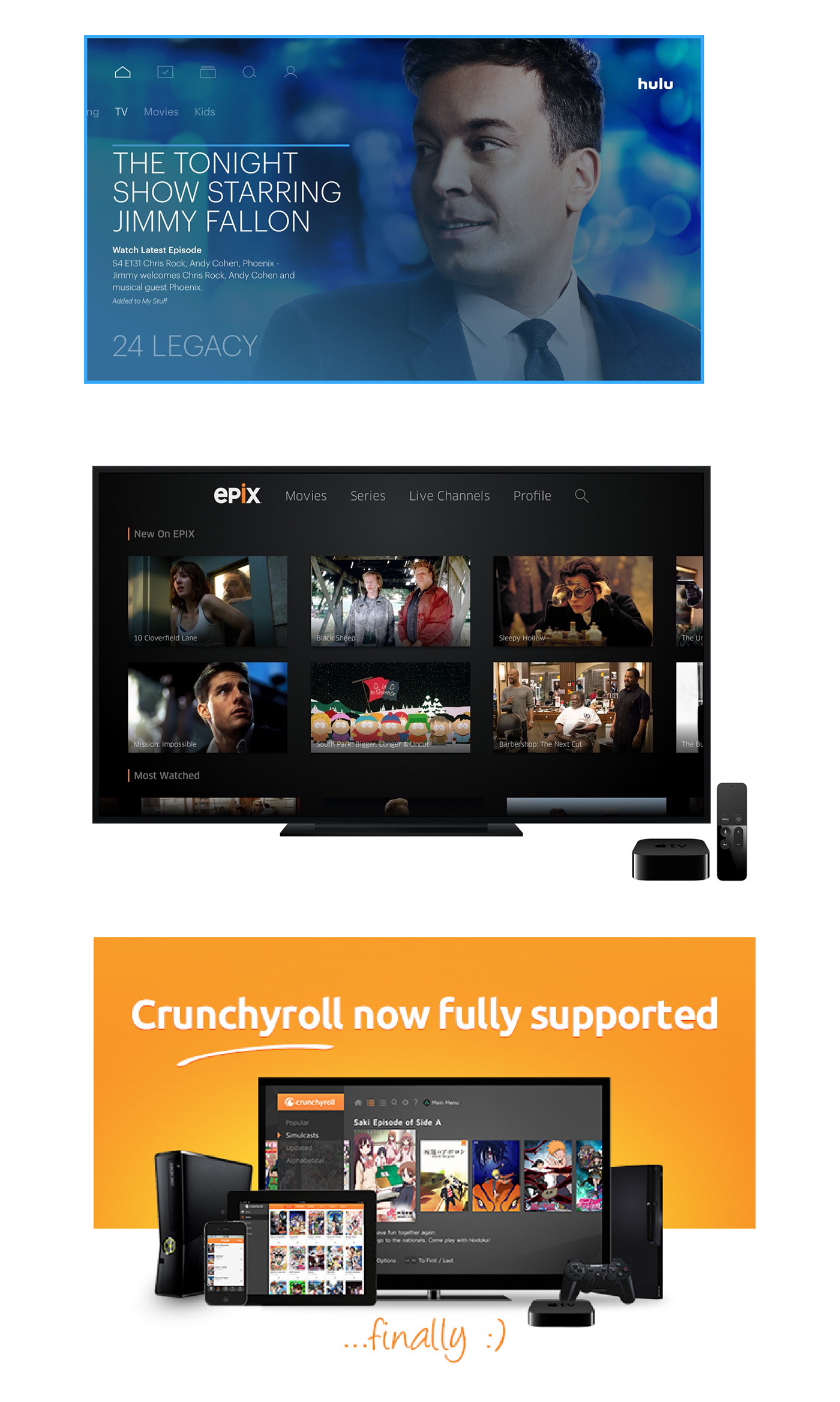
Comparative Analysis
I analyzed other content streaming app competitors as well as existing popular Apple TV streaming apps to see how they compare and to also draw inspiration.
TV/Media Boxes
I watched and read several reviews/walkthroughs of the Apple tvOS to gather info about its core features and functionality. I also read the Apple TV Human Interface Guidelines.
I took some inspiration from the universal search to implement in my search screen as well as scrolling.
I also did research on android's Material Design Guidelines to draw inspiration from how its menu is laid out and how the screens flow
User Interviews & Contextual Analysis
I interviewed and observed three Apple/Android TV users that also have subscriptions to the platform. I also asked several users would they like tablet apps for their iPad and/or android tablets. Another question was how would they feel if the subscription price was raised to offset the fees for apples payment processing.
Users Complaints/Requests:
The cost going up, Therefore subscription prices will stay the same and users will use the same login information as the website
The majority of the streaming apps today have some type of a "recently watched, watch next and or # of Episodes remaining" category. Users said they wished they could get this feature implemented on launch but would be fine if it was a "future feature".
Most iPhone users talked about having a tablet app so they can watch on the go or at work.
Most iPhone users talked about having a tablet app so they can watch on the go or at work.
Another feature several users wanted was a "Shows You Would Like", based on shows with similar actors/content.
A small percentage of users requested during the loading screen the would be greeted based on their gender (ie: 'Welcome Mr. Adams", "Welcome Tanya").