


In 2015, TRAVO reached out to me to help them design an easy-to-use product which is capable of managing multiple traveler profiles in one place, creating beautiful and functional itineraries, tracking and viewing all travel expenses and itineraries of a company's employees. Product design for a revolutionary travel management platform.
I've been working together remotely with their team for almost 3 years and it resulted in new friendships, and a product that helped planning trips easier for thousands of administrative professionals around the world.
In 2018 the product has been acquired, and I'm looking forward to see what new possibilities will bring once it comes back.
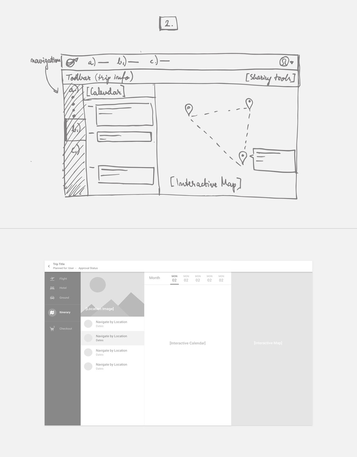
Information architecture
Information architecture was the first major UX hurdle because of the complexity of the product. We had to find a way to structure all the features of creating, managing, purchasing a trip and organizing profiles with related preferences and policies, while ensuring a simple and usable experience on every screen. This process required multiple rounds of prototyping and revisions, while we ended up on structuring the product in two main sections: 'Dashboard' and 'Trip Page'.


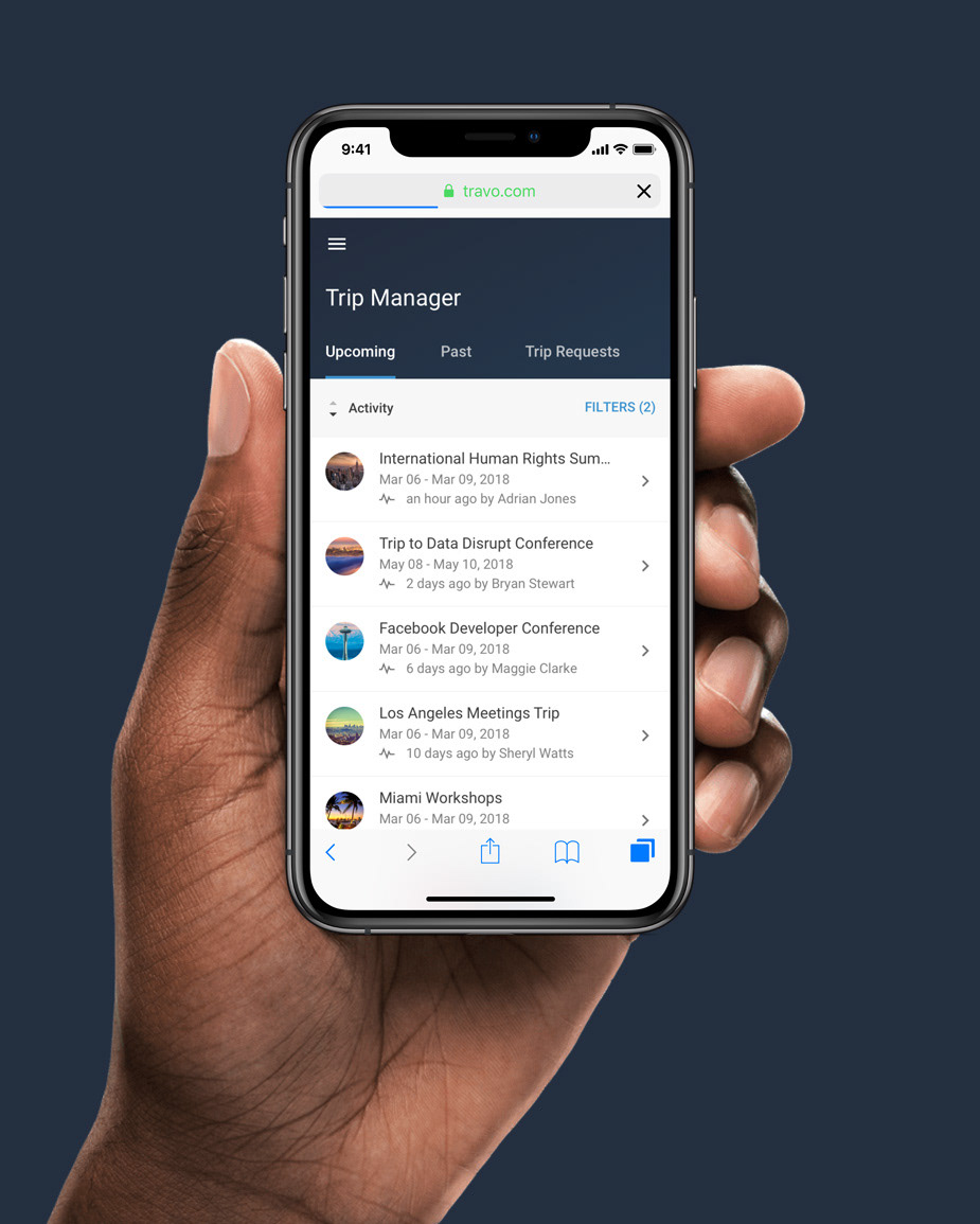
1. Dashboard
Plan new trips, manage traveler profiles (travel preferences, payment info, etc.), create and assign travel policies, manage organization settings, download reports, view upcoming trips.

Designing the possibility of creating and assigning travel policies inside departments was another major UX challenge. Instead of cluttering everything in one-place, we created two major components: Travel Policies – where admins can find every actions related to any travel policies (Creating and deleting policies, rules, edit policy violation settings) – and ORG Manager – where admins can manage every department and profiles inside the organization and assign policies to each departments / profiles OR the entire company.

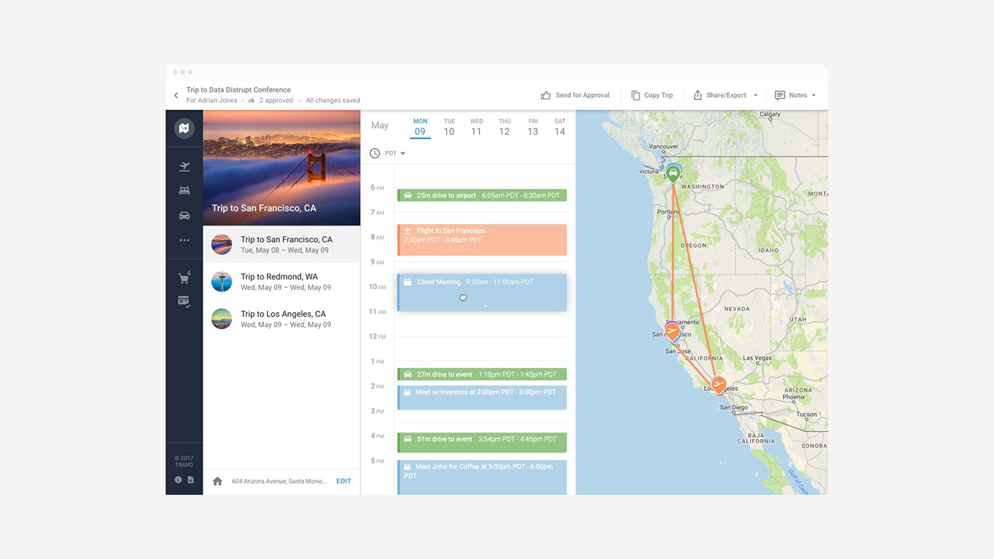
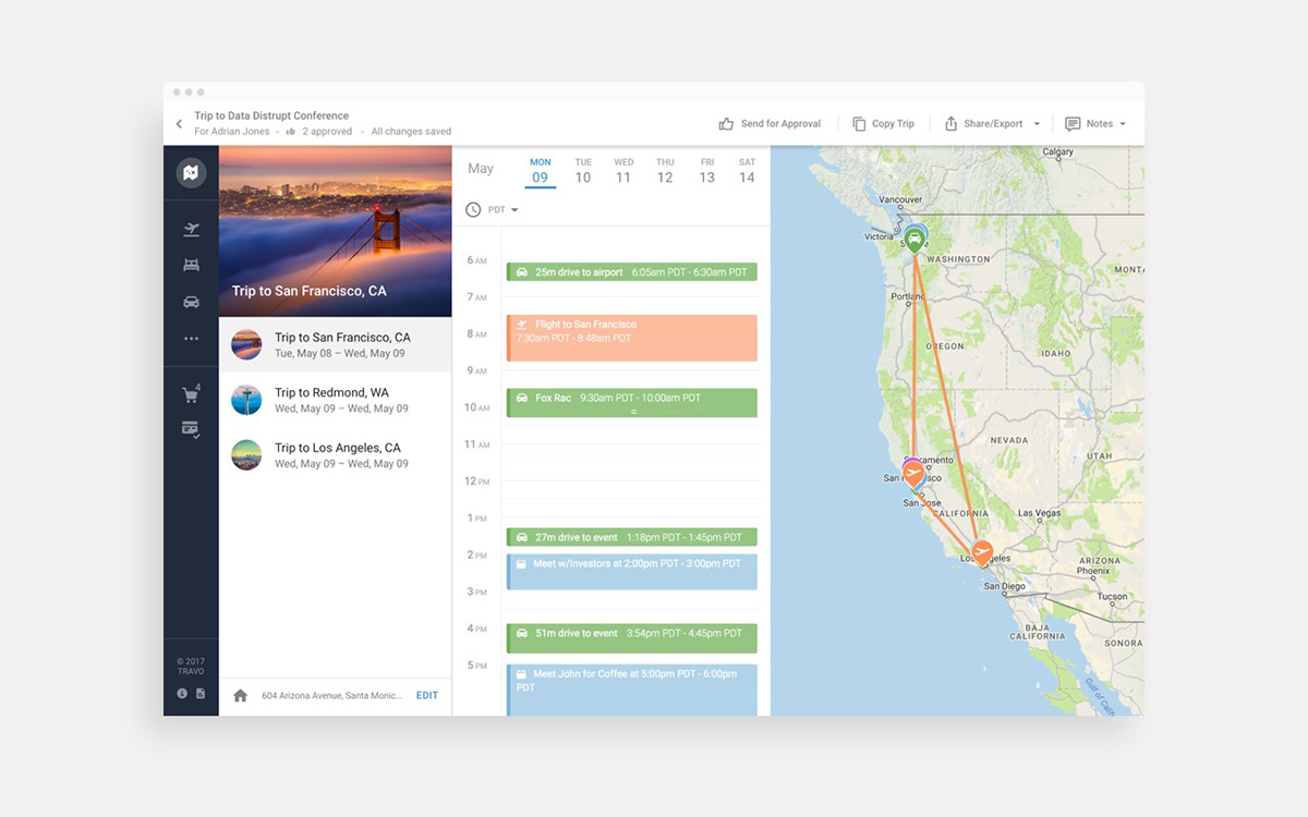
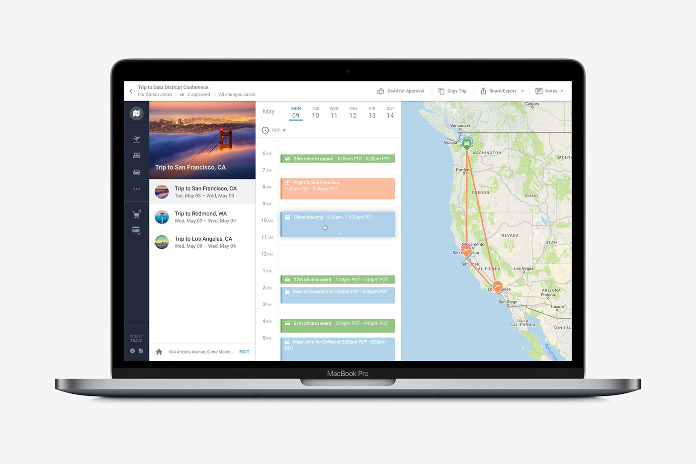
2. Trip Page
The second main section of the product is where you can view, edit, send for approval and purchase and end-to-end itinerary.
Loading time
Another challenge we had to solve was caused by loading time. When you start to plan a Full Itinerary, you type in an event's location and time, and the platform will search hundreds of flights, hotels, and ground options to this event, and automatically selects the best one based on your profile preferences.
This loading process takes up to 20-30 seconds, and we wanted to find a way to keep users interested in the meantime.
After we tried out couple of ideas (showing weather forecast of destination with fancy paper-plane animation / showing testimonials by advanced users, etc.) I came up with a solution that made possible with the help of motion and skeleton designs to educate the user in the time of loading about how the platform works, and this way when they landed on the page they were are already familiar with their selections to the trip (automatically added to shopping cart), and the structure of the trip page.

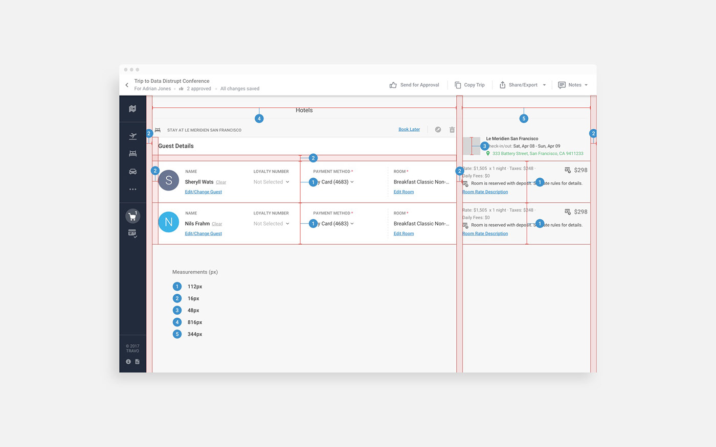
Checkout
To keep user's trust when they are in the process of booking, we needed to come up with a way to organize all the important content they might want to see (type of bookings, locations, price, exact dates, credit card information, guest details, etc.).
To do this, we used wisely every pixel and managed to work out a balance to avoid their cognitive overload.
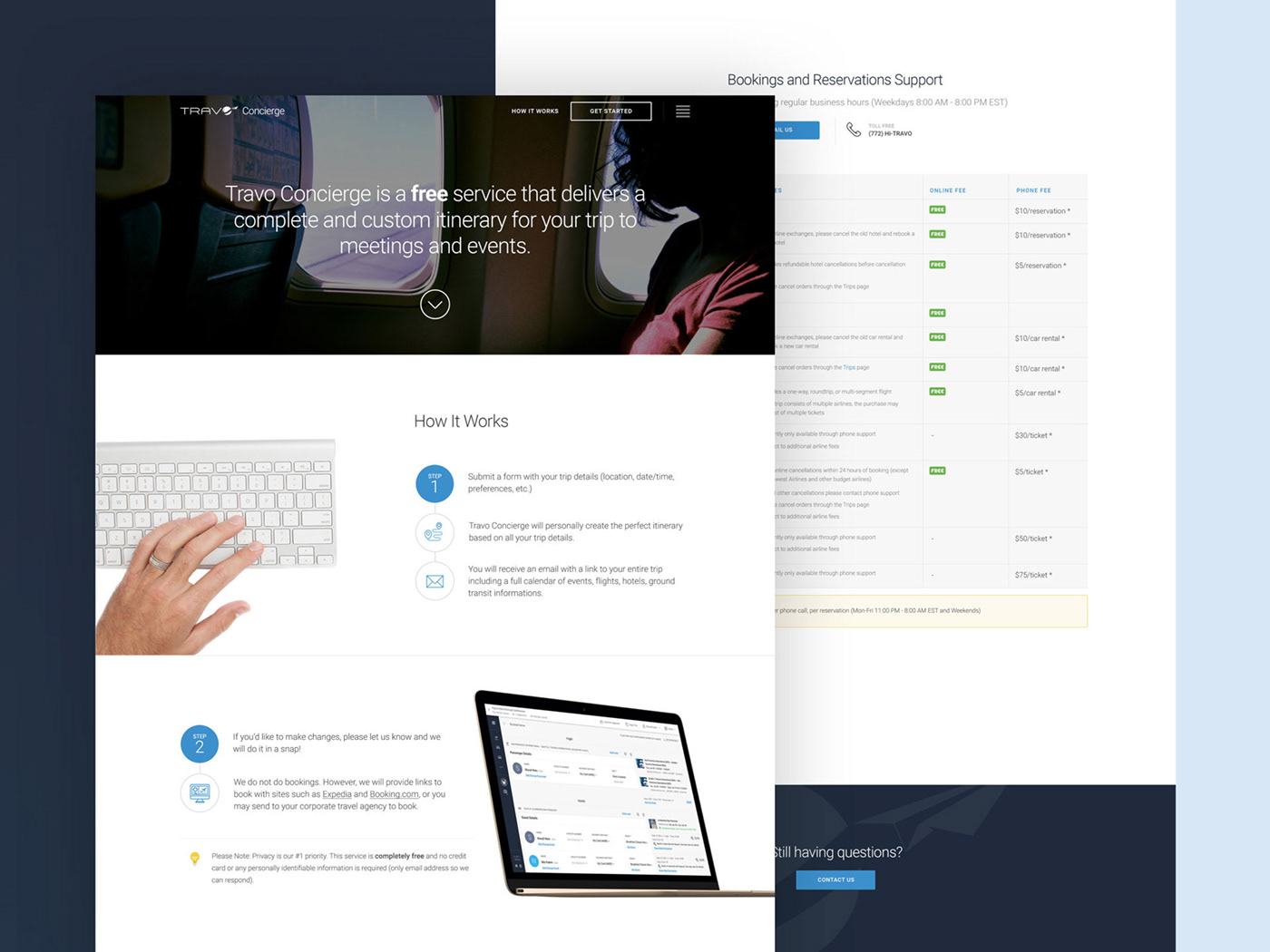
Web Design, Marketing Materials
There were lots of revisions for landing –, support – and pricing pages over the years. Here are a few.


Thank you!
To Tae Lee, (Founder CEO - TRAVO, INC.), and to all the amazing people who I have worked with on this project.
Involvement (2015-2018)
Information Architecture
UI / UX Design
Web Design
Marketing Materials / Print Design
UI / UX Design
Web Design
Marketing Materials / Print Design


