
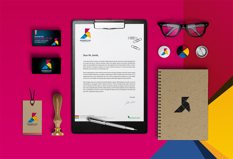
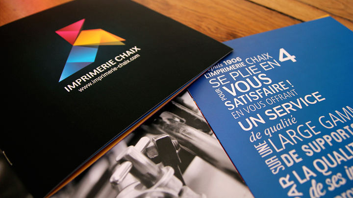
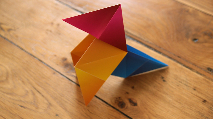
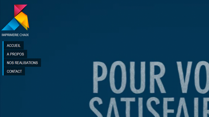
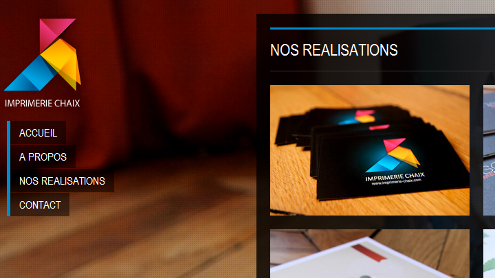
{ Visual identity & Branding for Imprimerie Chaix }
I created this logotype and branding for a french off-set printer.
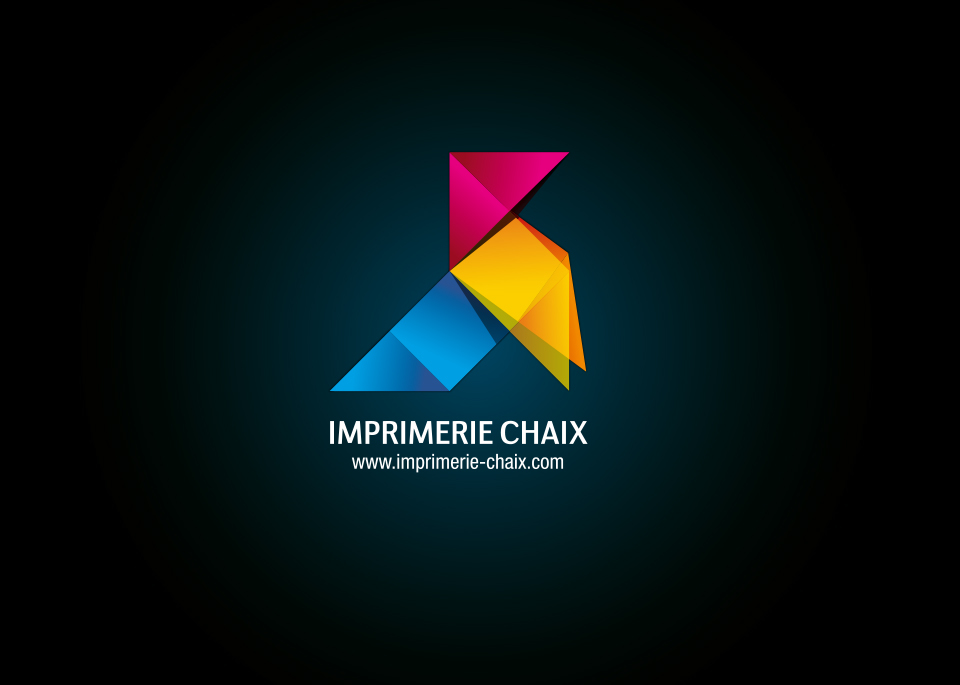
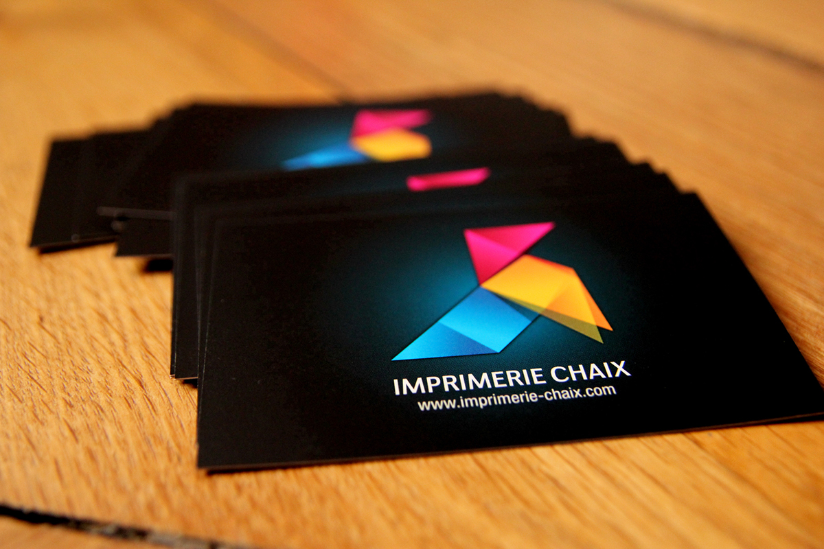
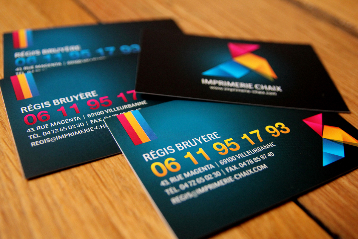
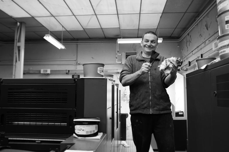
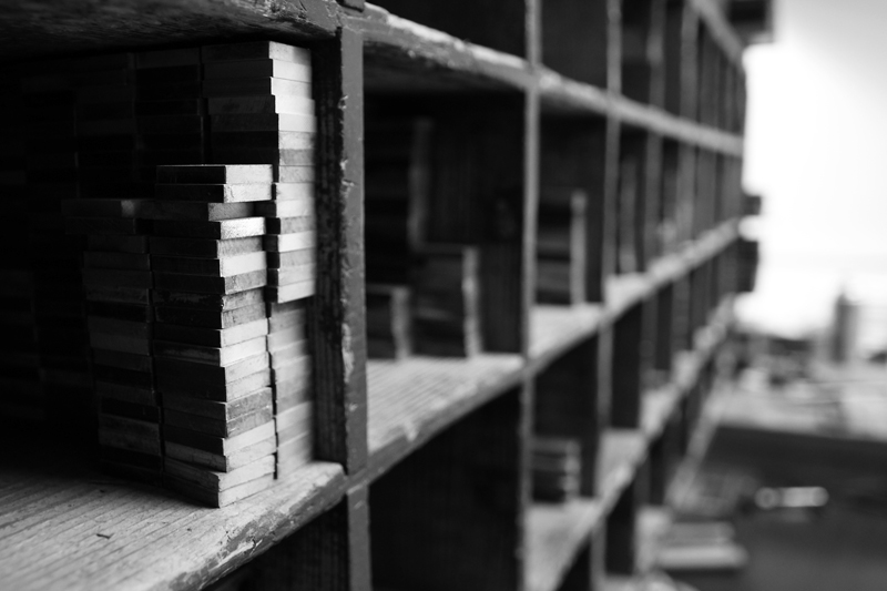
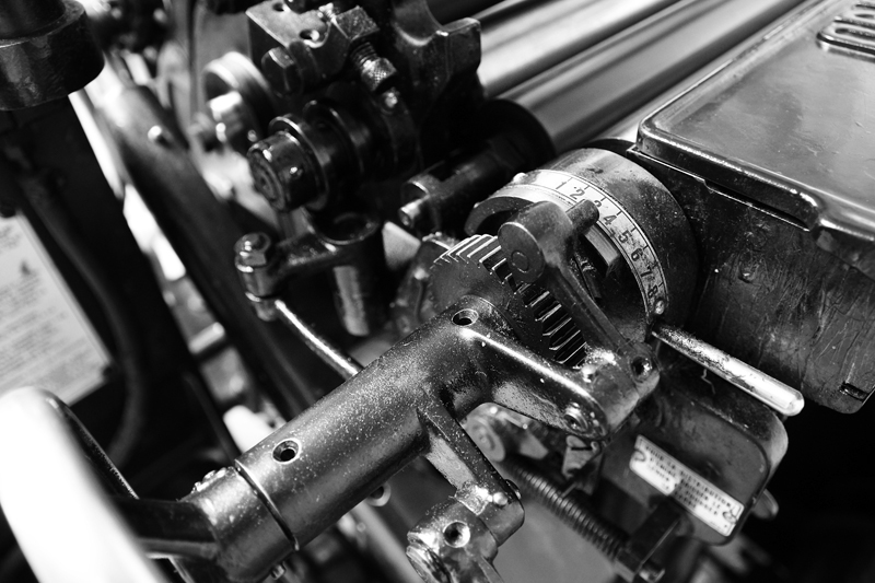
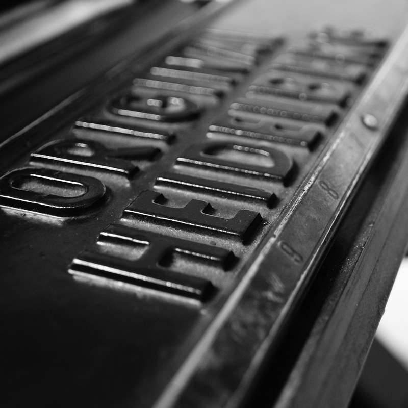
I wanted to represent a symbol that we all have in mind when we think about print and paper. So I decided to work around the origami style concept. As the Chaix printer's exists since 1906, I wanted my logo to bring us back to childhood, family feelings, something reassuring. The bird we all created as a child seemed the proper choice to me. I created many branding media, such as brochure, business cards, wishes card, webdesign, and a photo-reportage.


THANKS FOR WATCHING!

