Spex
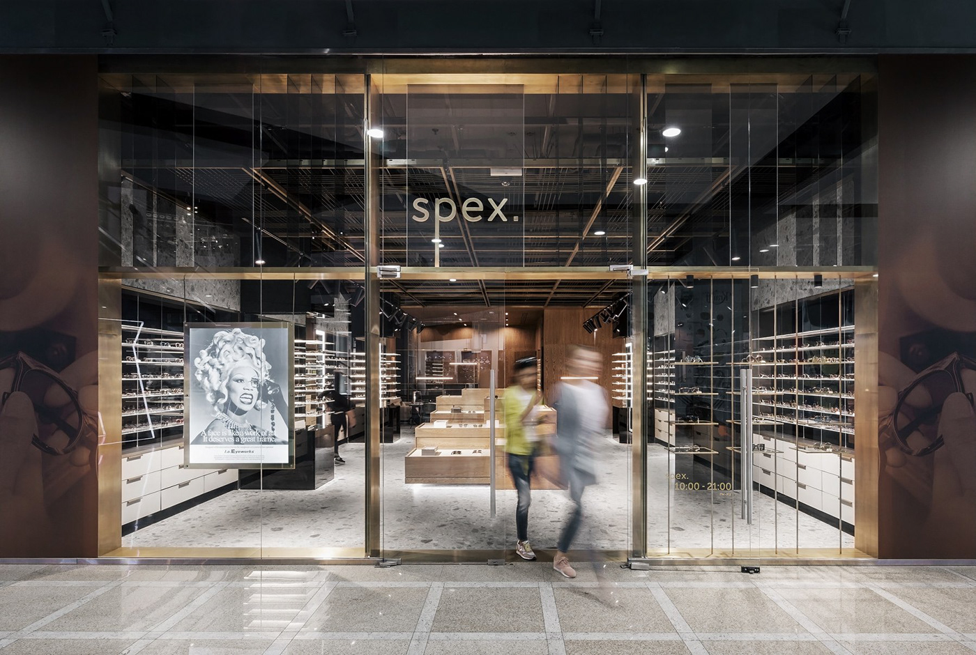
It is focused on wealthy and high status people niche optical store. That is why the identity has to be matched with product's premiality and positioning of the brand.
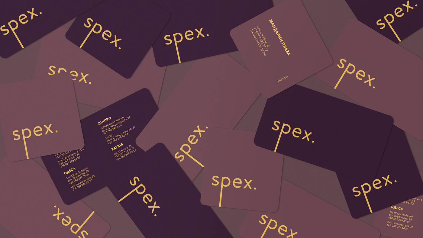
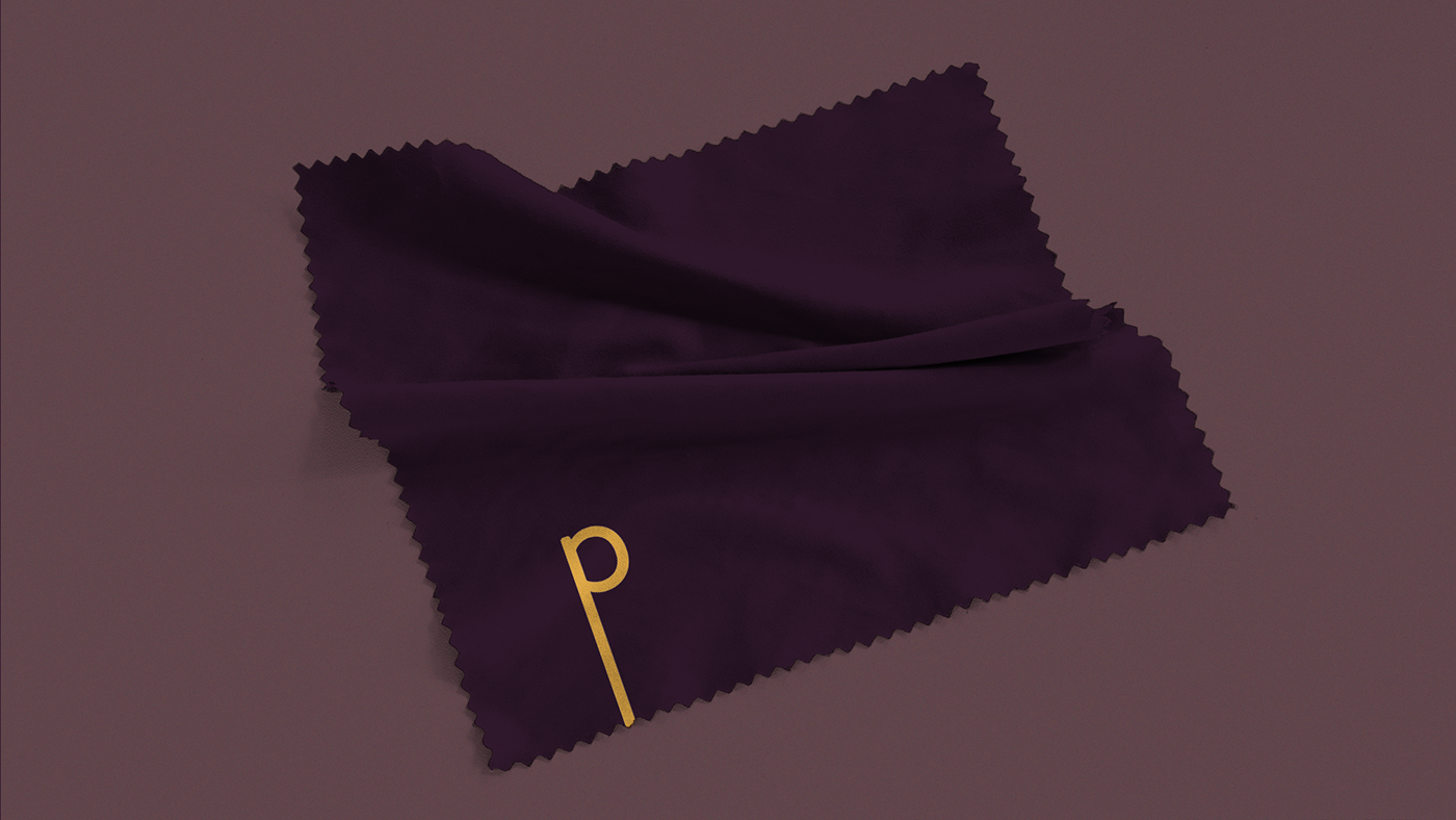
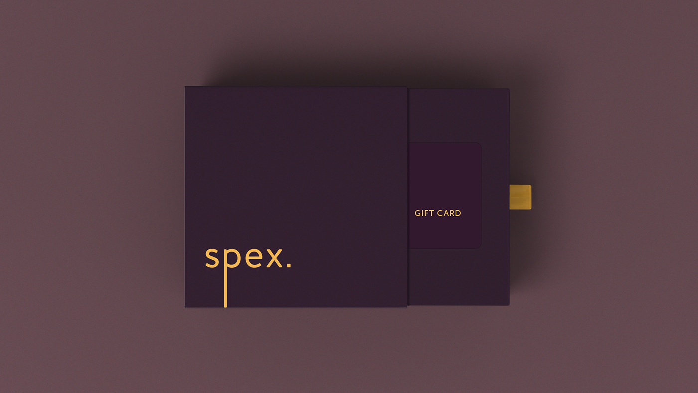
We have used a text symbol as the main logo and it’s most recognizable element have been used as the abridged version of the logo.
Also, we used a visual language of minimalism and forms simplicity, though the color scheme gives us a clear view of premium product segment on the market.
An award winning project - Ukrainian Design The Very Best Of 2018.


Thanks for watching

