Mix Eat
San Pedro Garza García, México
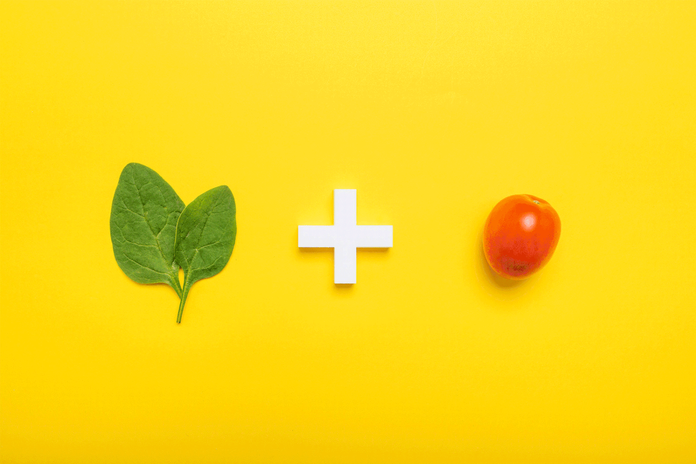
"Romper con la monotonía" fue una de las primeras frases que mencionó el cliente al solicitarnos crear el concepto integral de una barra de ensaladas premium; la frase se transformó en un mantra para la creación de la marca, comenzando por el nombre, derivado del juego de palabras mix e eat, resultando fonéticamente en la palabra mézclalo en inglés, permitiéndole proclamarse como una marca memorable y fácil de posicionar como una alternativa original en contra de los estereotipos asociados a las marcas de comida saludable.
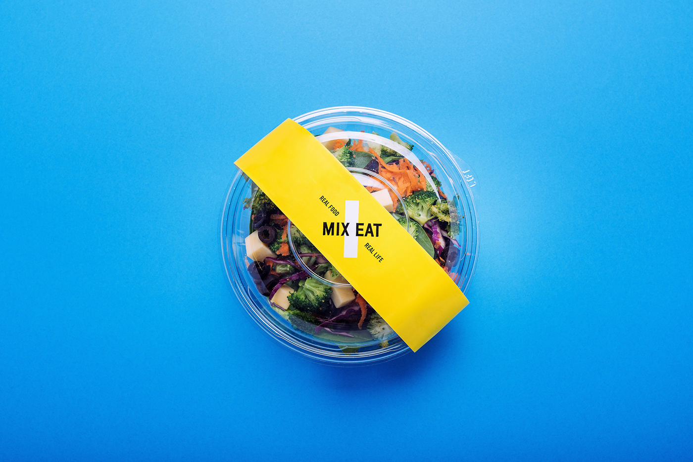
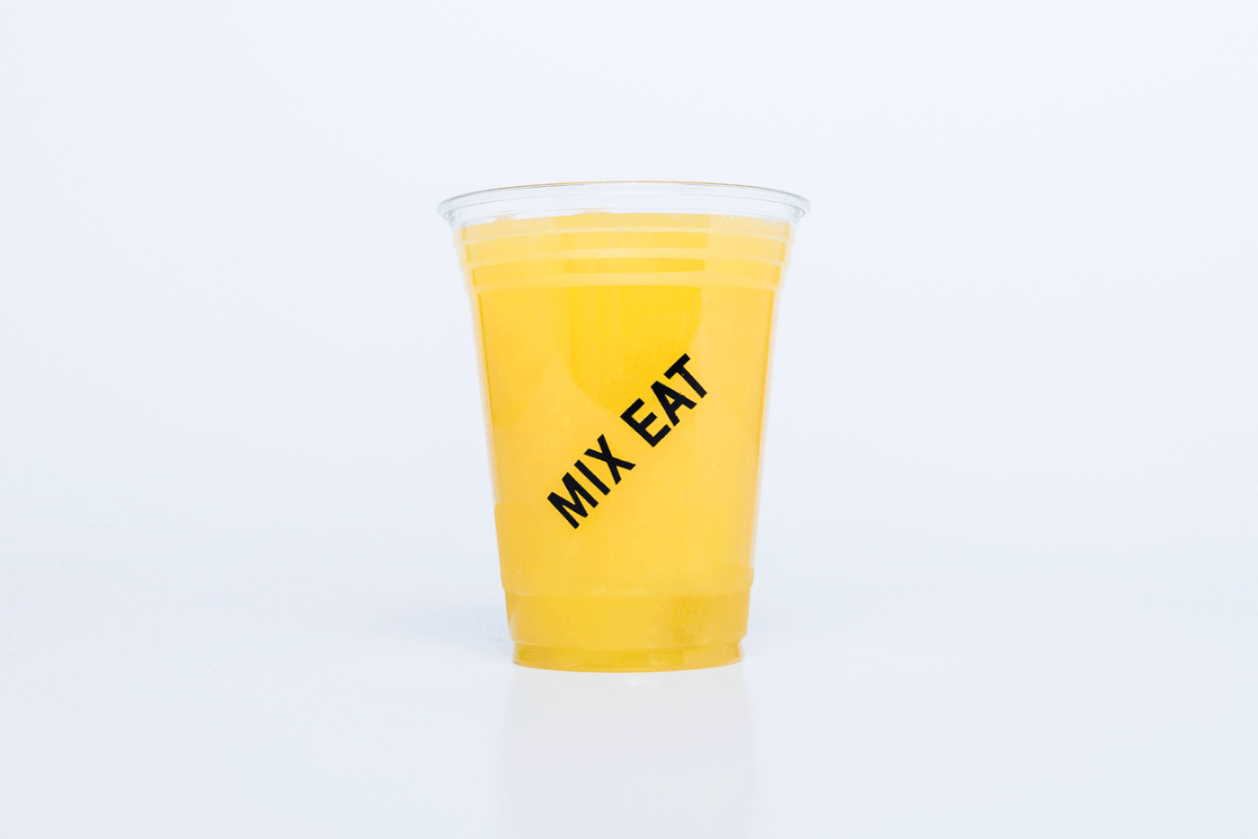
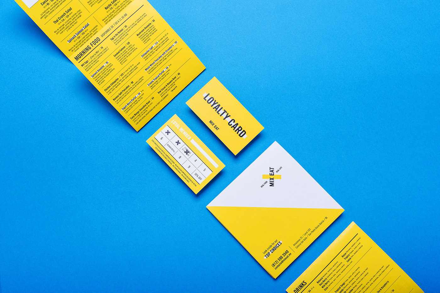
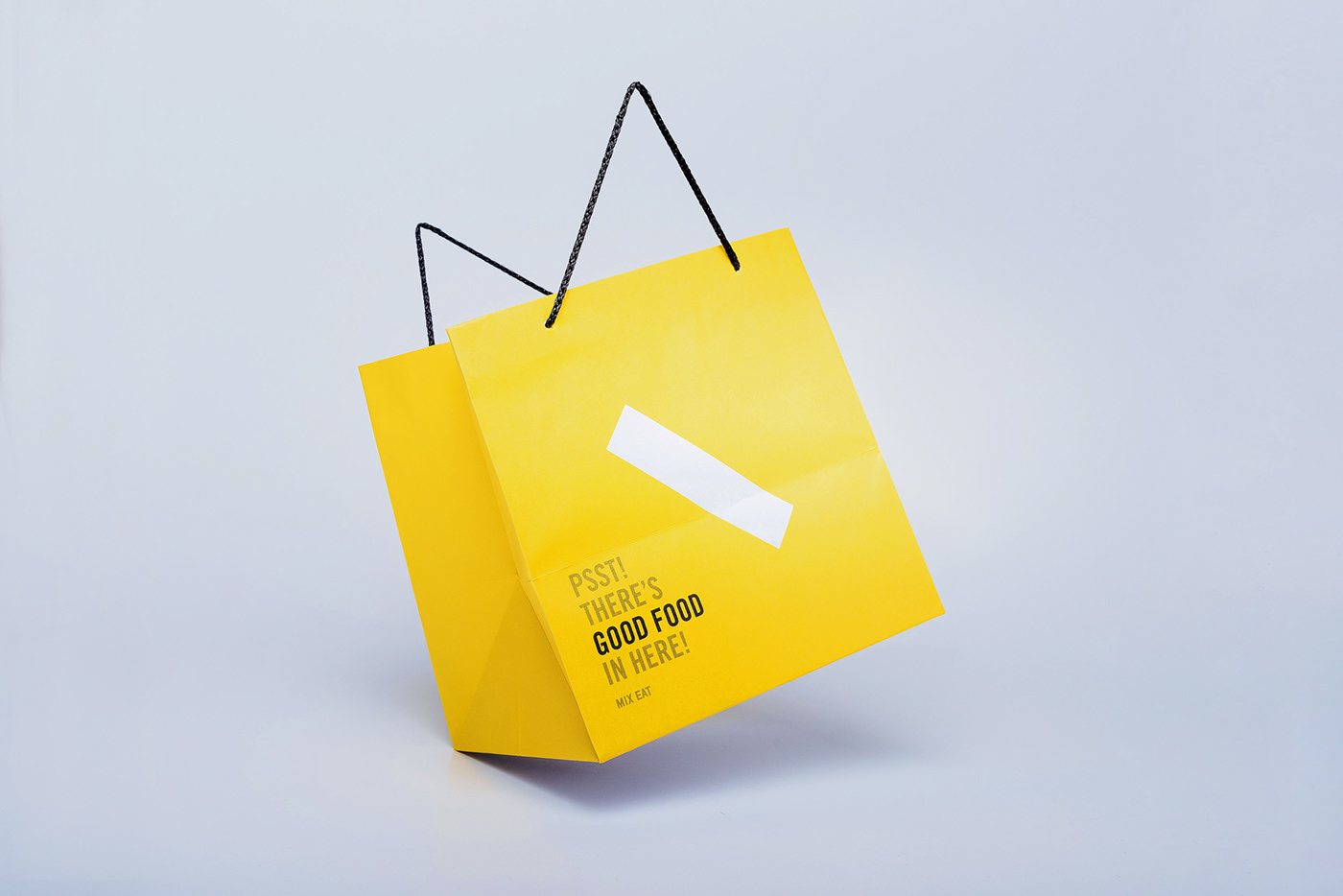
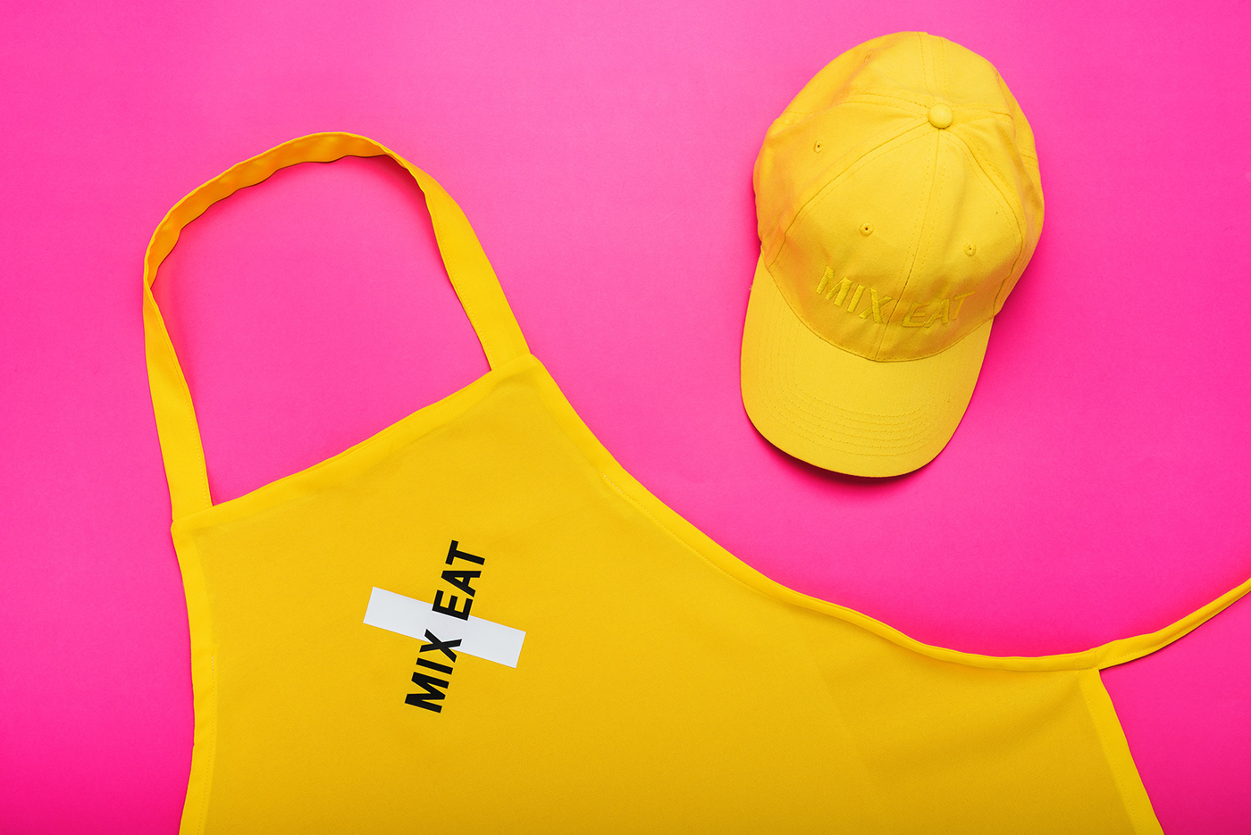
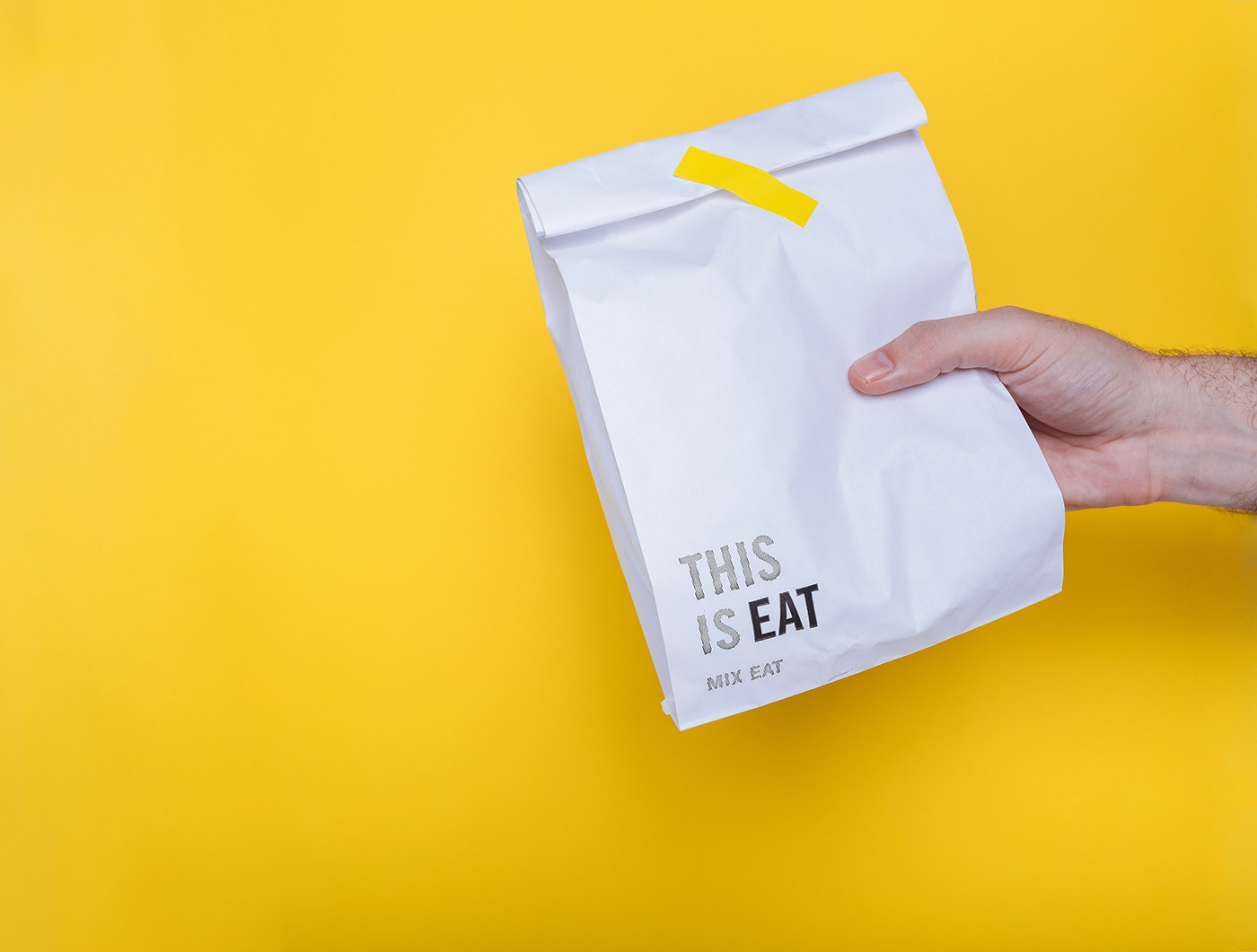
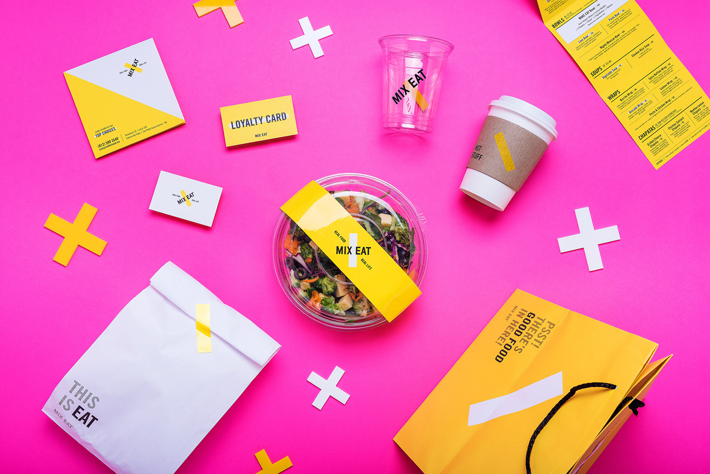
Esto, alineado a una propuesta fresca del diseño de interiores, con espacios funcionales y un toque de sorpresa, fueron los elementos clave para el desarrollo de la identidad visual, en donde el logotipo está compuesto por el wordmark de MIX EAT que se superpone al slash amarillo, representando un cruzamiento, lo cual en conjunto evoca los conceptos de mezcla, punto medio y balance. La X se convierte en el elemento más reconocible, con la ventaja de ser una figura poco explotada en el sector alimenticio, ayudando a destacarse de la competencia y posicionarse en la mente de los consumidores.
"Breaking the monotony of life" was one of the first things that the client mentioned when he asked us to create an integral concept for a new premium salad bar. This phrase became our mantra for the project, starting with the name, which is a wordplay on the fact that mix and eat together sound exactly like mix it; the incentive to choose ingredientes and blend them together to create a unique salad or dish. The brand poses a fight with the stereotypes associated with healthy food places.
Together with a fresh take from the architects' interior design of the place, with functional but surprising spaces, the key elements for the graphic style of the brand manifested through a main logo that overlaps the wordmark with the yellow slash, like a cross, referencing the concepts of blending, midpoint and balance. The "X" becomes the most recognisable element, with the advantage that it is an overlooked shape on restaurant-branding, helping MIX EAT stand out and easily position itself among consumers.