While Dr. Smoothie has been a staple in the healthy smoothie market for more than 20 years, their brand identity was failing to properly represent the freshness, deliciousness and innovation that they uniquely bring to bear in their full-line of beverage products. The time had come to signal a change in ownership and a fresh commitment to creating quality, healthy products that today’s consumers need.


Working with their marketing team, we went through an extensive on-site brand strategy session in which we clarified and defined the audience, brand personality, competitive advantages, as well as the emotional and functional product benefits.
One of the primary drivers for how the refreshed brand would look and feel was the Brand Archetype of Explorer. Throughout our discovery process, we collectively decided the Explorer persona best represented the ethos of the brand: adventurous, resilient, upbeat, non-conformist and independent. This proved to be a cornerstone of our voice and design decisions throughout the project.
One of the primary drivers for how the refreshed brand would look and feel was the Brand Archetype of Explorer. Throughout our discovery process, we collectively decided the Explorer persona best represented the ethos of the brand: adventurous, resilient, upbeat, non-conformist and independent. This proved to be a cornerstone of our voice and design decisions throughout the project.

When it came to the logo and visual identity, we knew we wanted to stay with the color red and within the script family for type in order to take advantage of the brand equity that had been built in the marketplace for the past 20 years. We also knew the brand deserved custom handlettering, not a pre-built font.
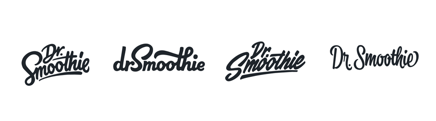
Here are the first round concepts we presented to them:
We also provided several design directions for the packaging art direction and worked through some revisions and iterations with the client’s full internal team as we progressed toward the final label design.

After a few rounds of design exploration, we moved settled on a general look and feel for the labels, along with a flexible yet cohesive design framework for executing the sub-brands and label designs for the variety of Dr. Smoothie products. Here’s a mockup of the final label designs:


From there we were ready to start creating all sorts of brand collateral, from tradeshow booths to in-store signage and display systems to a website homepage and some merchandise. Here’s a photo of the tradeshow booth we designed for them:


In addition to the primary logo, we created a secondary mark that could be used throughout the new materials as something of a stamp or badge. This fell right in line with the Explorer archetype and gave them an opportunity to use an interesting design element to reinforce the brand personality in creative ways. Here’s how the secondary mark progressed, and where we landed with it:

Throughout this process, we created and continued to add to the Brand Style Guide, which serves as somewhat of a brand bible for all the essential brand information and execution guidelines. This gave the client a living document that ensured all future materials can be crafted consistently and remain on-brand, ensuring the Dr. Smoothie brand awareness and equity continues to gain momentum. Here are a few quick screenshots from their robust brand style guide:


Twitter header example


