

SKAI GMBH
corporate design and website relaunch
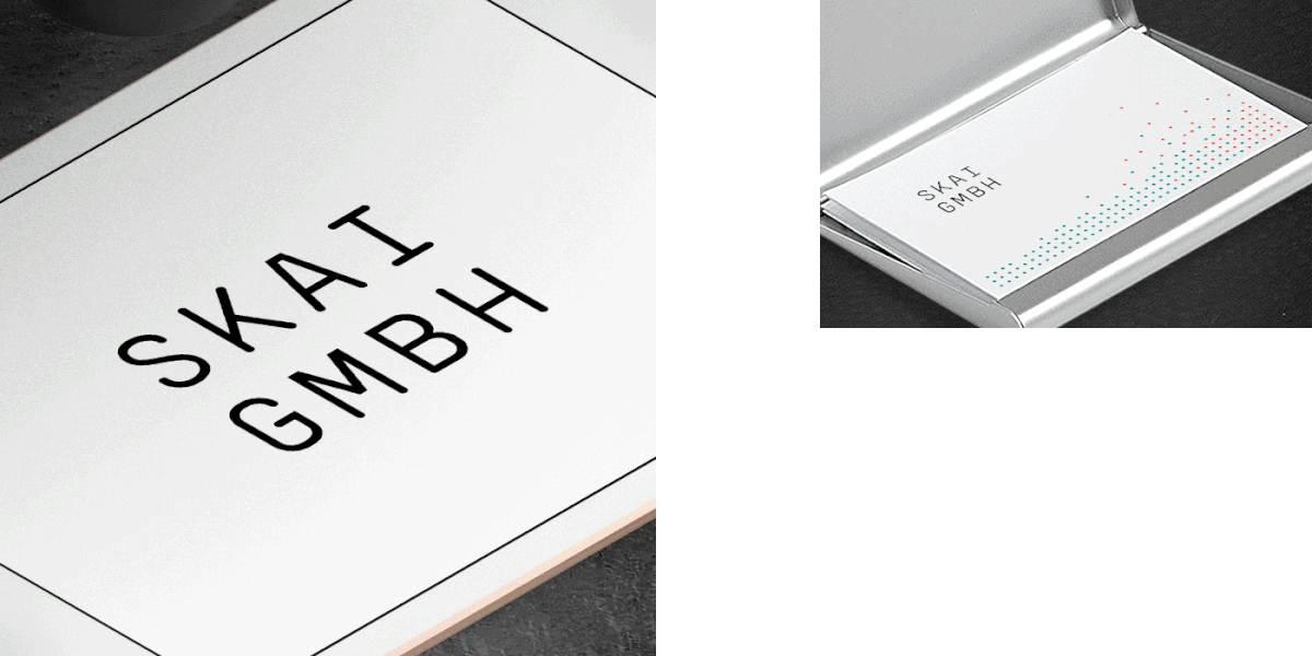
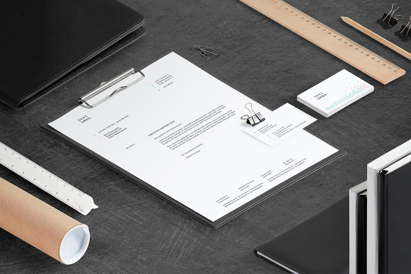
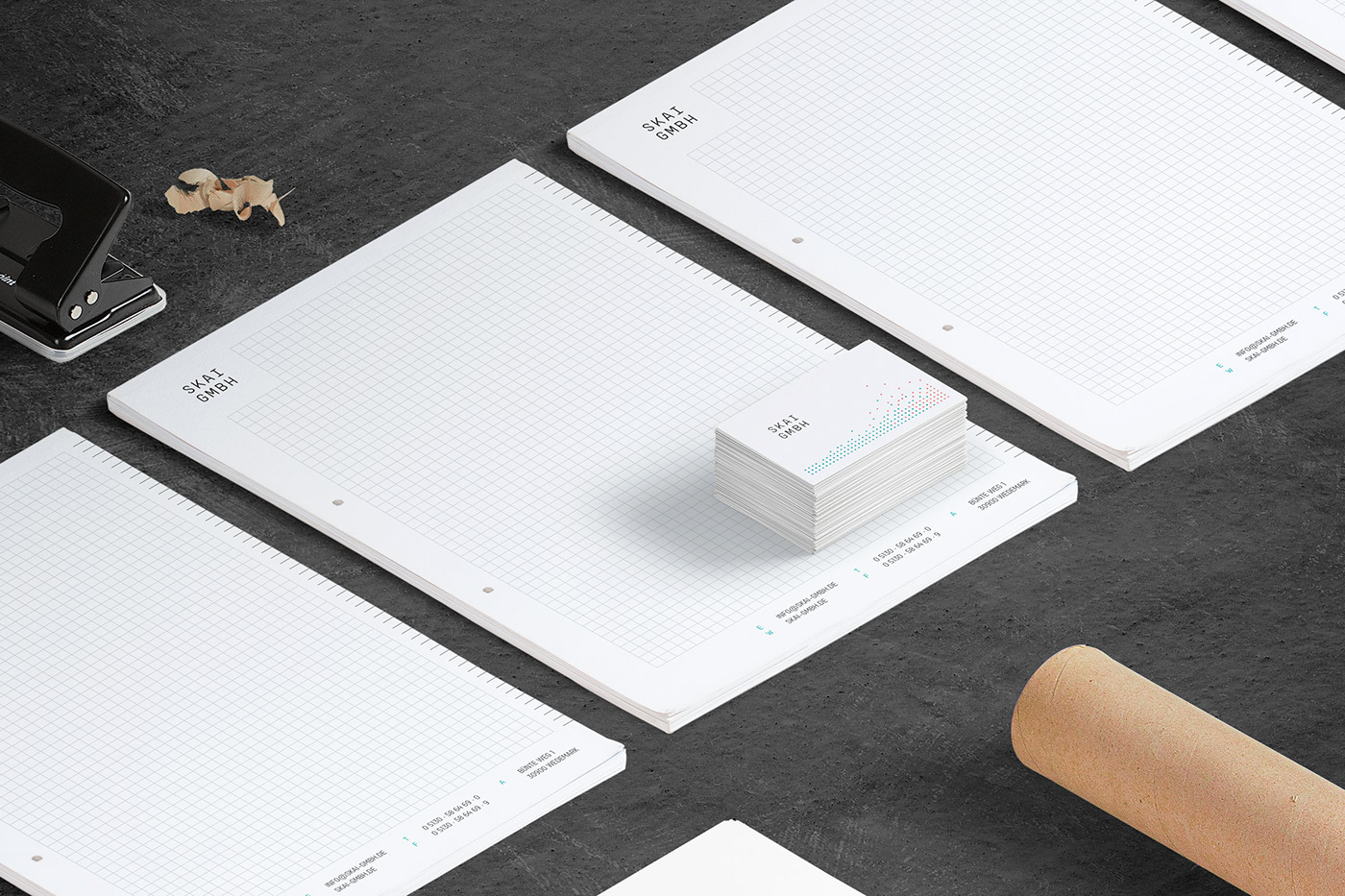
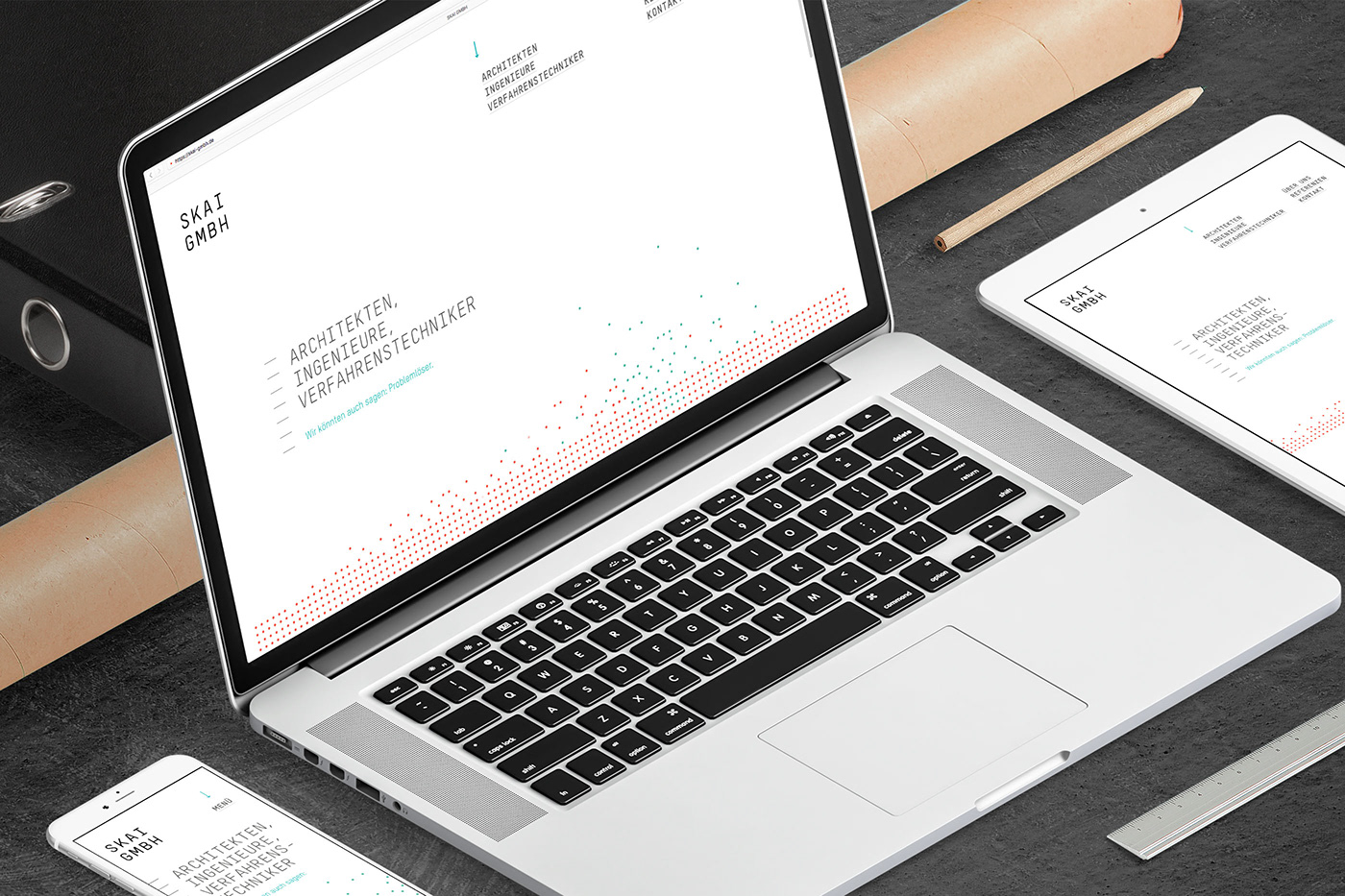
This minimalistic and unique corporate design is based on a very strict grid. Primarily black on white, two accent colors are used. The resulting lightness is accompanied by the technical but beautiful T-Star font family. Working in architecture and engineering, the mono space font perfectly fits the projects of SKAI GMBH. Their new website is a custom-made, flexible and module-based solution, featuring a responsive layout which looks great on all device sizes. The overall understatement can be felt everywhere from business cards and custom icons to smooth svg animations. Take a look at skai-gmbh.de


Thanks to everyone at SKAI GMBH for great teamwork, to Johannes Buchholz for working with me on the design, Michael Hüneburg for web development, Gunnar Hartmann for texts and last but not least Bureau Hardy Seiler for kicking off this project.


