Procom is a Belgian IT company / computer specialist. Their services consist of repair and sale of computers and laptops, web development, VOIP telephony, servers and networks, camera security, ...
They were looking for a more contemporary identity, and that's why they needed us.

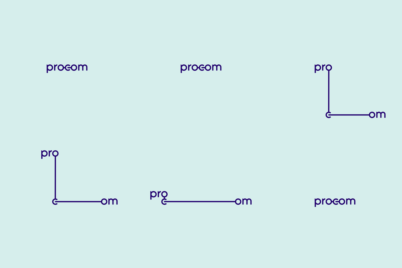
The starting point of the design was the idea of creating a network and being connected, both literally and figuratively. The letters 'OCO' were perfect to visualize this. They represent a part of a bigger chain / network.


All these elements of the identity can be connected together and thus form an infinite number of possible connections.


Designed at Creneau International — www.creneau.com


