


EXTERIOR SIGNAGE

The exterior look of the exhibit will be mainly to draw your attention to the exhibition. The shipping containers will be painted according to the color palette. The two containers that hold the main lettering will be painted with solid colors while the remaining faces of the crate will be covered with the stripe pattern.

FLOOR PLAN

The temporary exhibit is constructed from seven shipping containers in order to expand the space many of the interior walls will be removable to create a seamless unified interior. The plan is designed to maintain a smooth flow of traffic through the entire exhibit.

ANAMORPHIC TYPE

The entrance will take you through a hallway of anamorphic type, as a portal into the different rules of the exhibition.

ILLUSIONARY PRINTS
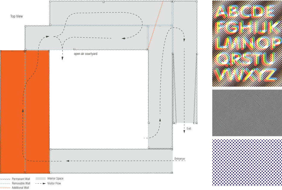
The first main exhibition space will consist of printed posters that use visual illusion in some form. The main focus of the posters is illusions and typography paired together. The infographics panel will be a smaller running panel underneath each print in place of the standard large graphics.

AMES ROOM
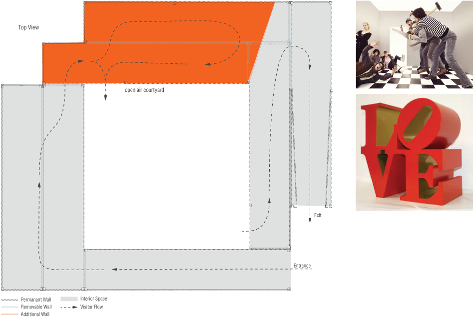
The purpose of this section is to create an illusion that requires the participation of the viewer to really become effective. There will also be a large block type sculpture in the room that is distorted to fit the perspective of the room.

COURTYARD
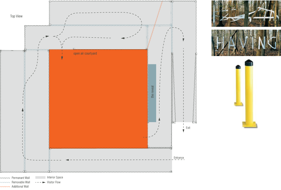
Viewers will wander through this seemingly abstract environment of wrapped pillars to make their way back inside the exhibition to see the reveal and actually be able to understand the message hidden in the environment. This gives the viewers a break in the pacing of the exhibition and creates mystery to be solved upon returning into the exhibition space.

PHOTOGRAPHY
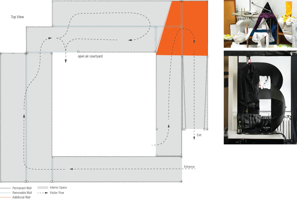
The exhibition wraps down the same way it begins with printed work. In this case photgraphy of environments from the right perspective to create typogrphay.

ESCAPE

Just as the begginning was a hallway so is the end. This one however mimics the illusion by Borromini. It will create the illusion that the hallway is much longer than it first seems giving the feeling that you are trapped in the exhibition. When you actually walk through it it goes by much quicker. I hope this is the main take away from the space people will feel immuresed while they are in the experience but afterwords feel that they enjoyed it so much that it wasn’t long enough.

GRAPHICS PANEL
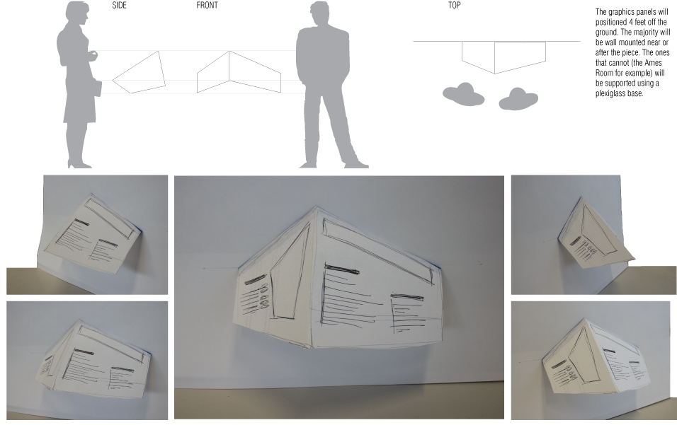
The Graphics panel shape is designed to exagerate perspective to never present a square or flat side at the viewer. There will be one panel near every exhibition piece explaining the piece and the illusion it illustrates. These models show the graphics panel from different angles. It is important to notice from the most extreme side views the panel loses it’s dimensional view.

GRAPHICS PANEL
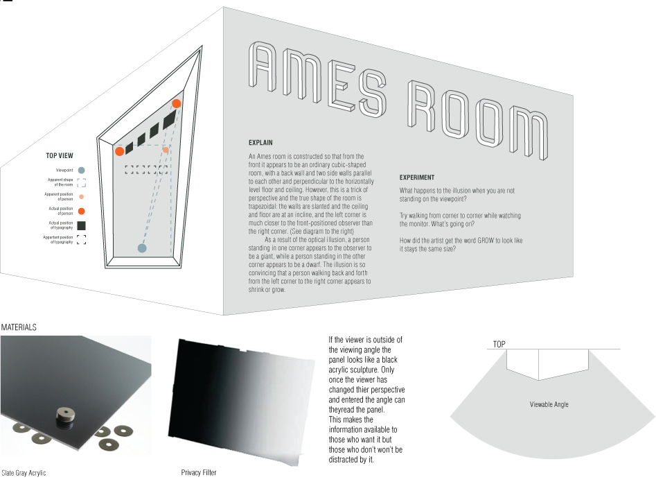
The Graphics panels will be constructed from a combination of acrylic plastic, the graphics and directional privacy filters. The goal is to creat an attractive dimensional shape that only displays it’s information once a viewer is standing in front of the graphic. Each panel contains a diagram explaining the illusion, a written explanation and prompts to explore and reflect on the illusion more.


