


TEVIOT RANGERS FOOTBALL CLUB
Crest Redesign Concept
Passion project for the rebrand and design of the Teviot Rangers Football Club crest.
Teviot Rangers was founded in 1970 and are predominately associated with youth / junior football. They run youth teams at all age groups as well as U18, U21 and Senior teams.
The clubs current crest is made up of the teams name and founding date on a circular shield. Inside the shield is depicted the letters 'T and R' to represent the clubs name as well as a football emblem. Above the 'T' there is a lion grasping a sword. The club colours are red, white and blue as used on the crest.

Existing Crest
The current Teviot Rangers crest seen above follows a traditional round shield template with an emblem inside. The red, white and blue theme is very vibrant and eye-catching. With a bit more precision, I believe the structure of the current crest wouldn't need much adjusting. However, to me it seems like it has been thrown together quickly and the 'TR' emblem inside needs more thought when being put together.
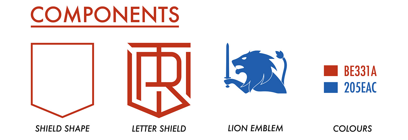
I aim to maintain the clubs identity on my version by using the colours seen on the existing scheme as well as creating a new way to display the 'TR' emblem. I also plan to make the Lion holding a sword aspect of the logo a much more prominent feature. By bringing all these aspect together, I hope to create a modern logo design that represents the clubs current identity.


Single Colour Variant (Shield and Lion)

Single Colour Variant (Shield Only)
The design I have created steps away from the circle shield structure the existing crest follows. The main reason for this was how the 'TR' would be displayed. Taken directly from the previous logo, the 'TR' was the main focus point of that design and was essential to make up the main aspect of the new one. The letters have been displayed in a fashion that they work as an emblem as well as the main structure of the crest (the shield shape).
Obviously, The colours utilised were taken directly from the existing logo design (a few adjustments in tone). The team shirt used by Teviot Rangers is mainly white; therefore I chose not to use it on the majority of versions of the design. The way the logo has been put together, the white of the strip will show through sections and still look a part of the design.
I was very keen to utilise the Lion holding a sword aspect seen on the existing crest. There, it is displayed above the letter 'T' but is very small. I believe a symbol like this should be much more prominent, in order to make the logo more iconic. I modernised a version of the Lion grasping the sword; making it solid and bold to make it stand out. The placement above the shield mirrors how it is displayed in the existing design (above the 'T' / above the 'T Shield').


Logo Variants Embroidered Mockups


