


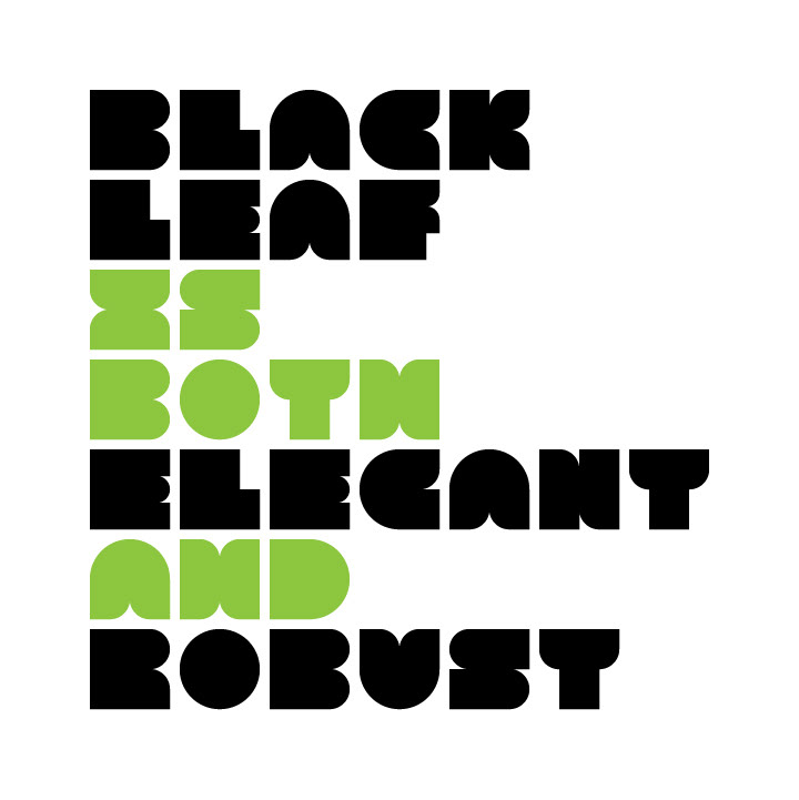
I wanted a thick and heavy display type face, that still felt elegant and smooth. A tree full of leaves came to mind, the trunk is thick but the leaves have elegance. This guided my design.
For the month of March, Black Leaf was featured in the logo for Mark Design, a british design group. The website used the typefaces letter M in their logo.