Ensaio Lucro - Identity
Made in 2011 - By Kanceistudio

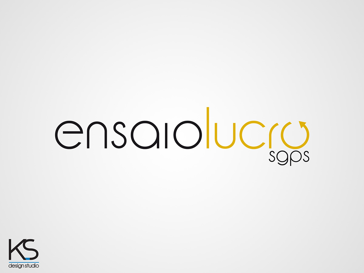
This is a branding project for the company Ensaio Lucro, Sgps, a society-oriented investors to create new businesses or start-ups with innovative nature of projects.
As it can be seen in the logo, according to its evolution, there has been a constant concern in making something clear and simple, minimal, readily apparent to the perceiver and captivating.
The source used was based on a source other small format, which worked its details, gave a single source stylized purposely created for this concept.
With respect to the symbol, developed a series of papers in accordance with the symbol profit and movement while maintaining a clean appearance and easy to remember. We used simple colors like black, synonymous with strength and austerity (labor market) marking a strong position and needs, and a golden spleen compared to the reference gold, marking once more the dynamics of the company, while maintaining the simplicity .
The choice of positioning the abbreviation "sgps" due to a concern positioning easy to read, with an elegance slightly visible, but imposed by his tone black.
Simbol evolution


Final appearance
Black Logo

White Logo


