“Visual identity and promotion of the Tériade Museum Library” is the title of my thesis project in University.
The existing Museum (now undergoing heavy restoration) is located in Mytilini, Lesvos island, Greece and houses a big collection of illustrated books by Pablo Picasso, Henri Matisse, Marc Chagall, Joan Miró, and other modern artists all published by the editor [Stratis Eleftheriadis] Tériade.
The existing Museum (now undergoing heavy restoration) is located in Mytilini, Lesvos island, Greece and houses a big collection of illustrated books by Pablo Picasso, Henri Matisse, Marc Chagall, Joan Miró, and other modern artists all published by the editor [Stratis Eleftheriadis] Tériade.
My main goal with this project was to introduce modern art to the wide public in the simplest way possible. I designed a minimalistic, neat and to-the-point identity which allows the books to play the leading role - so nothing speaks louder than them.
Logo
The logo symbol is a part of a Le Corbusier illustration for the book “The poem of the right angle”, which is exhibited in the museum. This stylised symbol was the best option for the museum because it is representative of all books - which are as diverse as these four colours but unite well under their editor’s name and passion for art. Sans serif black type gives a strong contrast and builds a more contemporary character for the museum itself.
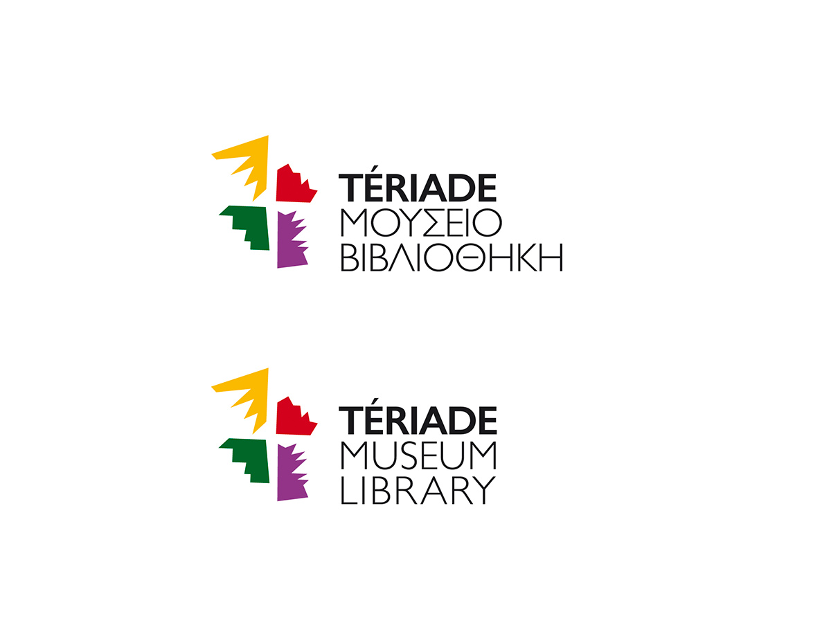
The four colours of the symbol represent the illustrated books exhibited in the museum.

The page from "The poem of the right angle" by Charles-Édouard Le Corbusier that the logo was inspired from.
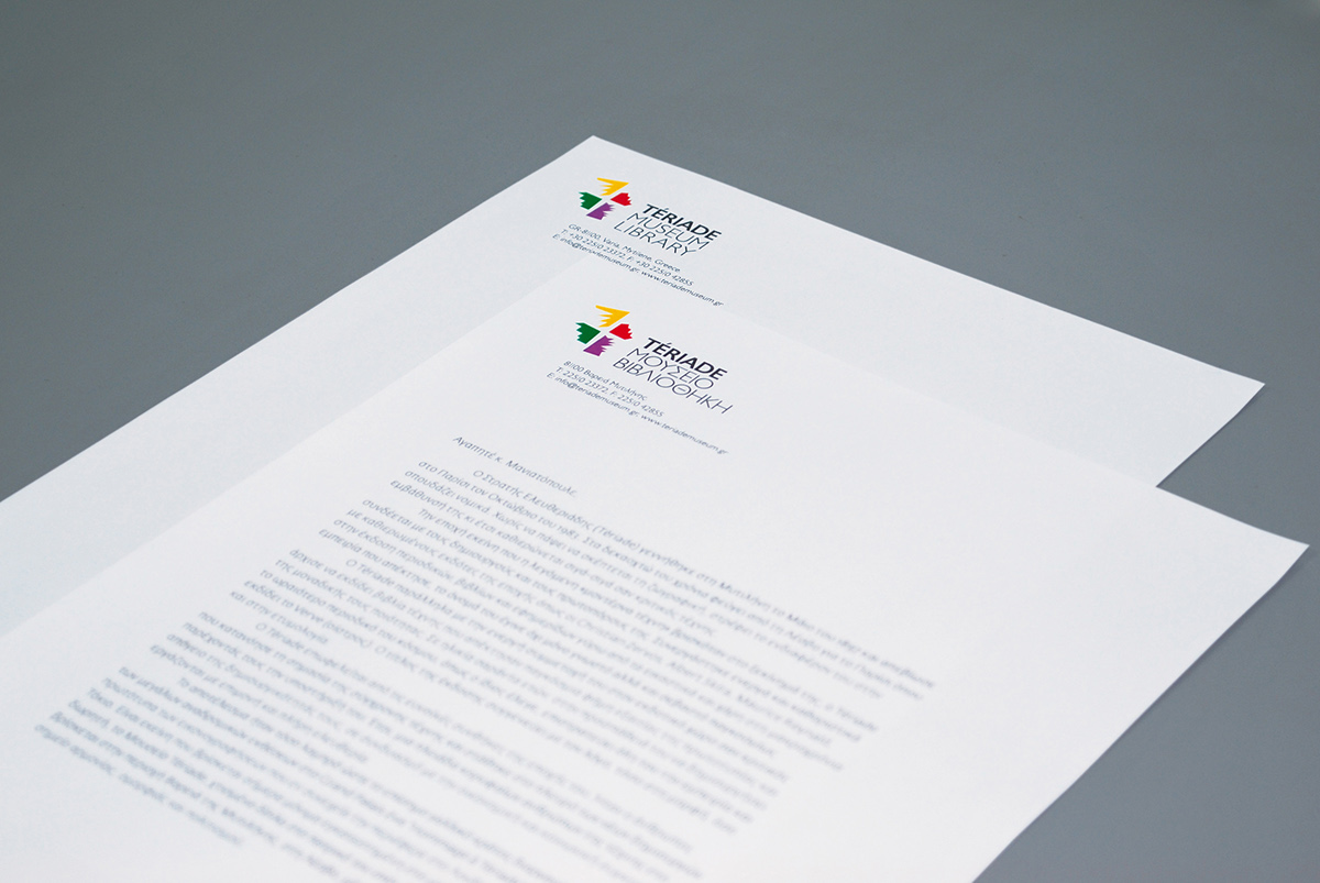
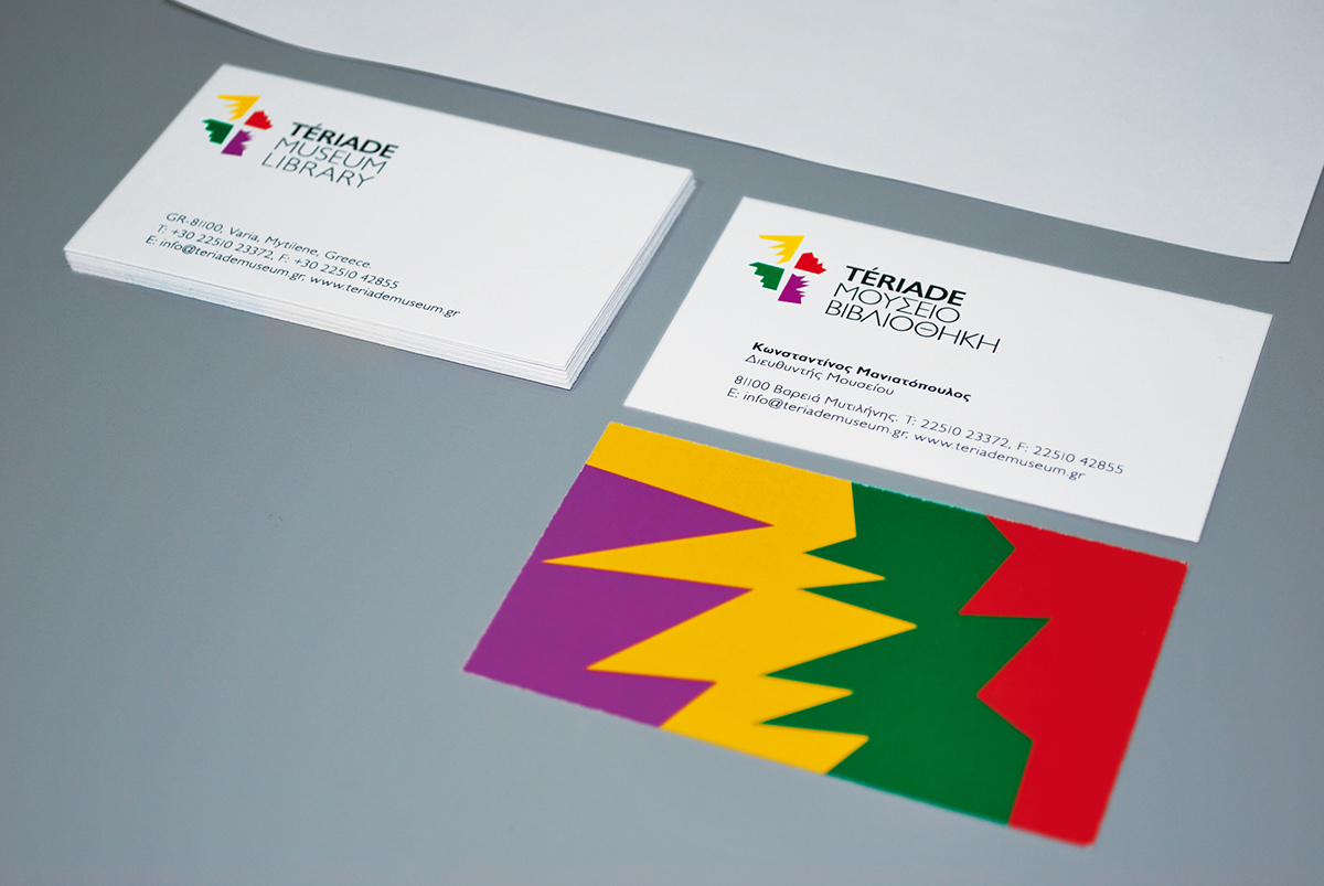
Stationery and other applications
For all identity applications a combination of the four sharp shapes is used to show the energy and contradiction of the vibrant colours (the books).


Postcards
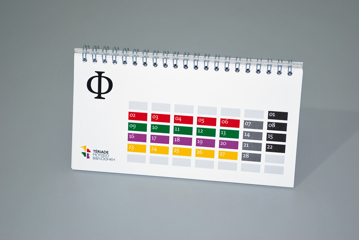
Desktop calendar
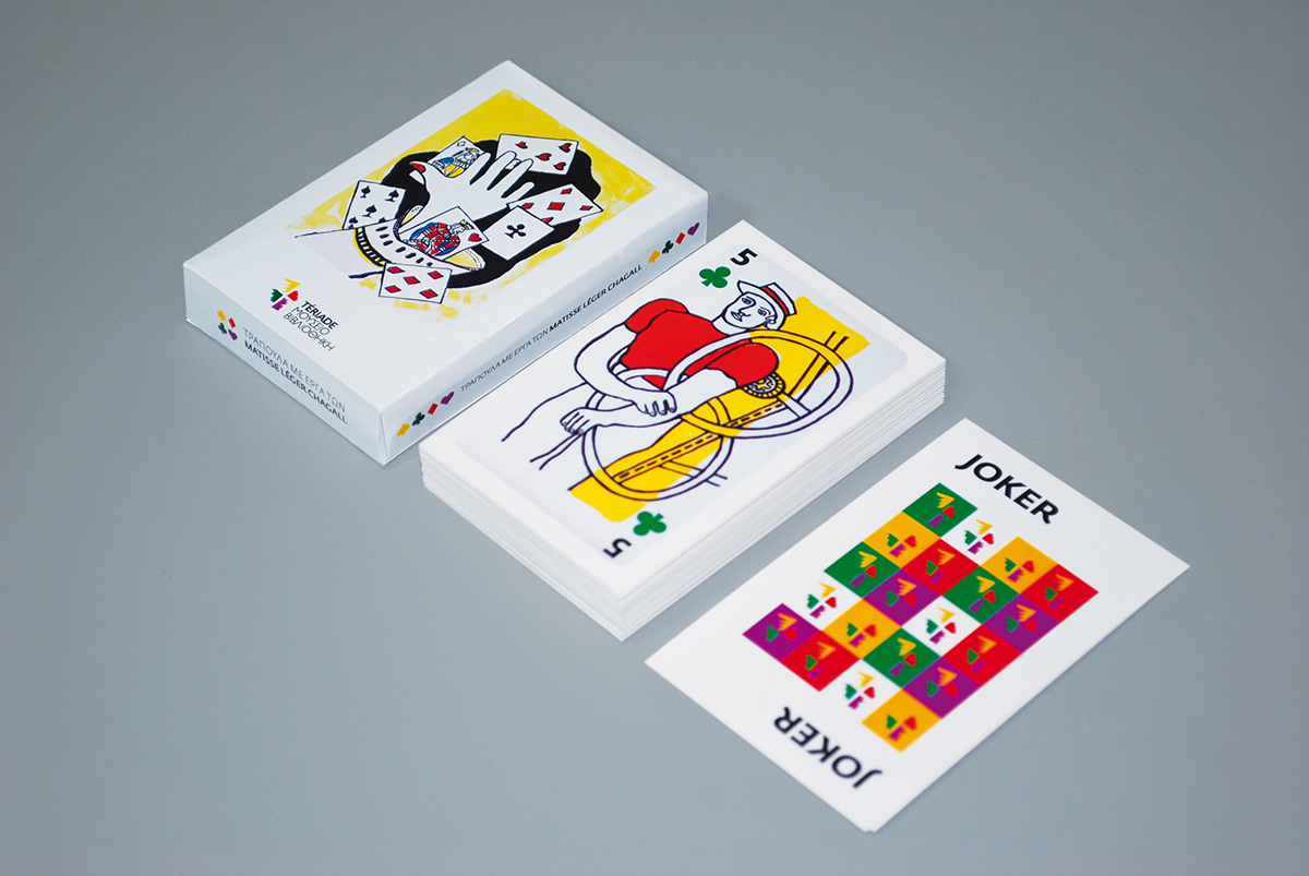

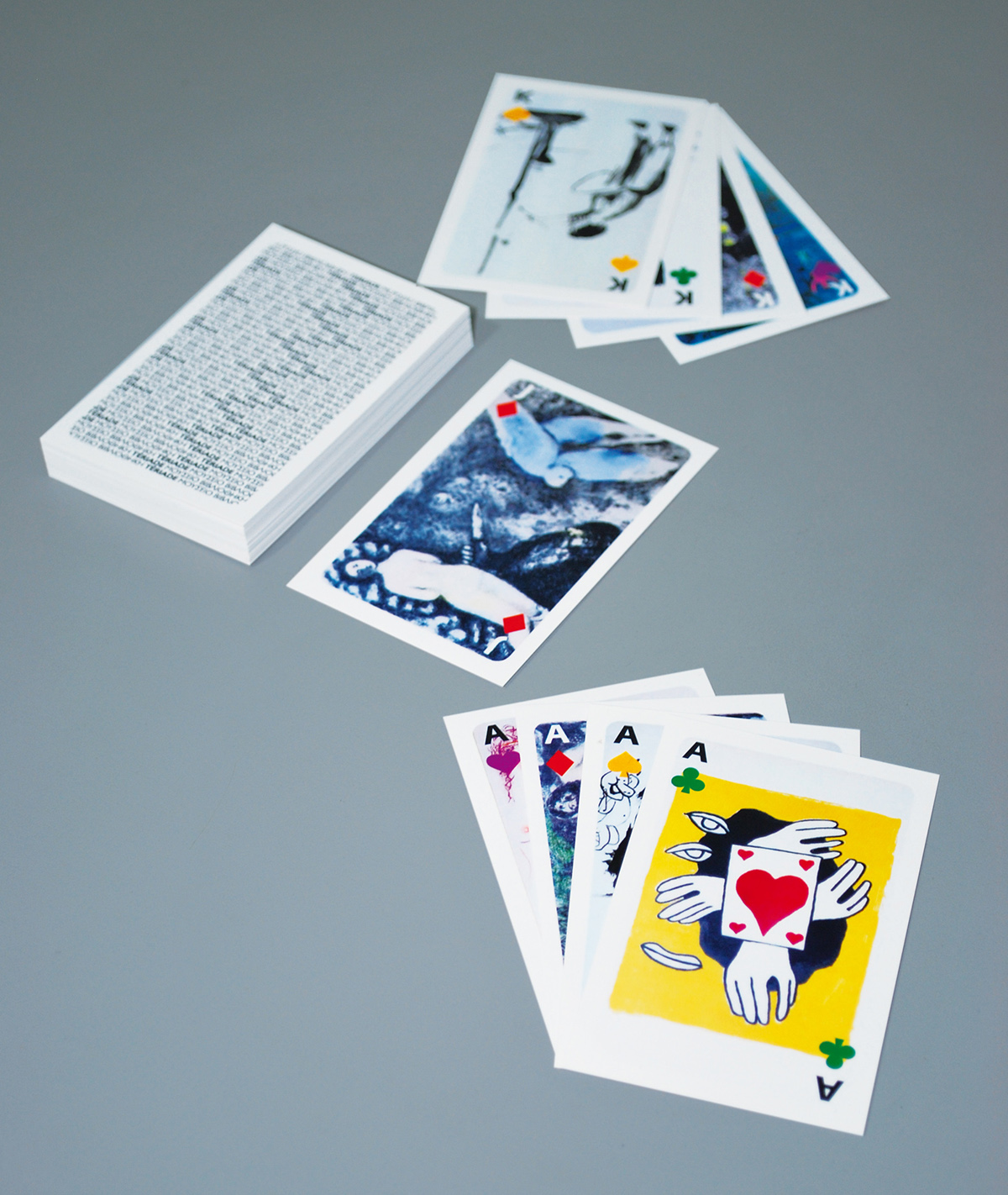
Playing cards set showing illustrations by Henri Matisse, Fernand Léger and Marc Chagall.
Print ads
A series of print advertisements was produced with the intention to make the museum's precious art collection widely known. Relevant to the piece of art quotes by a specific artist each time play a discreet role allowing attention to be brought to the illustration itself.
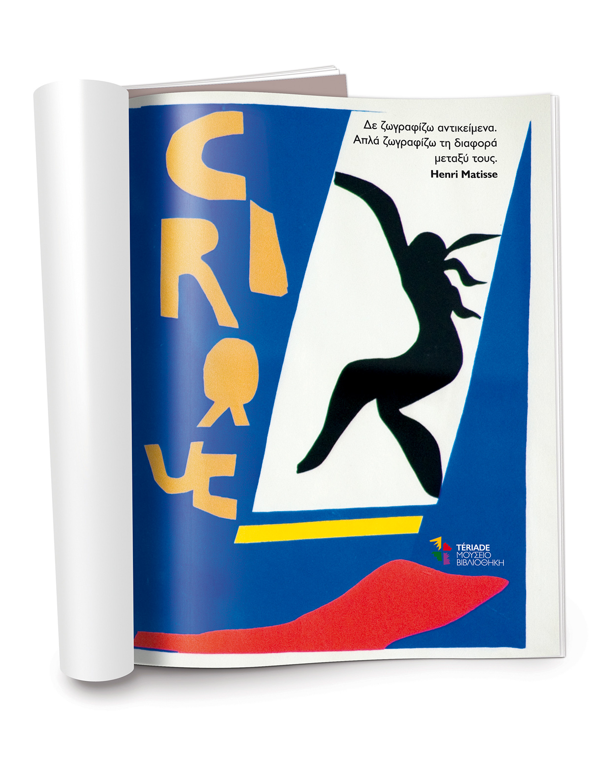
"I don't paint things. I only paint the difference between things". Henri Matisse
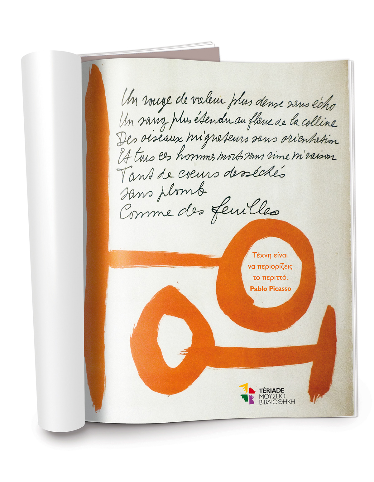
"Art is the elimination of the unnecessary". Pablo Picasso

"I try to apply colours like words that shape poems, like notes that shape music". Joan Miró
Poster for the new museum wing opening
This poster presents the new wing opening using just type and the logo's yellow shape which also stands for the projector light that illuminates the building during the opening ceremony.

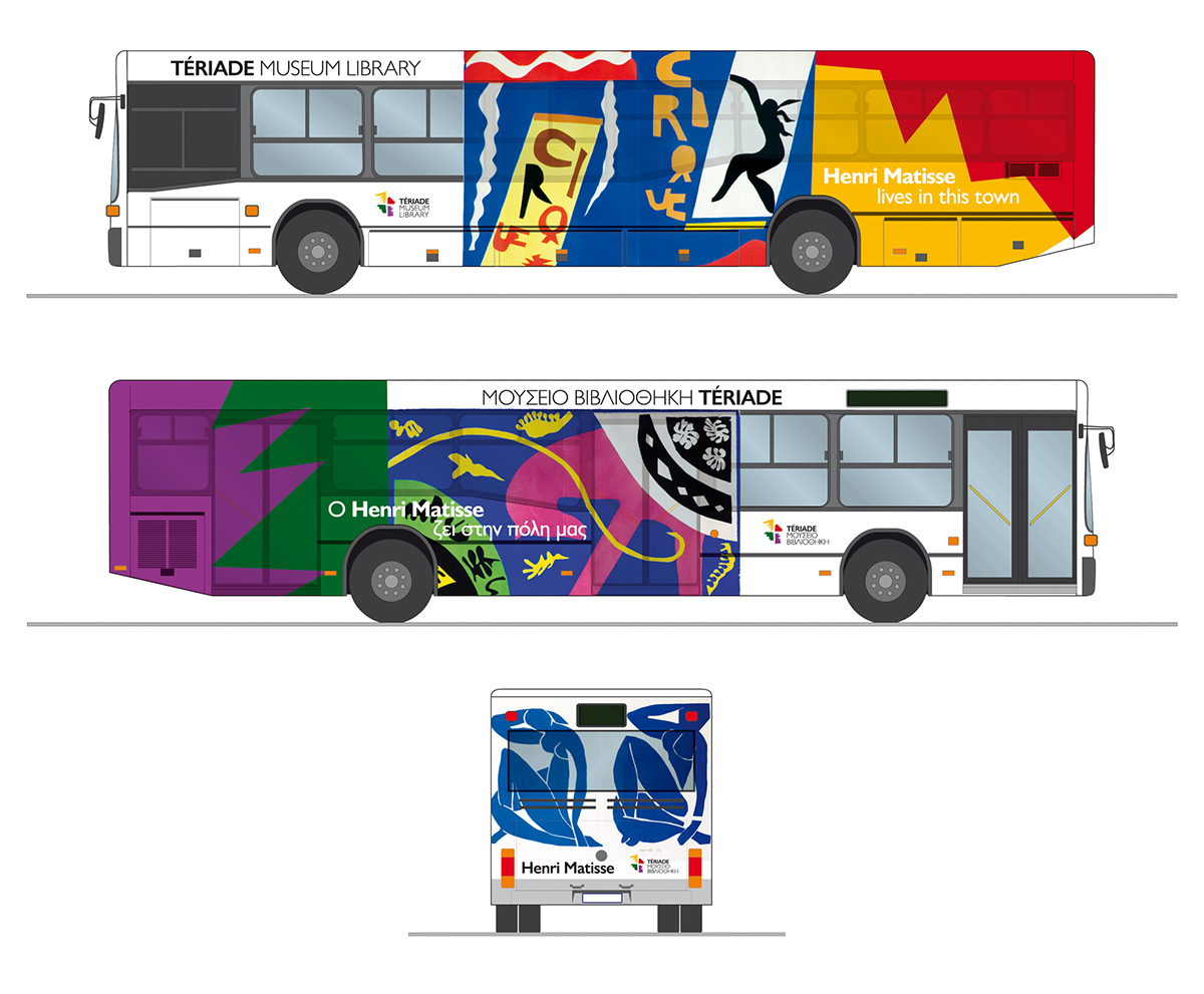
Local promotion
It is a fact that a lot of local people do not acknowledge the importance or even the existence of the museum. For this reason and for any out-of-town visitors too, I designed these moving ads on local buses.
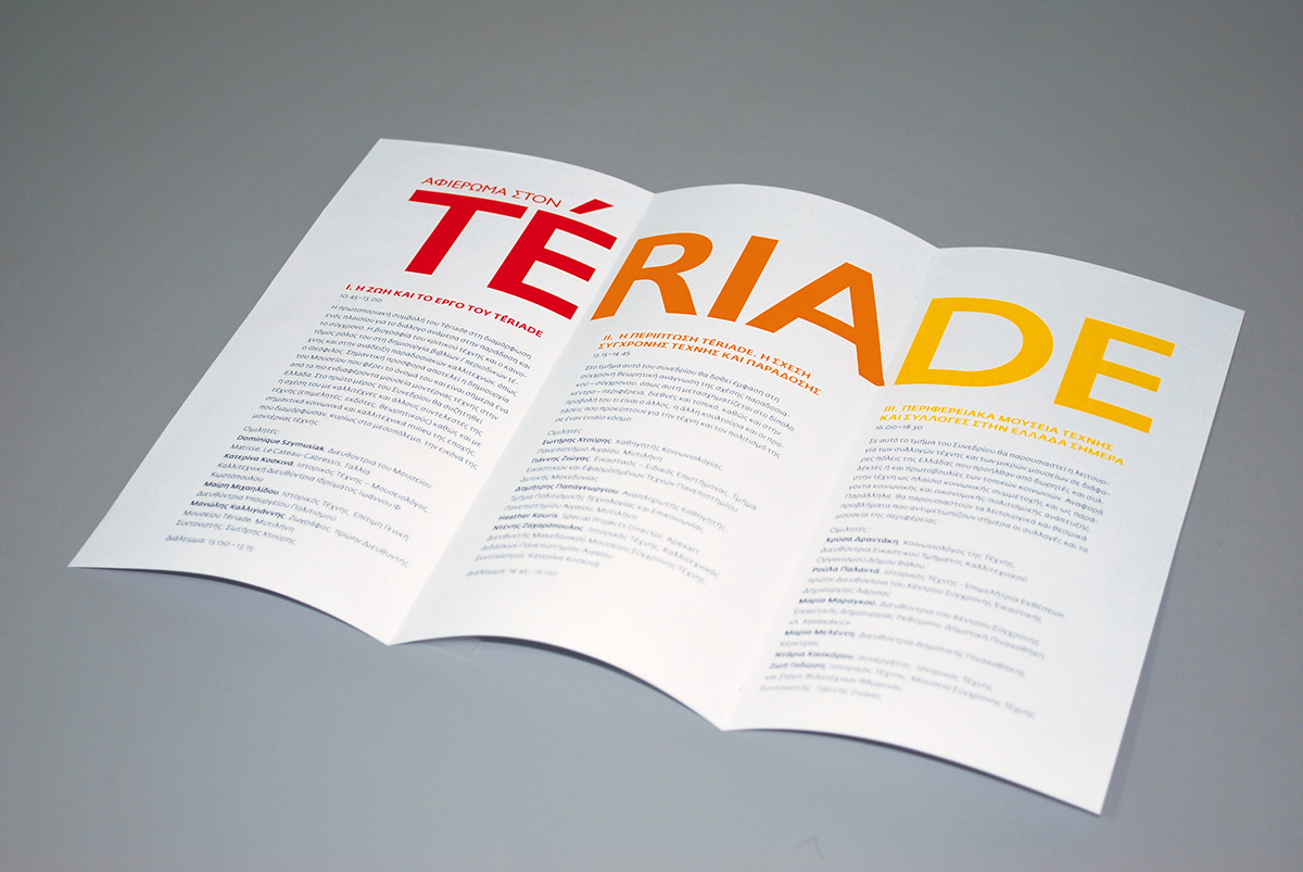
“Tribute to Tériade” conference materials
A conference dedicated to Tériade’s contribution to art and publishing was held in November 2008 in Athens.
The conference was divided into three sections and so were the name of the editor and structure of the poster. The same layout was used for a tri-folded brochure.
The conference was divided into three sections and so were the name of the editor and structure of the poster. The same layout was used for a tri-folded brochure.


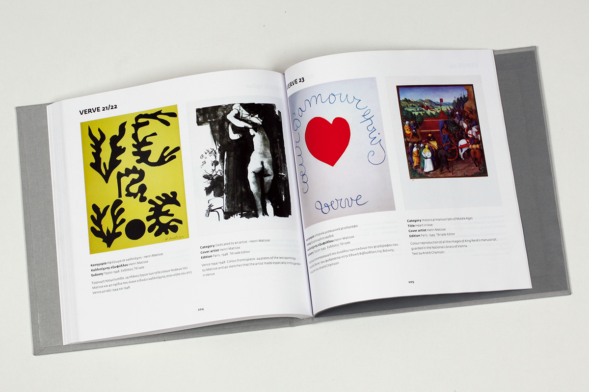
Bilingual museum guide (Greek and English)
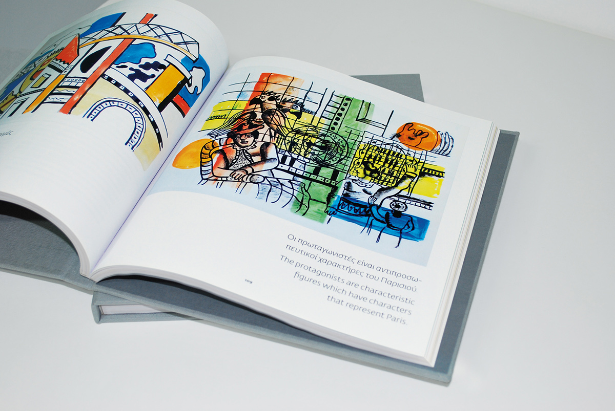
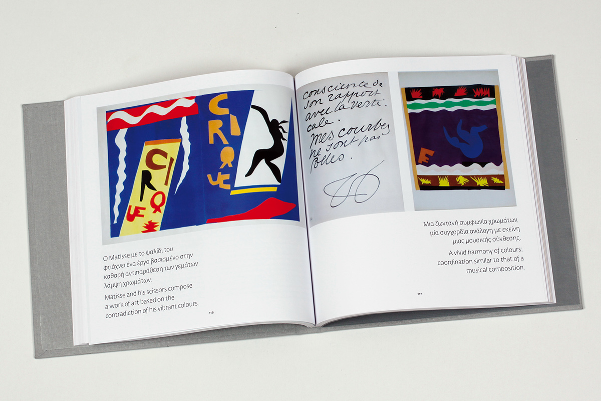
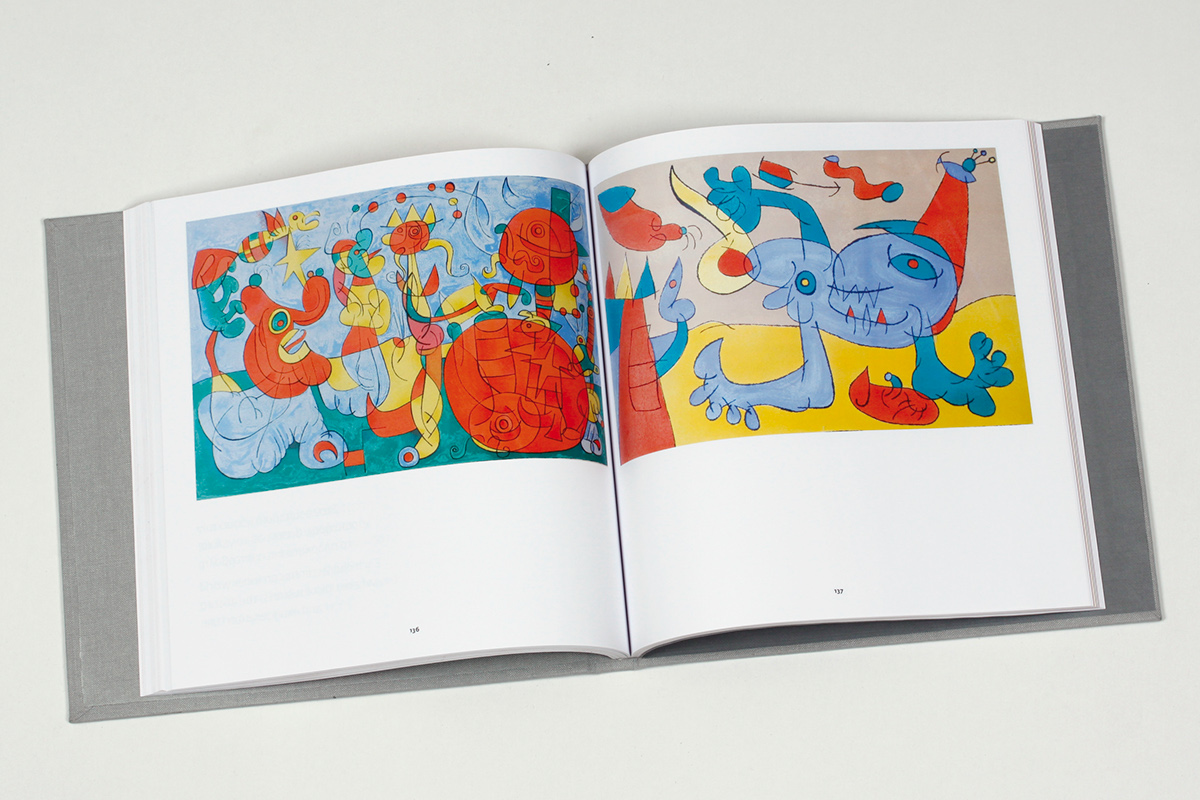
A bilingual 220-page guide was designed to showcase most of the exhibited books and Verve magazine issues (an art magazine published by Tériade in Paris). Both cover and binding are handmade to resemble the original illustrated book covers, whereas the layout serves to be read as a modern art magazine.
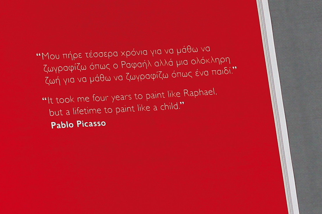
The illustrated books, grouped by illustrator, are presented in alphabetical order and every artist is introduced with one of the four logo colours and an inspirational quote of his.
The illustrated books, grouped by illustrator, are presented in alphabetical order and every artist is introduced with one of the four logo colours and an inspirational quote of his.