Cheers to Typography :)
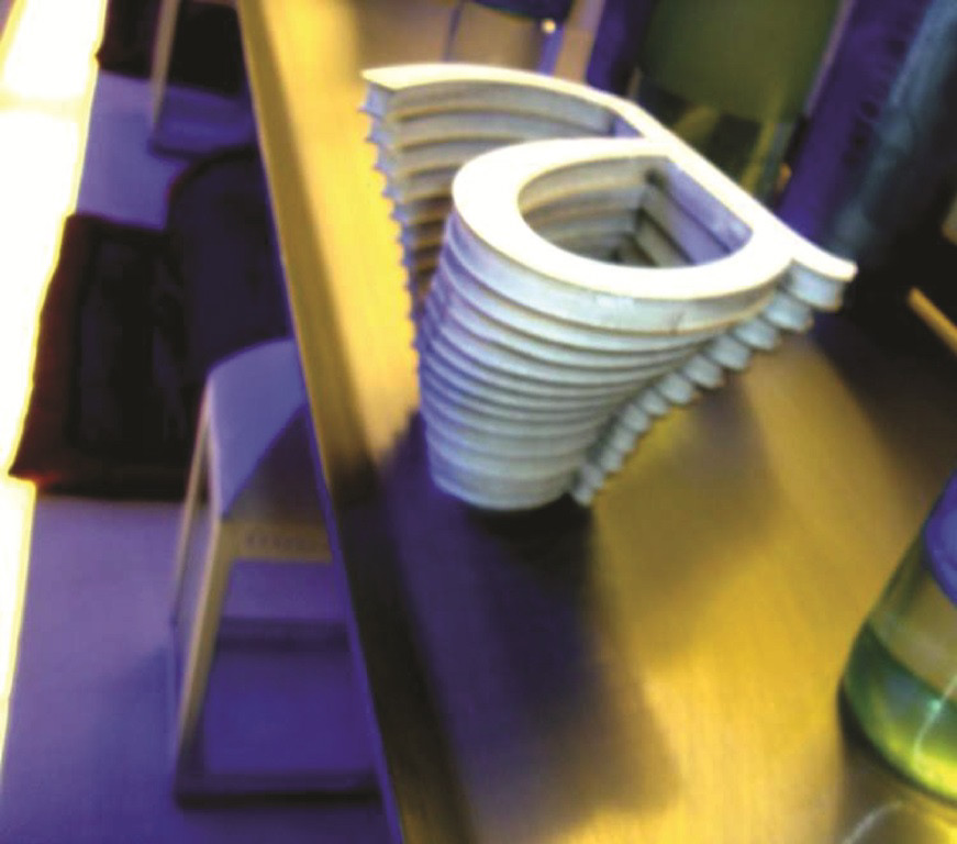
The 'a' cup concept. Used as display. Photo taken at cafe blanc, hamra.
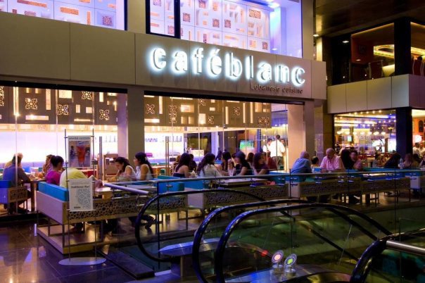
Cafe blanc - Hamra, Beirut. There are 2 'a's in the logotype,
one bold and one regular- both of which are extended vowels.
one bold and one regular- both of which are extended vowels.
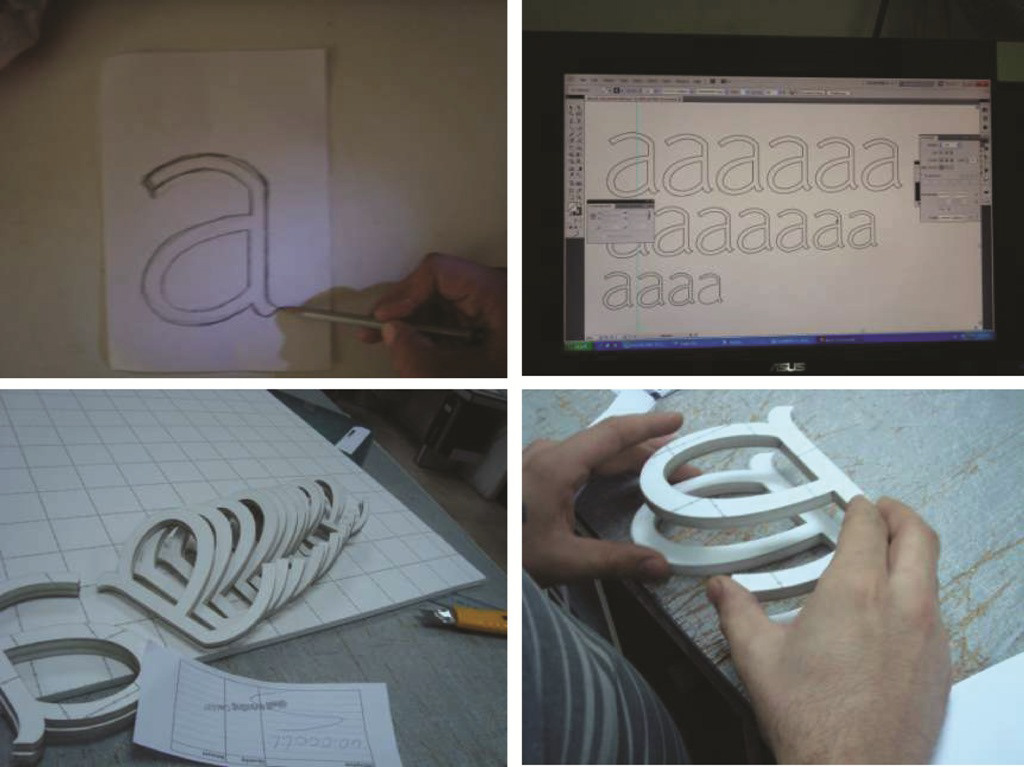
The concept is based the regular 'a' (in the word blanc), as it's thin elegant features
worked nicely to bring out the modern, luxurious feel associated with cafe blanc. I began with
a few sketches, then careful rendering and measurement adjustments on illustrator,
followed by a laser cut prompt, and finally putting it all together.
worked nicely to bring out the modern, luxurious feel associated with cafe blanc. I began with
a few sketches, then careful rendering and measurement adjustments on illustrator,
followed by a laser cut prompt, and finally putting it all together.
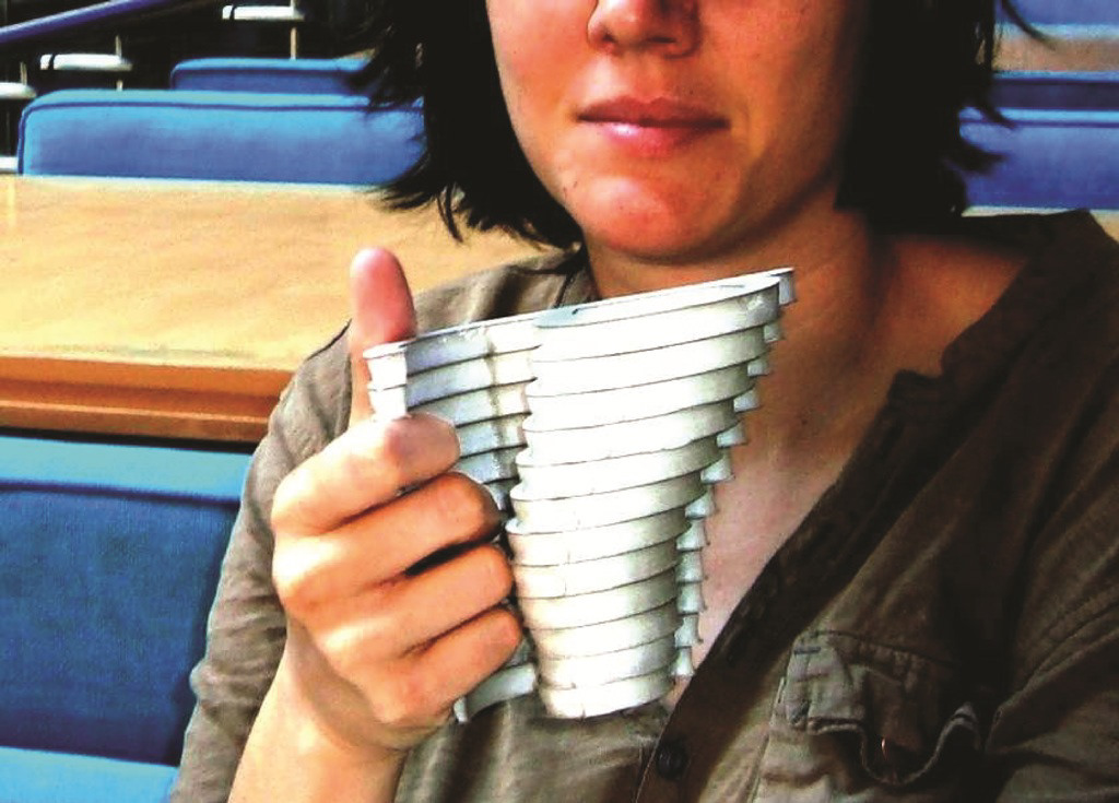
By adding a finish, one can actually drink from the cup!
Thank you for viewing!
Thank you for viewing!


