Quarkie / Finesse
Branding, Print
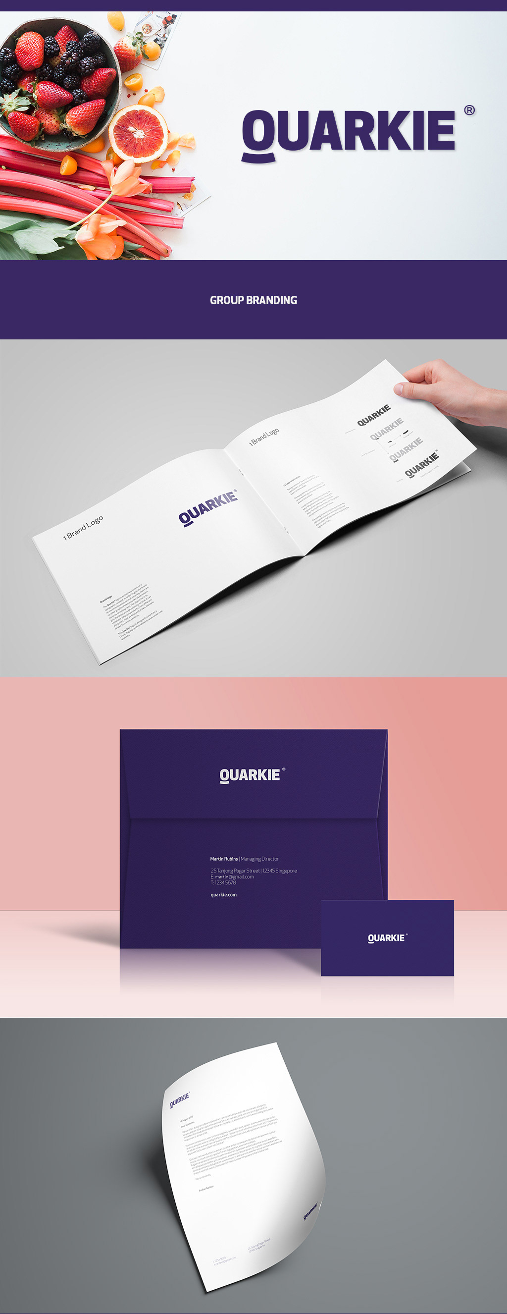
The founder of Quarkie had the idea to introduce a new kind of healthy snack in Singapore. For this, he needed two new brands – one for the company name (Quarkie) and one for the actual product (Finesse). The plan was to add further products under the Quarkie brand at a later stage.
We’ve designed two fully custom brands and developed the logos, stationery and packaging designs. The Quarkie company logo has a more simple yet modern look and feel, and is based on an existing font with some amendments to the alignments, shapes and dimensions of the letters. The Finesse product logo is a fully custom shape drawn by hand.
Initially, the healthy snack was targeting kids and one of the concepts that were developed was based on super heroes representing each flavour of the snack. Later on the business plan had some slight amendments and so the target audience changed as well as the design concepts.