

This project visualizes data for each delay-causing incident happened on Toronto’s TTC streetcars network during the year 2016.
The map-based, interactive application aims to provide an overview of the effects of delays over the network, giving information about the duration and the location of incidents, the direction of the delayed streetcars, the reported cause as well as additional statistics. Interactive commands allow users to select specific routes and compare them, as well as to filter the data based on different variables.

Interactive application - unfiltered data.
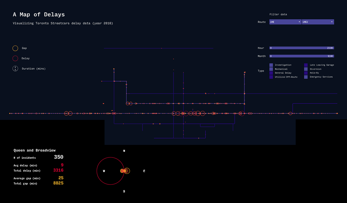
Interactive application filtered to show only two lines and specific delay types.
The size of symbols is proportional to the duration in minutes of each incident. Red circles represent delay (delay in minutes to the transportation schedule), while yellow ones represent gap (gap in minutes between the preceding streetcar and the delayed one). The interactive callout adds a further layer of information to the map, visualizing a unique delay diagram for each specific location, depicting both quantitative (number of delays and durations), qualitative (delays and gaps) and spatial (directions) information.

Excerpt from the dataset.

2016 TTC Streetcar Map.
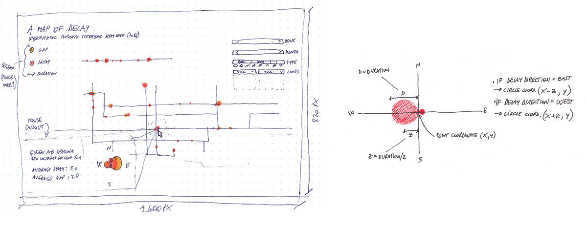
Working sketches.
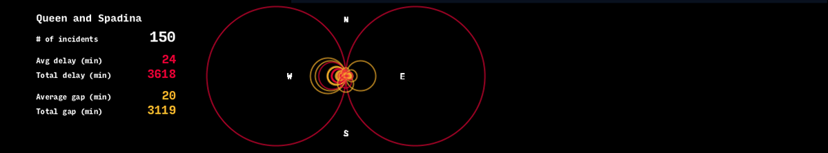
Mouse-over callout showing a delay diagram for the specified location


