


A month ago I did a poster for a Christmas concert and there was this concept that I really liked but due to project requirements I didn’t use. So I decided to create a Christmas card out of the illustration and at the end I made a couple of actual cards.
For the words appearing on the card, I intentionally chose to skew type so that when set vertically they would conform to the structure of Chinese type instead of normal Roman type. This sort of highlights how normal Roman italic type always look “wrong” in a Chinese paragraph and also why Chinese “Kai” type (which really should be classed as italic) always look “wrong” in a paragraph of English text. Most people do not seem to realize that the two have inherently incompatible structures although both structures are cursive. (You can read more about this in my blog post, and as the mini-site mentioned below states, this type treatment can be thought of as a continuation with the experimentation I did in my face2face project.)
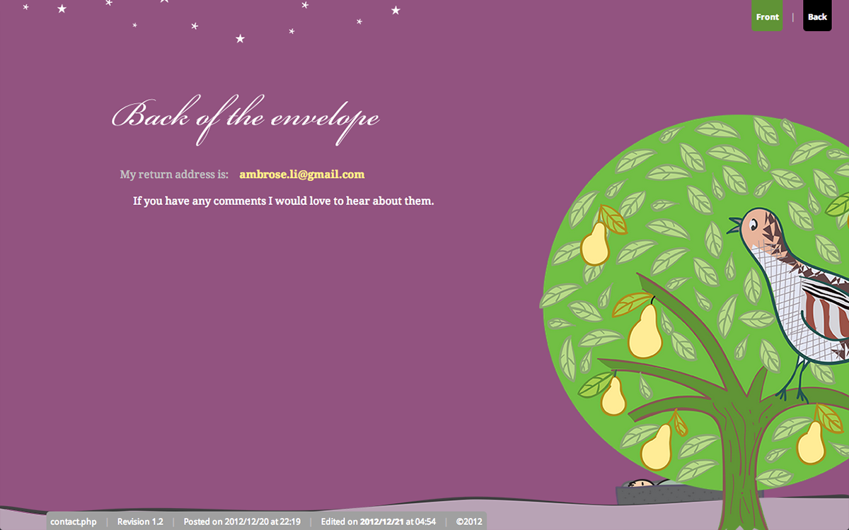
The back of the card contains a web site address that points to a mini-site with a terse explanation of the illustration and a slightly less terse explanation of the type treatment.

Descriptions for the front and back of the card have also been written for adapting the card as a piece of HTML email. The idea was to make sure that the electronic version of the card would be totally accessible. Unfortunately, the longdesc attribute is not supported by most browsers and so some of this accessibility is lost.
Finally, here are the original sketches:


