Akvarel Stoleshnikov
Akvarel is an elegant boutique hotel in the heart of Moscow’s historic center. In 2016-2017 a fundamental renovation was executed under the project by the famous Front Architecture, and Akvarel turned into a design-hotel, where one can spend time in the atmosphere of modern sophisticated luxury.
Rocklin cooperated with the hotel management and the architects and was responsible for complete re-branding, brand identity and customer experience development.
Client: Akvarel Stoleshnikov. Strategy and positioning, creative concept, brand identity, customer experience, copywriting.
Architecture: Front Architecture.
Calligraphy: Olga Gorbatyh.
Photography: www.muzalevsky.com
Site: www.hotelakvarel.ru (concept design by Rocklin)


Brand Positioning
The Challenge
1. To keep interest of loyal target audience (mostly officials and managers) and to attract new perspective audience — guests who are interested in creative activities, cultural life and fashion.
2. To develop strong brand awareness and unique communication language.
3. To create good brand perception and to turn certain controversial features (for instance, location of the hotel in the courtyard in the pedestrian zone of Stoleshnikov lane) into obvious advantages.


The Solution
Rocklin’s strategists travelled to Moscow in order to make a deep survey on location and to carry out a one-day design-thinking workshop. The hotel management and staff representatives, the architects and us worked as one team. As result, four viable concept drafts were ready by the end of the workshop.
“The Hidden Gem” concept was chosen for further development. It was decided to position Akvarel as a stylish, modern and secluded hotel in the heart of Moscow, a secret place to stay, an oasis of comfort and peace in a 12-million city.


Visual Identity and Brand Experience
The Concept

Akvarel’s identity system is constructed as a combination of two motifs.
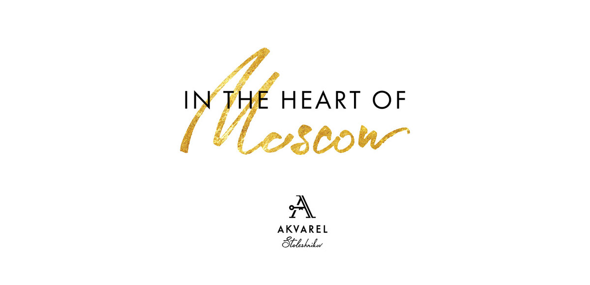
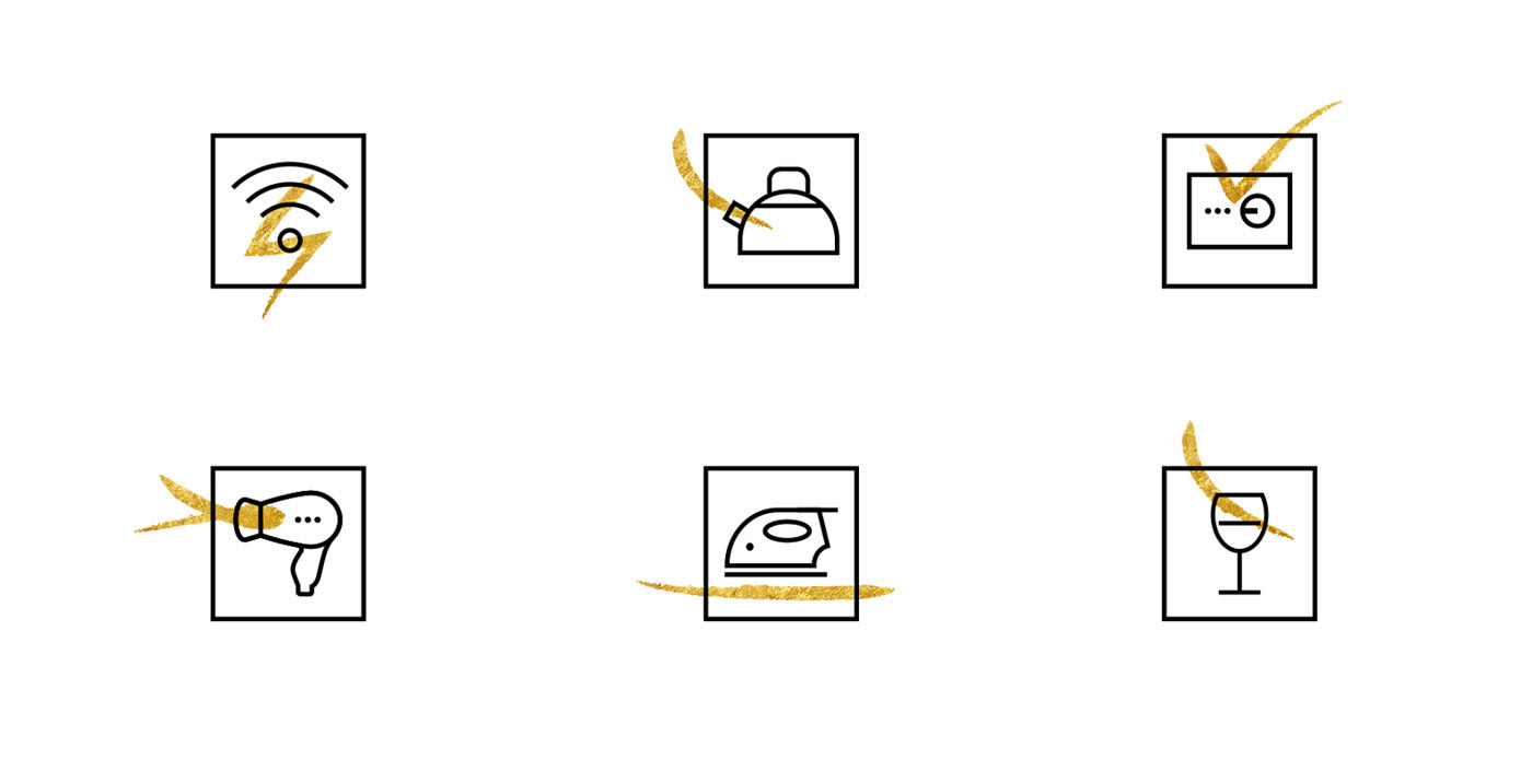
The first one is a covert element, some secret meaning that appears in all sorts of compositions. Primarily, this method was implemented in the logo, where the A mark contains a symbolic secret key. An observant viewer can discover some other meanings as well: an arrow — which is a hint to the hotel location in the inner courtyard of Stoleshnikov lane, and a bow tie — as a symbol of perfect service.

The second motif is built around open and free graphics and custom-made calligraphy — a peculiar interpretation of aquarelle (watercolor) technique, which certainly helps connect the design solution with the brand name. Movement of color and flow of shapes, figures and meanings is also a perfect metaphor for vibrant and turbulent Moscow life.
Logo, Headers, Typography and System of Icons


Identity Implementation and Brand Experience (according to the Steps of Consumer Journey)
Website

Ad

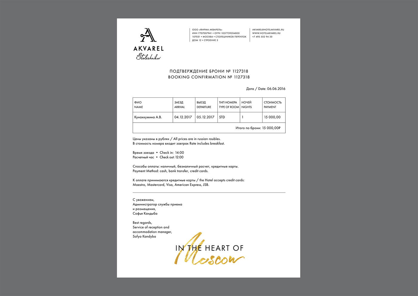
Confirmation of Booking
Business Card on Reception

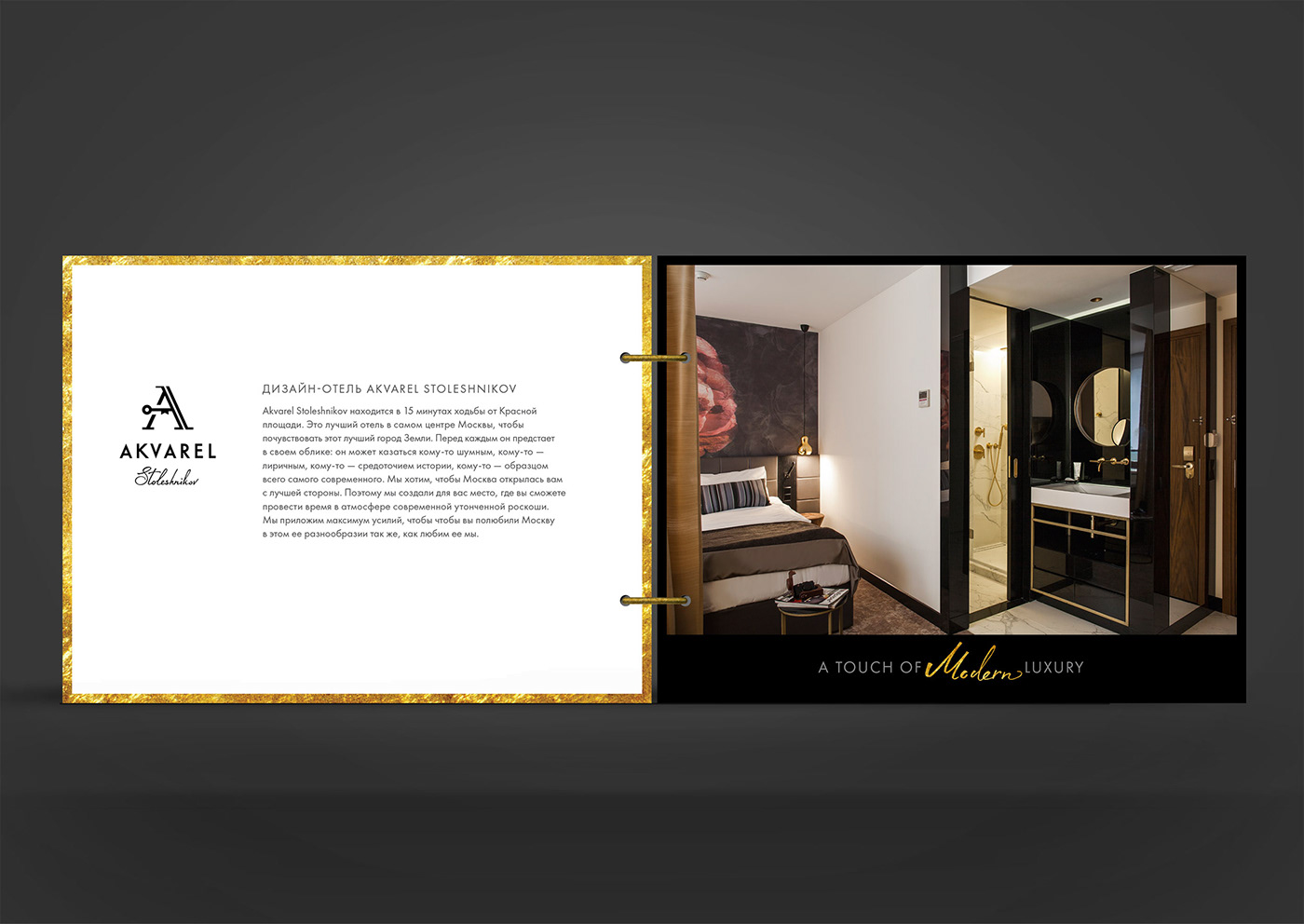
Brochure

Room Key

Door Hanger

Guest Book (in the Room)

A Perfect Cup of Coffee

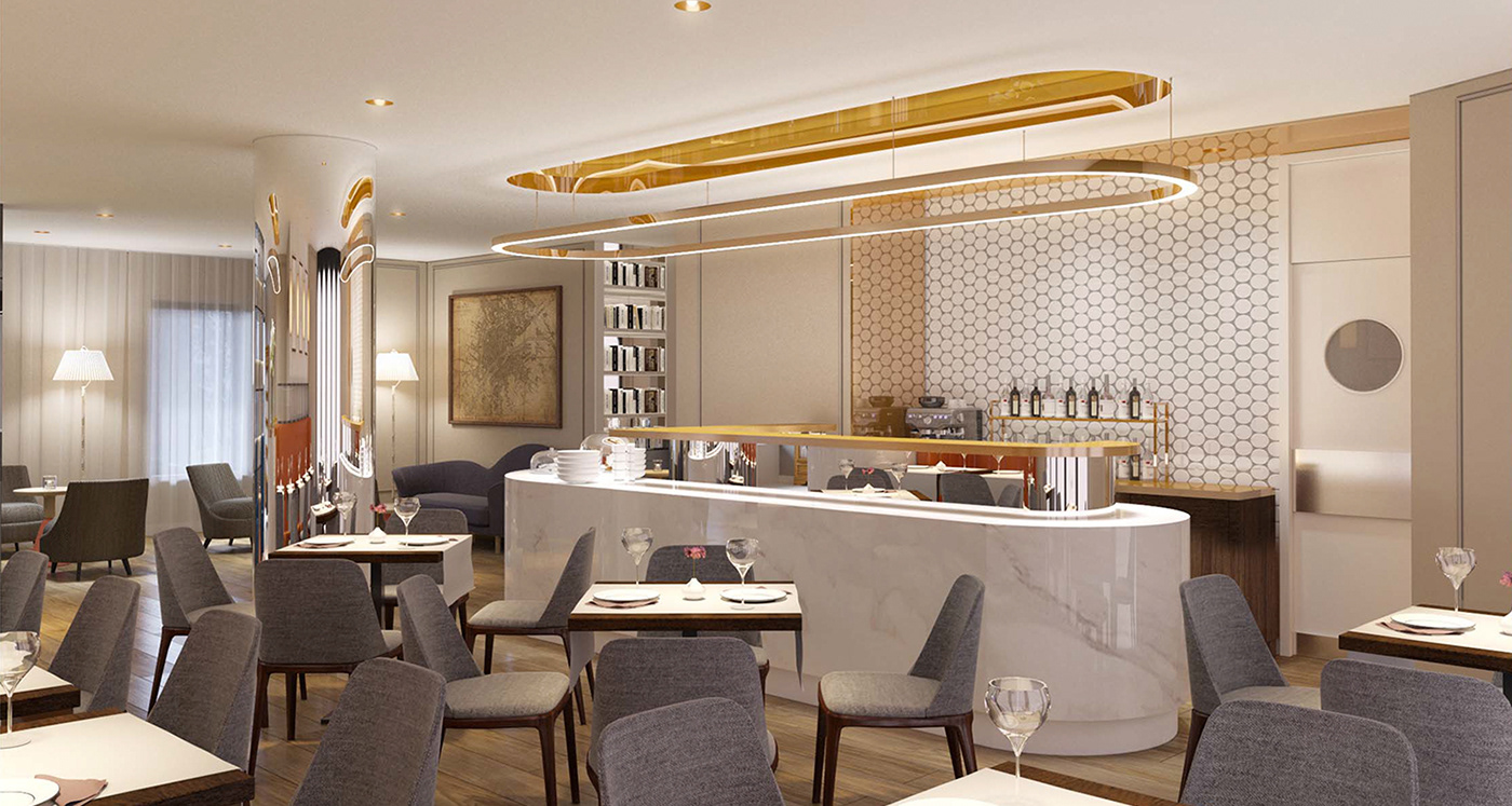
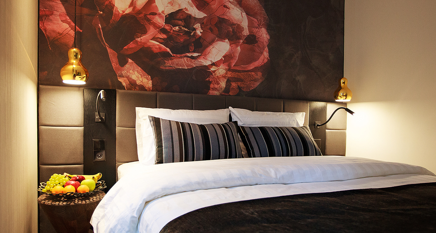
Some More Pictures from the Hotel


Thank You!


