Mouth-watering aromas of Sichuan cuisine fill its bustling streets, as well as the lively buzz of conversation and music from local tea house operas. Look a little closer and you'll find a fly restaurant, where real Sichuanese food comes from. Dubbed 'fly' restaurants by locals as they are often impossible to find, cramped and outdated, but full of irresistibly flavoursome dishes which make people swarm like flies. These hole-in-the-wall kitchens with seating that spills onto the alleyways are run by chefs who master authentic Sichuan dishes. These restaurants embody the soul of Sichuan cooking.
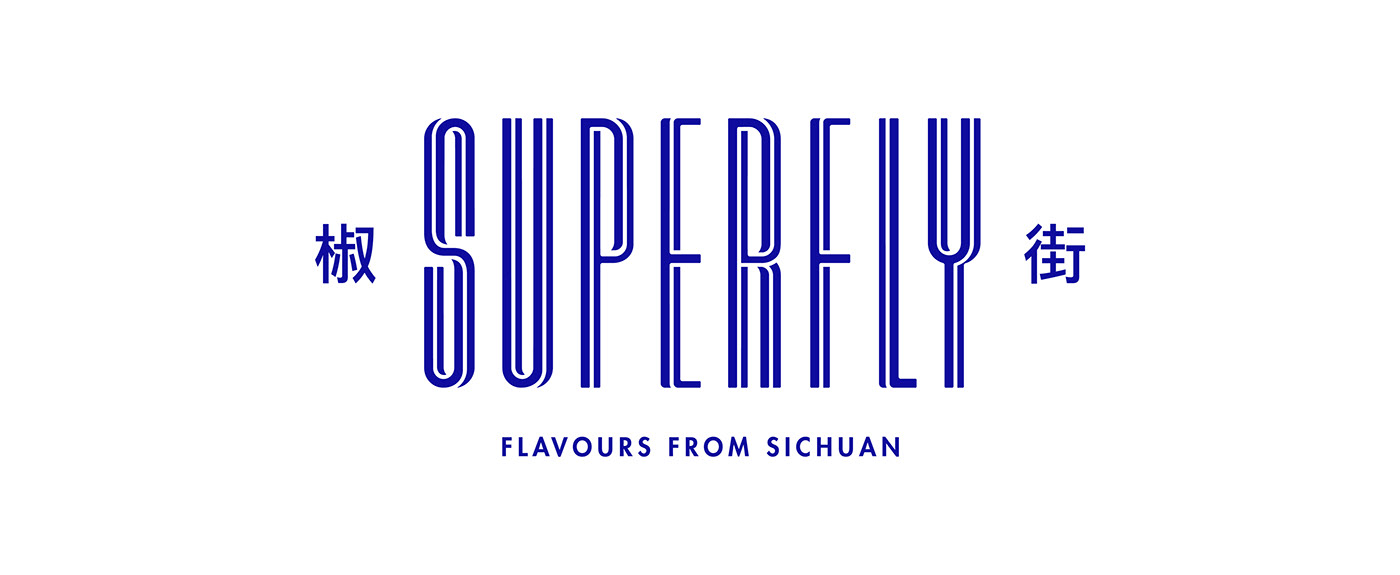
Superfly looks to bring the authentic cooking from these local restaurants to a contemporary setting. Adding ‘super' to fly, there is a juxtaposition of old and new; old recipes in new locations. The Creative Method tied this story into Superfly's identity, infusing traditional Sichuanese imagery with modern printing techniques. Blue was chosen for the brand colour as this style of cooking is thought of by Westerners as being overly spicy rather than complex with flavour. One of our challenges was to show a new market that this cuisine is approachable. Superfly's story is brought to life through naming, logo creation, visual identity, signage and packaging.
Creative Director: Tony Ibbotson
Art Director: Lee Nicol
Graphic Designer: Emma Lucia
Interiors: Giant Design
Interiors photography: Andrew Worssam Photography